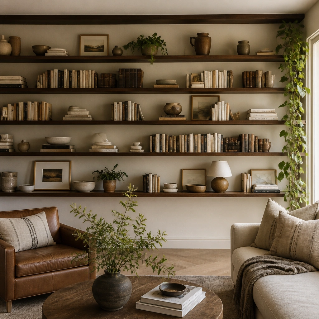
1. Picture-Ledge Frame + Books (Instant Gallery Feel)
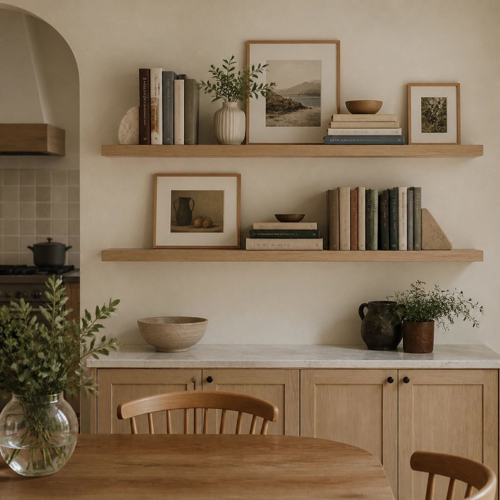
This setup works because picture ledges give you a clean, low-profile “gallery” look without fighting bulky frames. Keep most books in the same color range (cream, tan, and muted greens) so the wall looks calm when you swap small seasonal items. The ledges also make it easy to add art in winter and switch to lighter prints in spring.
Pro tipInstall ledges 12-14 inches apart and keep the top edge of frames aligned — it makes the whole wall look designed, not crowded.
2. Kitchen-Friendly Open Cubby Grid (No Seasonal Gaps)
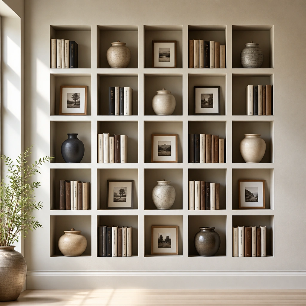
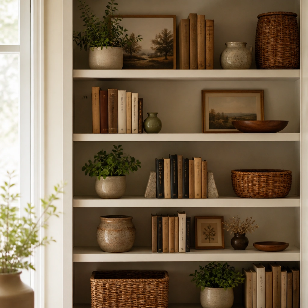
A cubby grid is a year-round win because each compartment can hold a fixed “base” item plus one easy swap. In a kitchen or dining space, choose materials that handle everyday life — sealed wood, powder-coated metal, or laminate-backed shelves that wipe clean. Use book stacks as the structure and let art/objects rotate seasonally.
Pro tipAssign a role to each cubby: keep 60% as always-there (books + frames) and rotate only the remaining 40% with small decor.
3. Built-In Look with Tall Books at the Center (Symmetry Anchor)
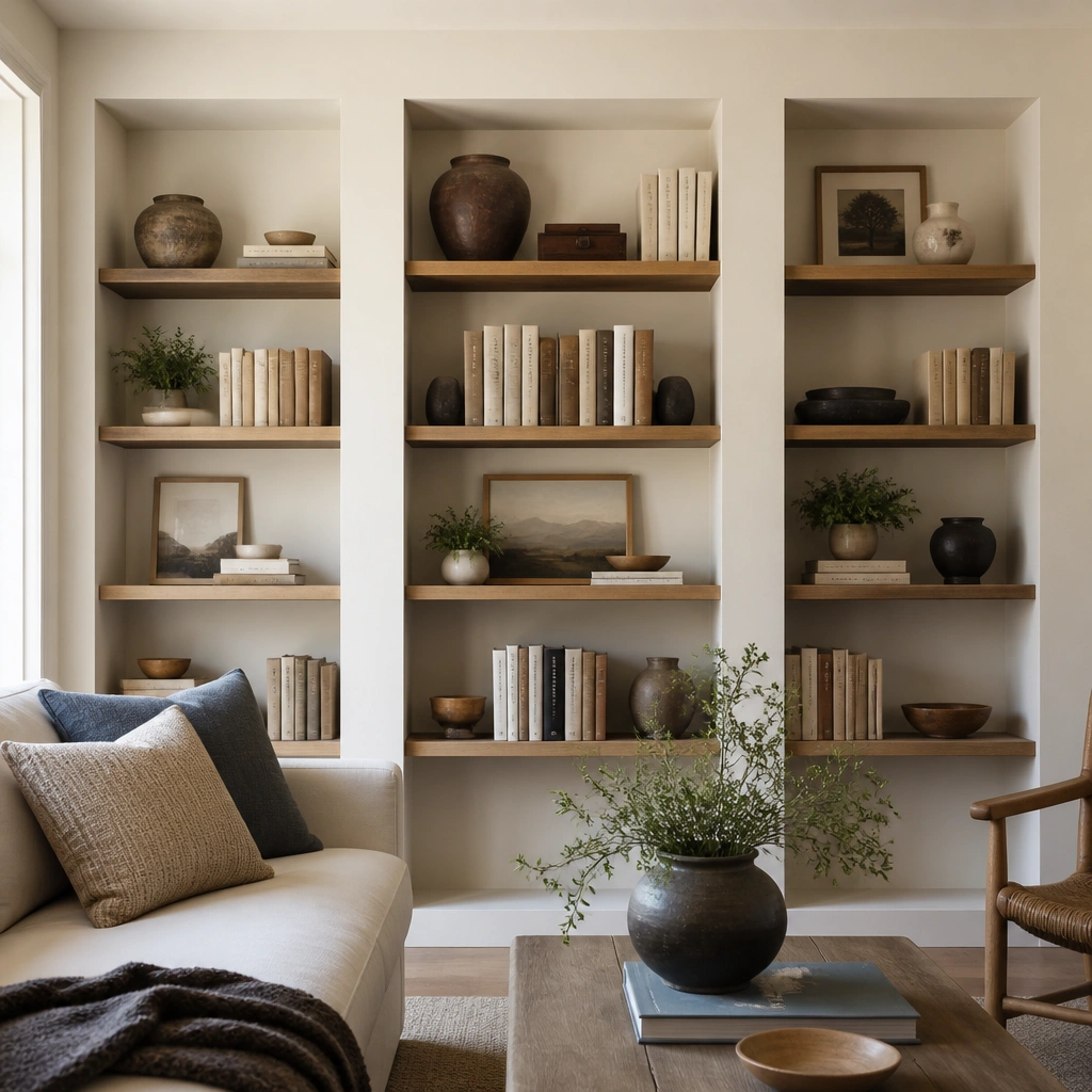
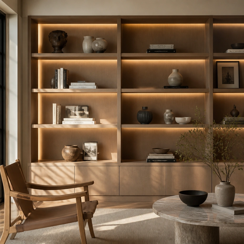
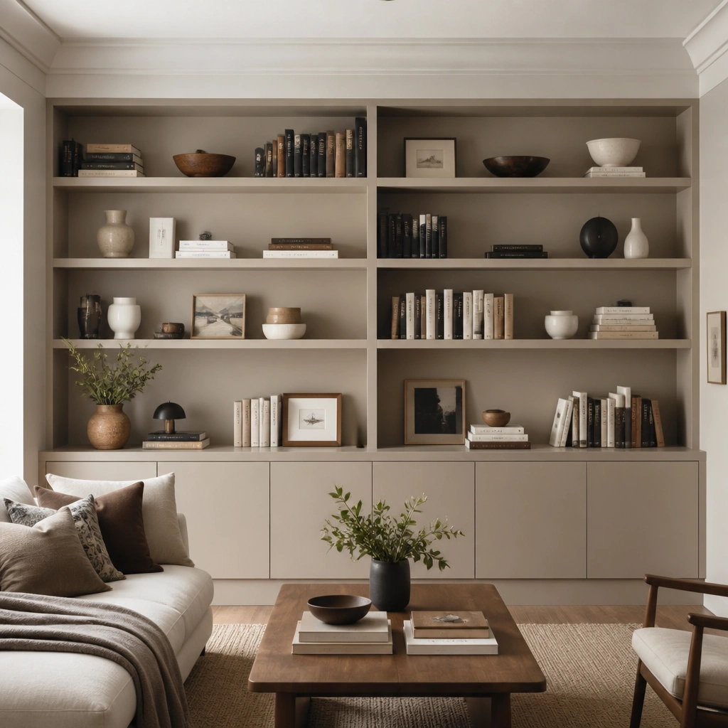
If your shelf styling feels messy when seasons change, symmetry is the fix. Place taller books in the middle to act like a visual “spine,” then balance with shorter stacks on the outer shelves. An off-white or soft greige back wall keeps book spines from clashing when you add holiday colors.
Pro tipAim for a 2-1-2 height rhythm: tall center stacks, medium on the sides, and small accents at the shelf edges.
4. Staggered Shelf Riser (Perfect for Dining Room Height)
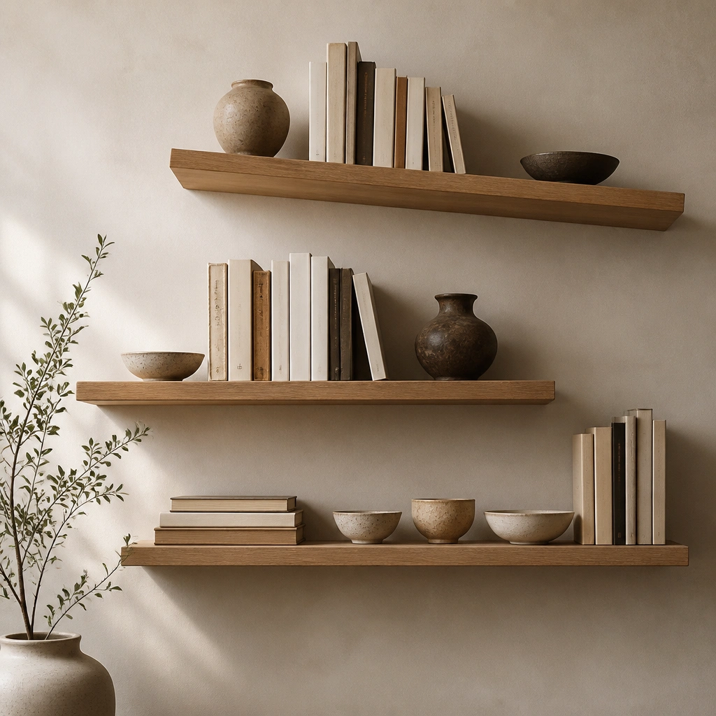
Staggered shelves add movement so the wall doesn’t look flat when you’re not using seasonal decor. In dining rooms, this layout is especially forgiving because it naturally draws the eye across the table line. Use a mix of vertical and horizontal book stacks to create a “story” without needing large holiday pieces.
Pro tipKeep the lower shelf within 18-24 inches of the table’s top height so you can still style comfortably without blocking sightlines.
5. Linen Backdrop + Brass Peg Rails (Crisp, Never-Too-Much)
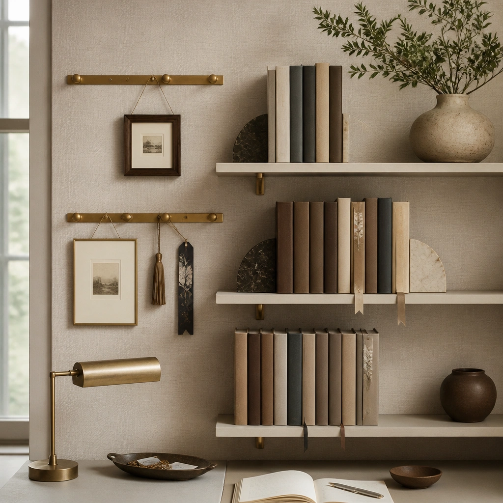
A linen-look backdrop makes book spines feel intentional because it softens contrast — especially helpful in kitchens where white walls can look stark. Brass accents read warm and timeless, and the peg rails let you hang small seasonal signs without replacing the whole display. This combo stays elegant even when your seasonal swaps are minimal.
Pro tipPick one metal finish (brass or black) and repeat it on shelf brackets, frames, and any hardware for a cohesive year-round look.
6. Black Metal + Light Oak Floating Shelves (Modern Farmhouse)
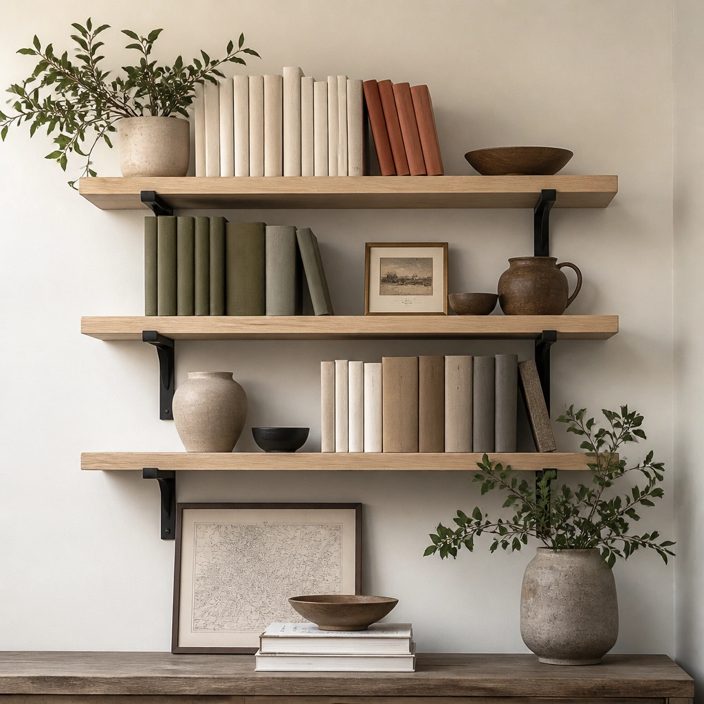
This pairing is timeless because it balances warmth (oak) with crisp structure (black brackets). Color-blocking your spines keeps the wall from looking chaotic when holiday books or themed covers appear. For kitchen & dining, floating shelves also reduce visual bulk compared to thick bookcases.
Leave 1-2 inches of breathing space between book stacks and rotate in only one “season color” (like terracotta in fall) so the wall still reads cohesive.
7. Vertical Picture Ledge Columns (Tall + Narrow Wall Friendly)
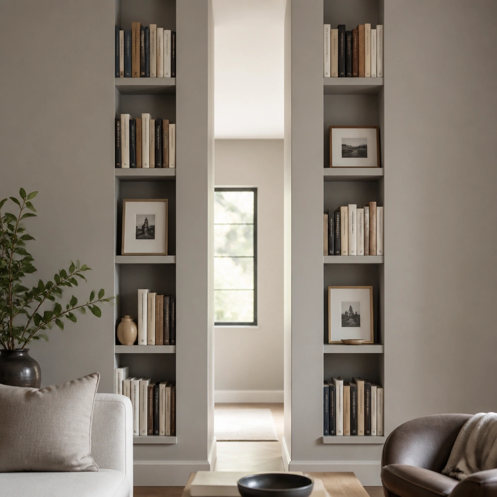
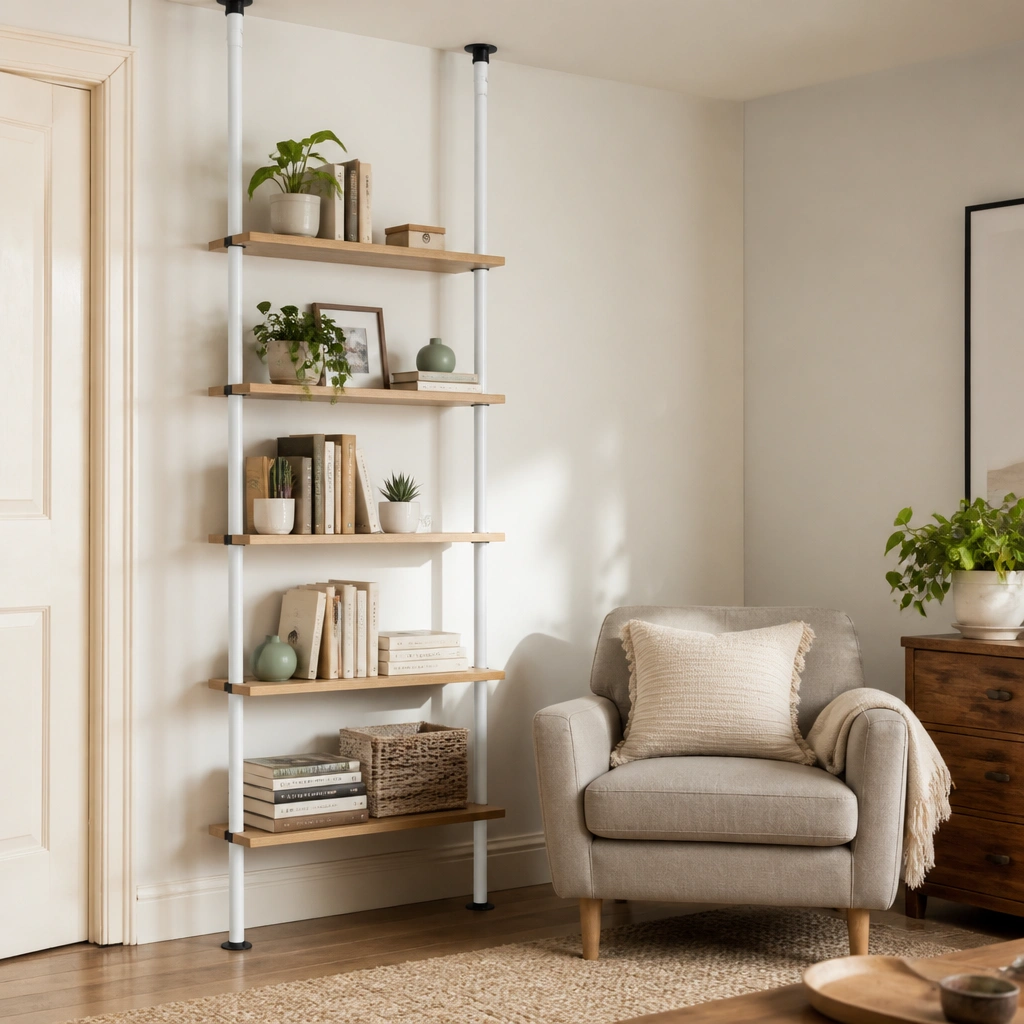
When you’re working with a tall, narrow wall segment (common near dining room entries), vertical columns make the most of your height without overcrowding. Use consistent frame sizes and keep the top of each book stack aligned so it looks styled even between seasons. The wall stays “decorated” because the books and frames provide structure on their own.
Pro tipMeasure your narrow wall width and keep each column to 12-16 inches deep so books don’t overhang and the display stays neat.