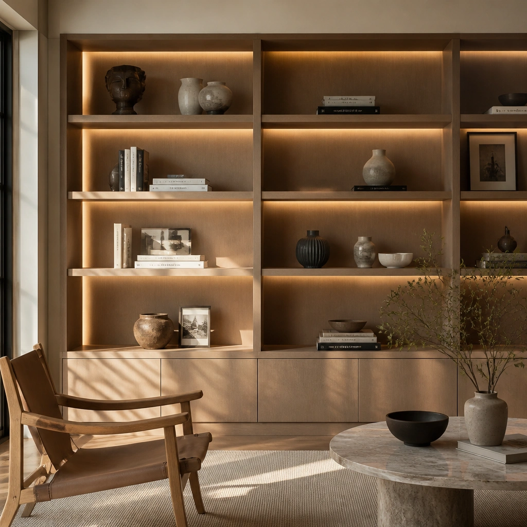
1. Linen-Backed Cookbook Display with Brass Bookends
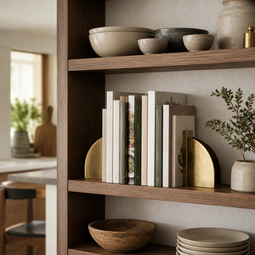
Line the back of your shelf with linen or linen-look fabric to instantly soften harsh kitchen lighting and make book colors look richer. Pair it with slim brass bookends (think minimal, not ornate) so the spines read tidy and premium. Keep the palette warm — cream, honey wood, and muted sage or terracotta from the book spines or covers.
Pro tipCut linen to shelf width, staple or adhesive-tape at the back edge, then limit yourself to 2 accent colors across all spines.
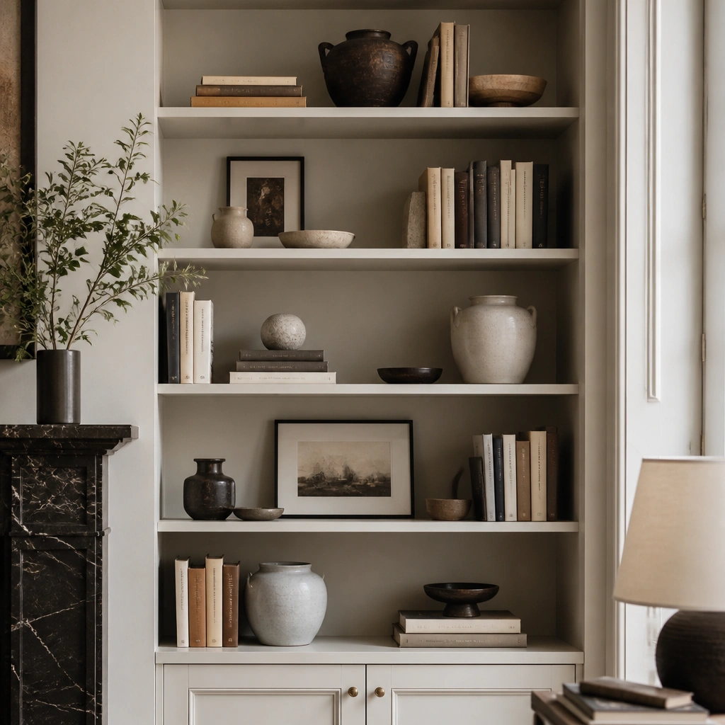
2. All-White + One Warm Accent Shelf (Cream, Oat, Terracotta)
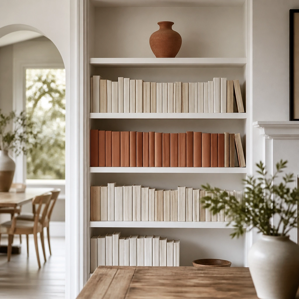
For an “expensive” look, treat your shelf like a wardrobe — most items should match, then one warm accent does the work. Start by pulling out books with white/cream spines; if you don’t have enough, cover spines with plain kraft paper or white book covers. Add one warm accent (terracotta vase, caramel ceramic, or cognac wood tray) to keep it from feeling sterile.
Stand back and check from doorway distance — if you can spot more than 3 dominant spine colors, swap or cover the ones that break the palette.
3. Vertical Cookbook Stacking + Small Gallery Objects
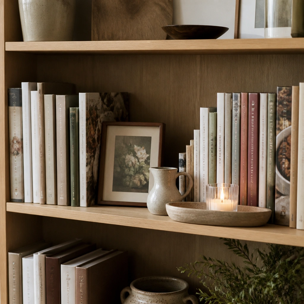
This layout mimics a gallery wall: mix vertical stacks (taller visual rhythm) with one “frame” moment. Use a shallow tray to group smaller items like a candle, matchbox, or tiny pitcher so everything looks curated instead of scattered. Keep objects small enough that the books remain the hero.
Pro tipBuild each shelf like: 1 vertical anchor stack + 1 leaning book or frame + 1 grouped accessory tray.
4. Woven Basket Storage Under a Book-Lined Top Shelf
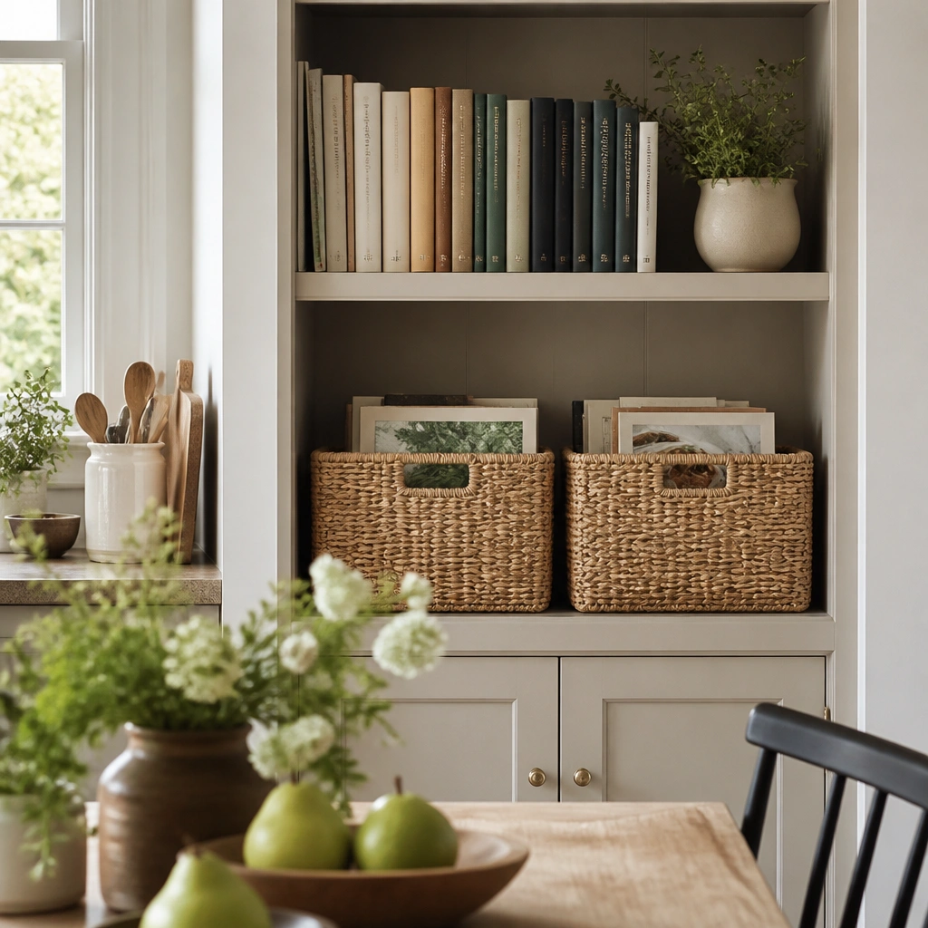
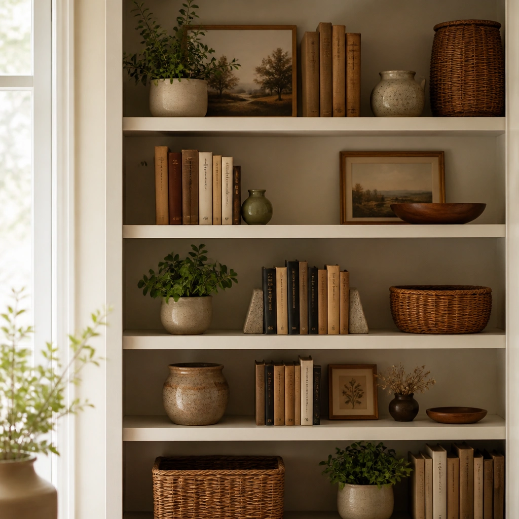
Visual expense comes from order, and baskets are the cheat code for kitchens where you might store extras. Style books on the top third of the shelf, then let woven baskets hide odds-and-ends below. Use natural fibers (rattan, seagrass, or jute) and pair with warm wood tones so the whole look feels cohesive and intentional.
Choose baskets that leave a 1-2 inch gap around the edges for a tailored look, then keep only 3-4 books visible on the top.
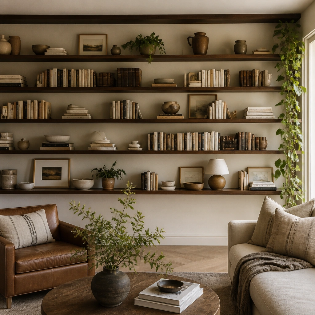
5. Dark Walnut Shelf with Color-Matched Spines and Gold Accents
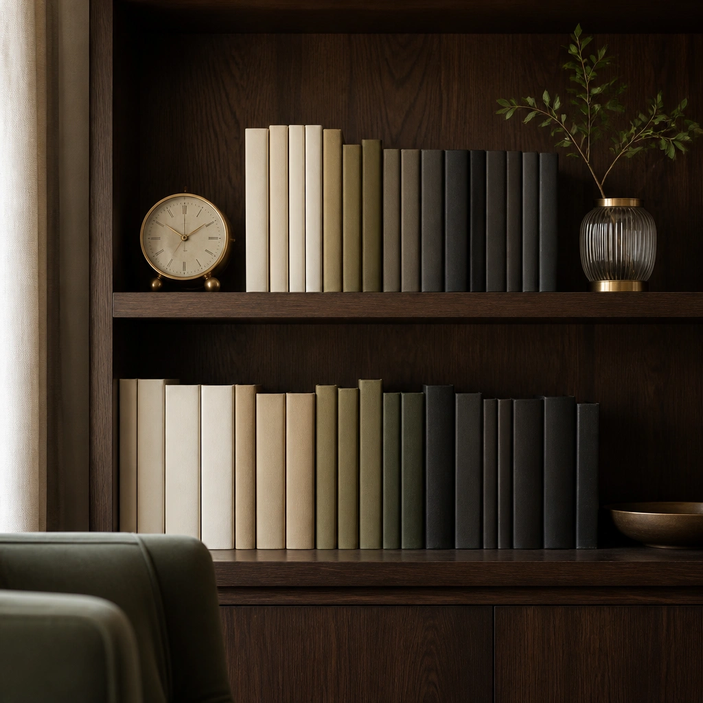
Dark wood shelves instantly read luxe, but only if your book arrangement is deliberate. Create a subtle gradient using muted neutrals and one deep color (olive or charcoal) so the shelf feels designer, not random. Add one or two gold accents (clock, picture frame, or a gold-rimmed vase) to tie in the warmth of the wood.
Arrange by value first (light to dark) and then tweak color — it’s faster and the final look is calmer.
6. Staged “Kitchen Stories” Books with a Centered Ceramic Pitcher
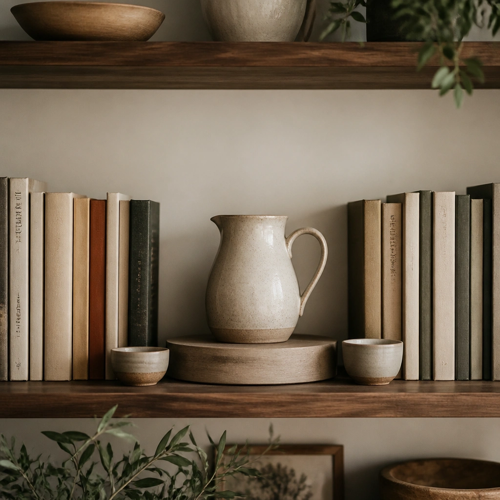
Symmetry feels expensive because it looks controlled. Put your most beautiful cookbook covers in the center, then build outward with matching spine heights. A centered ceramic pitcher (matte white, speckled cream, or soft blue) adds texture without overpowering the books, and small bowls act like supporting cast.
Pro tipUse a round riser under the pitcher so it sits slightly higher than the book spines — instant depth.
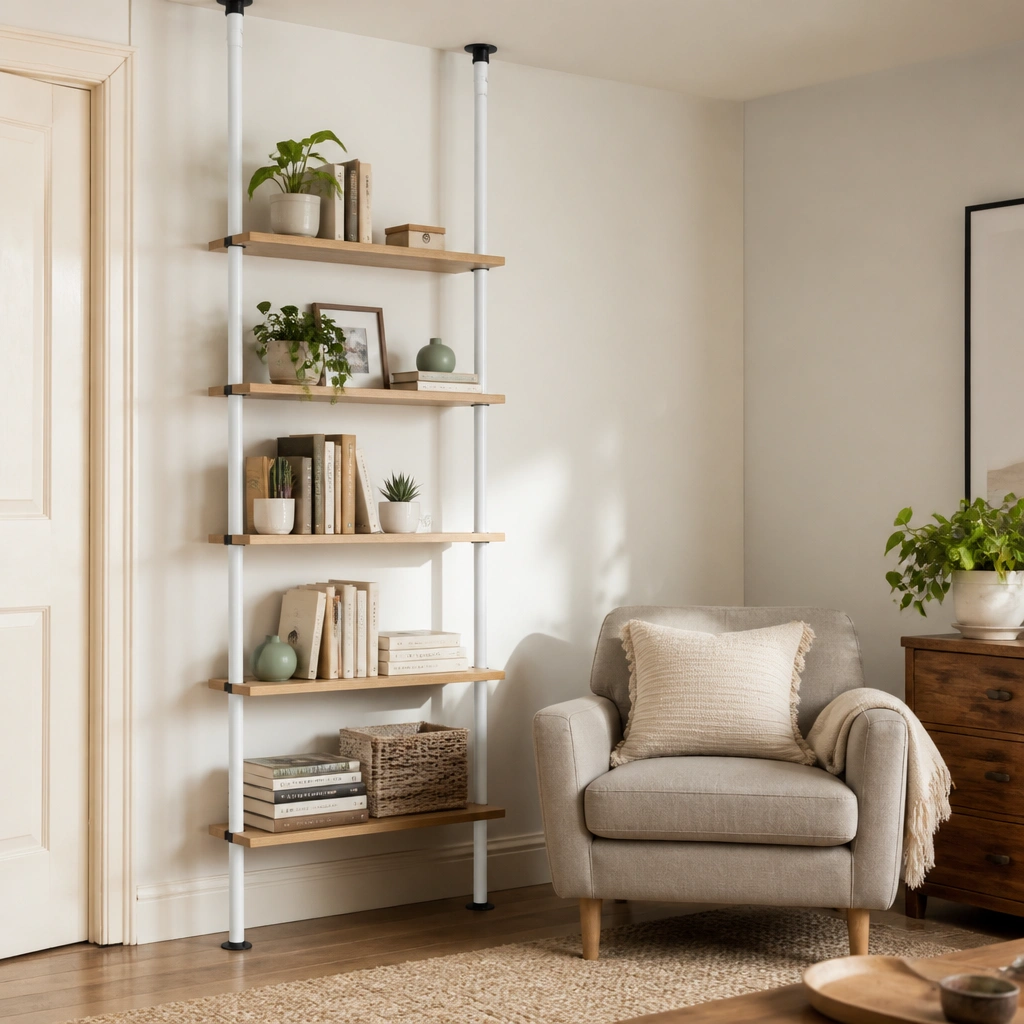
7. Floating Shelf Look: Books Leaning on a Wall-Mounted Tray
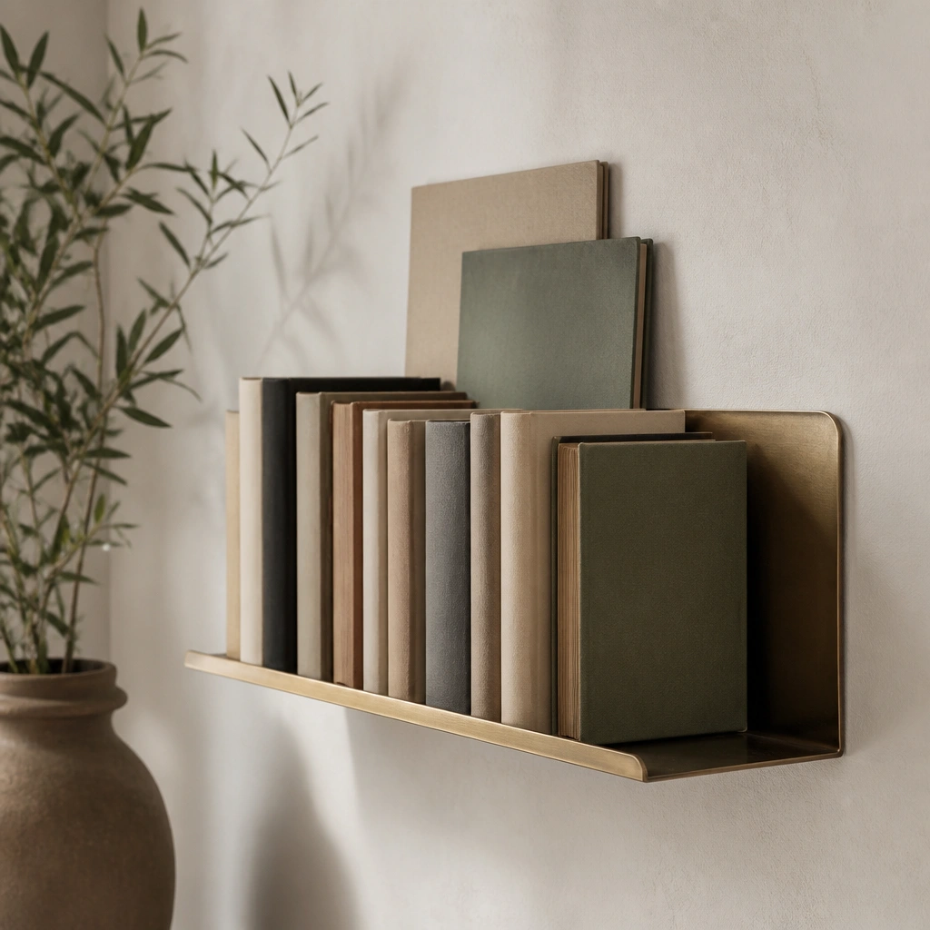
If you want an upscale look without bulky shelving, go for a narrow wall shelf and lean books strategically. Place a slim tray or ledge behind the spines (brass, black metal, or wood) so the books have a “stage” and don’t look randomly placed. Keep the accessories minimal — one tray object and one small plant or bud vase.
Lean books at a consistent angle (same direction and spacing) so the layered effect looks intentional.
8. Neutral Book Covers + Monochrome Decor (Matte Black + Cream)
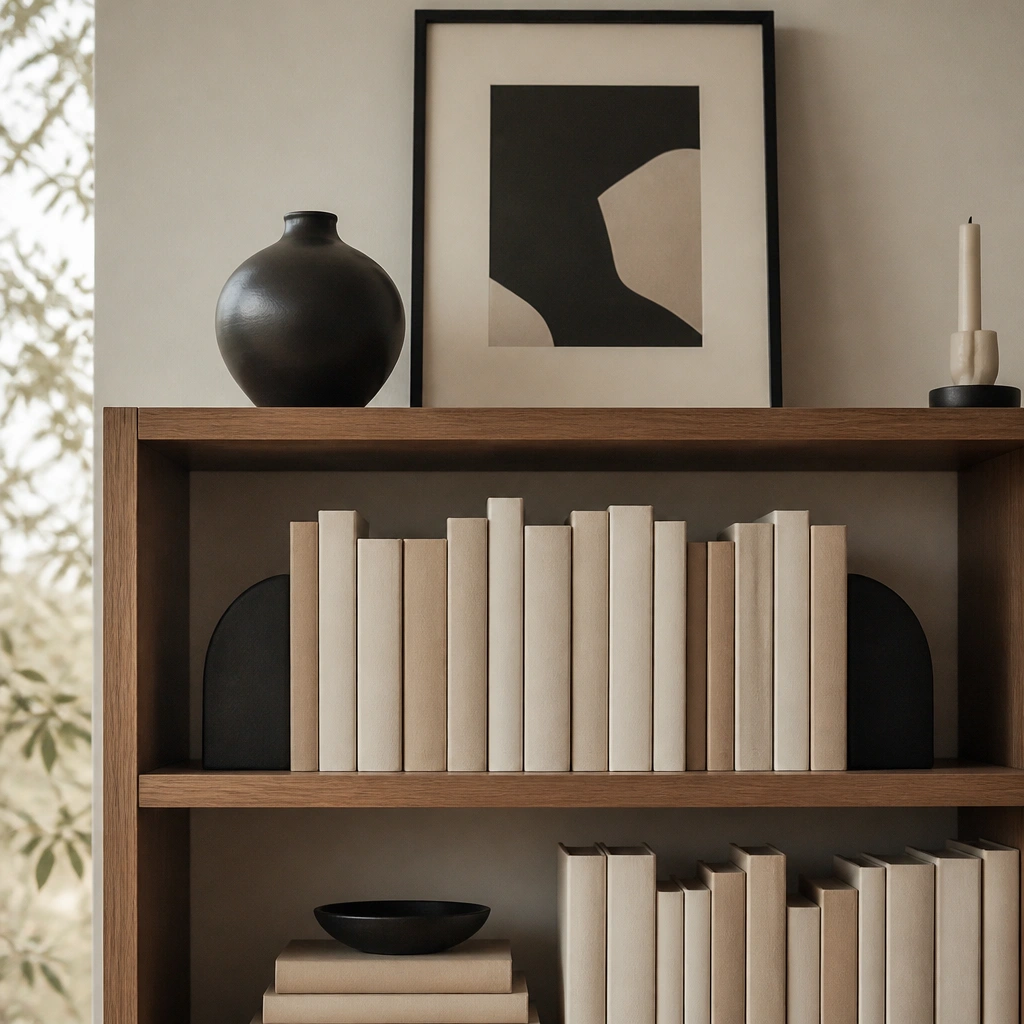
Monochrome decor reads expensive because it’s visually quiet. Cover mixed spines with cream book covers or kraft paper, then anchor with matte black bookends and a black frame. The contrast makes the books look styled as a set, while the cream keeps it warm enough for a kitchen dining space.
Pick one black accent (bookends or vase) and repeat it once more with a frame or tray corner — don’t scatter multiple black items.
9. Turn One Shelf into a “Tabletop Moment” with a Linen Runner
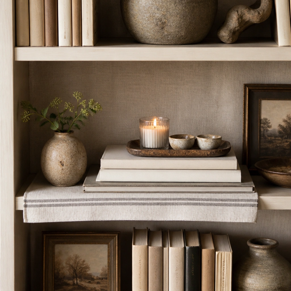
A linen runner makes a shelf feel like styled furniture instead of storage. Place books on the runner so the background stays soft and consistent, then top with a tray for candles or small kitchen decor. This works especially well with cookbooks and recipe books because linen echoes the warmth of dining textiles.
Pro tipFold the runner edges neatly and keep the tray centered — symmetry plus soft texture equals luxe.
10. One Statement Plant + Curated Book Stack (No More Than 3 Items per Level)
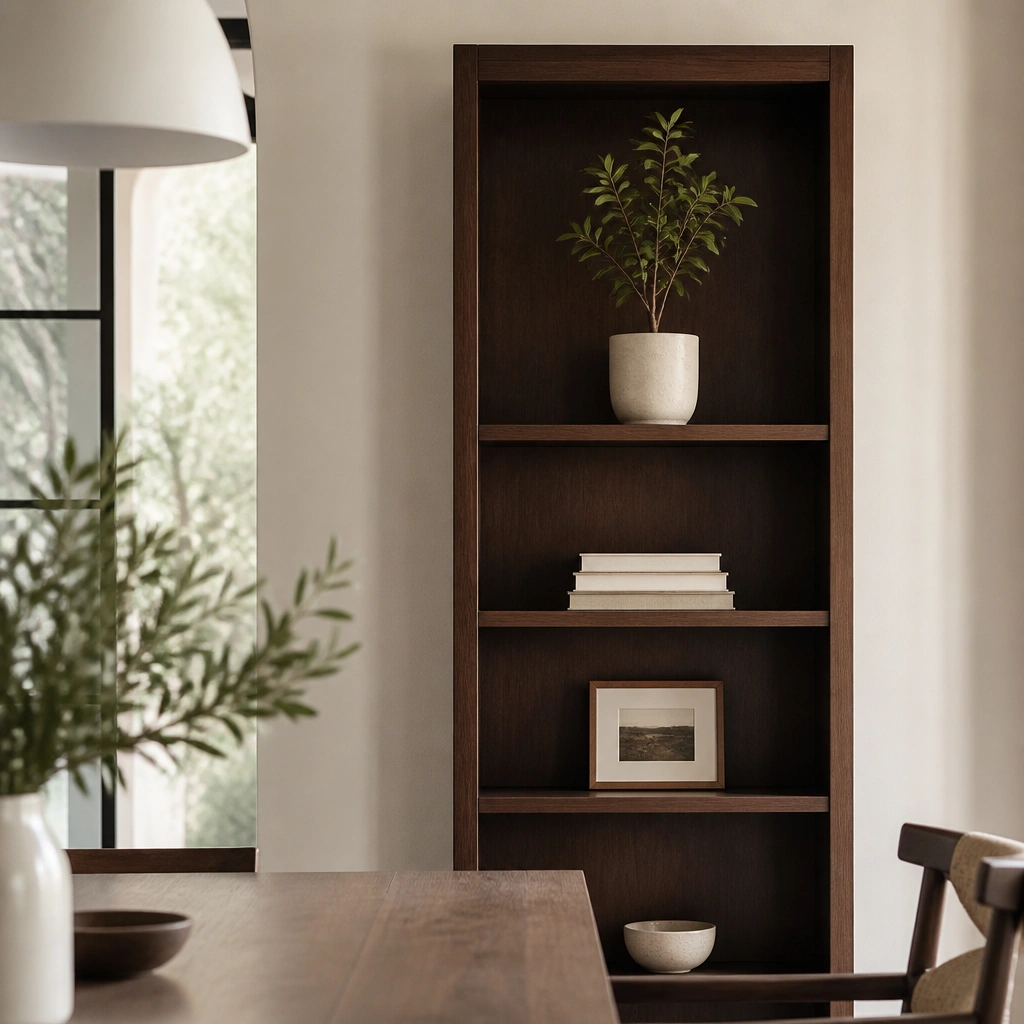
Over-styling is what makes shelves look budget. Limit each shelf to 3 items: one book stack, one “hero” accessory (plant or frame), and one small supporting piece (tray or bowl). A statement plant adds height and softness, which reads expensive in photos and in real life. Choose a ceramic pot in white, cream, or muted stone to keep it calm.
Remove everything first, then add back only 3 items per shelf. If you can’t stop at 3, you’ll know exactly what to edit.