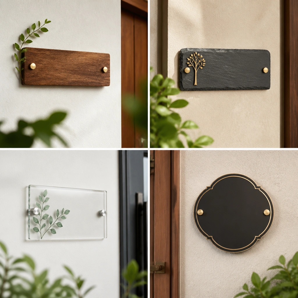

1. Brushed Brass Name Plate with Raised Letters
A brushed brass plate with raised letters looks expensive because the light skims across the metal instead of reflecting like a sticker. The raised lettering adds depth, so it reads clearly even when you’re standing a few feet away. Pair it with a warm, creamy wall color so the brass doesn’t fight the background. This style works best on entry doors, a foyer wall, or the side of a console where you want a “real signage” feel. Keep the plate simple — one line name, clean font, and no busy border.
Pro tipMatch the brass tone to your entry hardware — the plate looks more expensive when the key bowl, door handle, or light fixture shares the same warmth.
Start by picking a width around 10-12 inches for an entry wall and 8-10 inches for a hallway. Choose raised-letter brass (not flat engraved decals) and order the name text centered with consistent letter thickness. Then mount it using either concealed screws through the back or a slim mounting rail so you don’t see hardware. Mark the centerline with painter’s tape, drill pilot holes, and set the plate so it sits perfectly flat without a visible gap.
One warningDon’t use a glossy gold finish or thin-looking lettering — it reads like costume jewelry.
2. Matte Black Metal Plate with a Single-Weight Serif
Matte black makes name plates look expensive because it absorbs light and stays crisp. The trick is the typography: a single-weight serif keeps the edges clean and stops the plate from feeling decorative. Use this in modern entries, apartments, or rooms with black frames, black door hardware, or matte black lighting. The matte finish also hides tiny wall imperfections better than shiny metal. Keep the design minimal and let the contrast do the work.
Pro tipIf the wall has texture, choose a slightly larger plate so the letters still read cleanly.
Pick a matte black plate that’s at least 1/8 inch thick so it doesn’t look flimsy. Choose a width of 10-12 inches and keep the name to one line if possible. Mount it with standoffs or concealed brackets so the plate doesn’t sit flush with a visible seam. Measure the height so the center of the plate lands around eye level — roughly 60-66 inches from the floor in a hallway and slightly higher in a foyer.
One warningSkip distressed or “antiqued” black finishes — they often look uneven and cheap.
3. Smoked Oak Wood Plate with Laser-Cut Name
Smoked oak looks expensive because you get visible grain plus a darker tone that feels intentional. Laser-cut letters add a shadow line around the character edges, which gives depth without needing metal. This style pairs beautifully with warm neutrals, beige walls, or light wood trim. It also looks great in kitchens-adjacent spaces where you want something warm but still clean. Keep the font simple and blocky; ornate scripts can look messy on wood cutouts.
Pro tipSeal the plate edges if it’s near a humid entry — wood edges look better when they’re protected and smooth.
Choose a wood plate finished in smoked oak or dark walnut with a clear topcoat. Order cut-out letters so the backing reads through — a subtle contrast makes the shadow edge obvious. Start with a 9-11 inch width for a hallway and 11-13 inches for an entry console wall. Mount using two methods: either a thin French cleat on the back or concealed screws through standoffs so the plate sits straight and doesn’t warp.
One warningDon’t pick raw unfinished wood — the grain looks cheap until it’s sealed well.
4. Honed Stone-Look Resin Plate with Deep Engraving
Stone-look resin with deep engraving reads expensive because it mimics weight and surface texture without the mess of real stone. Honed finishes look calmer than glossy ones and hide small scratches. Go for deep engraving with a subtle color fill like dark charcoal or warm greige so the letters pop. This is ideal for a dark entry wall, a living room feature wall, or a reading nook where you want a “gallery” feel. It also photographs well because the texture doesn’t glare.
Pro tipAdd a small wall sconce or picture light — honed texture looks more expensive with side lighting.
Select a plate size around 10-14 inches wide with a thickness that feels substantial (aim for about 1/2 inch). Choose a stone-look color family that matches your room: limestone (warm) or slate (cool). Order deep engraving, not shallow etching; the depth is what makes it look premium. Mount with adhesive anchors meant for resin (or concealed screws if the back has threaded inserts), and keep the plate aligned with a level line.
One warningAvoid glossy “marble print” plates — they look like decor stickers.
5. Matte Ceramic Enamel Plate with Raised Border
Matte ceramic enamel looks expensive because it has that old-world signage quality — smooth, weighty, and not too shiny. A raised border frames the name and makes the piece feel designed rather than generic. This works especially well for kitchens, mudrooms, and interior walls where you want a softer, handcrafted vibe. Choose a restrained palette: cream with charcoal letters or cool white with black. Keep the letters clean; enamel looks best with crisp typography.
Pro tipUse it where you already have ceramic or tile textures — it looks like it belongs, not like an add-on.
Pick a ceramic enamel name plate around 8-12 inches wide depending on wall space. Choose a matte color pair like cream base with charcoal letters for maximum readability. Mount with hidden screws if the plate has mounting holes and a back cleat; otherwise use picture-hanging hardware rated for the plate weight. Position it with the center of the name at about 60 inches from the floor for interior walls.
One warningSkip high-gloss enamel — it can look cheap under harsh overhead lighting.
6. White Porcelain Plate with Black Lettering and Understated Frames
Porcelain with sharp black lettering looks expensive because it reads like permanent signage. The white base is clean and bright, and the thin frame adds structure without turning into decoration. This style is perfect for entryways with light walls, farmhouse-modern mixes, or homes with white trim and black accents. It also works when you need a plate that stays legible at different times of day. Keep the layout simple: name only, maybe one small line for a secondary word.
Pro tipIf you have black doorknobs or black light fixtures, match the plate’s black tone to them.
Choose a porcelain plate in the 10-13 inch range so the letters don’t feel tiny. Use black lettering with a clean font like a modern serif or classic condensed sans. Mount it with concealed hardware or a back bracket so you don’t see screws. Measure the plate’s top edge relative to a doorframe or shelf so it looks aligned with the architecture.
One warningDon’t use tiny fonts on porcelain — the white glare makes small letters harder to read.
7. Brushed Stainless Plate with Laser-Etched Name
Stainless steel with a brushed finish looks expensive because it has a professional, industrial cleanliness. Laser-etched letters give crisp edges, and the brushed surface makes the plate look high-end instead of reflective. This is a smart pick if your home has stainless appliances, gray stone counters, or modern hardware. It also hides fingerprints better than mirror-polished metal. Use a condensed font so the name stays elegant and doesn’t sprawl.
Pro tipWipe the plate with a microfiber cloth before installing so the brushed lines look even under light.
Pick a stainless plate 8-11 inches wide for a hallway and 10-14 inches for a foyer. Choose laser-etched letters with enough contrast — darker etching reads better than faint etching. Mount with concealed screws or a thin standoff system so the plate doesn’t look like it’s floating awkwardly. Use a level before drilling; brushed metal shows misalignment instantly.
One warningAvoid mirror-polished stainless — glare makes it look cheaper and harder to photograph.
8. Walnut Name Plate with Brass Letter Inlay
Walnut with brass inlaid letters looks expensive because you get warmth from the wood and sharp definition from the metal. Inlay reads more premium than surface engraving because the brass sits flush and catches light in a controlled way. This style is ideal for living room walls, home offices, and entry spots near wood furniture. It also creates a layered look without adding extra pieces. Choose a thicker walnut slab so the grain looks dimensional.
Pro tipMatch the walnut tone to your furniture legs or picture frames; mixed undertones make it look accidental.
Order a walnut plate with real brass inlay, not just brass-colored paint. Aim for 10-12 inches wide and a thickness around 3/4 inch if you want it to feel substantial. Mount using concealed hardware so the plate sits perfectly flat; a back cleat works well for heavier wood. Place it where there’s a nearby wood element — a console, bench, or bookshelf — so the materials feel coordinated.
One warningDon’t choose thin veneer walnut — it looks like decor paneling, not a name plate.
9. Black Acrylic Plate with Gold Vinyl Letters (Done the Right Way)
Yes, acrylic can look expensive, but only when the letters are clean and the edges are polished. A deep black acrylic plate gives a modern, glossy surface, while gold letters add that “designer signage” contrast. The trick is to use letter vinyl that sits perfectly flat and doesn’t peel at corners. This style is best in interiors with controlled lighting — think hallway walls, a home office door area, or above a slim console. Keep the typography bold and spaced so it reads like branding, not a sticker.
Pro tipUse a condensed font and keep letter spacing tight; it prevents the gold from looking like craft-store lettering.
Start with a thick black acrylic plate (at least 1/4 inch) with polished edges. Apply high-quality gold vinyl letters or a gold foil decal system with a clear topcoat overlay if the product allows it. Mount with standoffs so the plate doesn’t look like it’s stuck on with tape; hidden screws through mounting points work too. Position it so the name line is centered and the vinyl edges don’t drift — measure twice before peeling the backing.
One warningAvoid thin acrylic and low-grade vinyl — they ripple and look cheap fast.
10. Two-Tone Wood Plate with Light Backing and Dark Front
Two-tone wood looks expensive because it creates a built-in depth cue. A lighter backing makes the name area pop, while a darker front panel adds contrast and makes the letters readable from a distance. This is a great option if you want a warmer look without going fully brass or fully black. It also looks good in hallways where you have wood floors and lighter walls. Choose a clean, simple font and keep the design symmetrical so it feels architectural.
Pro tipIf you have light oak floors, use a warm light backing like natural maple or birch to match the undertone.
Choose a two-layer wood plate where the front panel sits slightly proud of the backing. Order the name cut or engraved so the contrast reads clearly against the lighter layer. Aim for 9-12 inches wide and mount with a flush bracket or hidden screws so the plate sits straight. Before installing, dry-fit the plate on the wall and step back to confirm the name is readable from the doorway or hallway end.
One warningSkip mismatched wood tones — cool gray wood with warm walnut usually looks off.
11. Oversized Name Plate for a Foyer Wall with Centered Alignment
Oversizing is one of the most reliable ways to get name plates for home that look expensive because it stops the plate from looking like a small decoration. When the plate is wide enough, the typography has room to look clean and intentional. Use this in foyers, stair landings, or above a bench where people see it from across the space. The expensive vibe comes from scale and centered alignment, not extra decoration. Keep the design simple: one line, calm font, and a finish that matches your door hardware.
Pro tipAdd one matching element nearby — a matching wall hook or small tray — so the plate looks like part of a designed set.
Pick a width of 14-18 inches for a foyer wall and keep the height proportional so it doesn’t look like a sign sticker. Choose a finish like brushed metal, dark wood, or stone-look resin so it reads as a real object. Mount it with a level line and concealed screws; use a template on painter’s tape so the centering is accurate. Plan the placement so the plate sits about 6-10 inches above a console or bench top, depending on wall height.
One warningDon’t go oversized with a tiny font — the letters will feel lost and amateur.
12. Door-Ready Outdoor Plate in Brushed Aluminum with UV-Proof Letters
If your plate is near a front door, brushed aluminum is the cleanest way to keep it looking expensive through sun and rain. UV-proof letter systems resist fading and keep edges sharp, which is where cheap plates fall apart. Choose a matte brushed aluminum for a premium read and less glare. This style is best for exterior-facing walls, porch columns, or mailbox-adjacent spots. It also photographs well because the letters stay crisp instead of turning cloudy.
Pro tipUse a matte finish outdoors — it hides micro-scratches and water spots better than high gloss.
Choose an aluminum plate with a weather-rated coating and UV-proof lettering. Start with 10-13 inches wide for visibility and pick a font with thick strokes so it stays readable. Mount with exterior-rated screws and a gasket or mounting standoffs if the plate includes them. Seal the screw holes if the plate doesn’t include a pre-sealed system, and keep the plate level using a spirit level.
One warningSkip interior-only finishes — they chalk or fade under direct sun.
13. Layered Frame Plate with a Slim Backboard and Center Name
A layered frame plate looks expensive because it adds a built-in presentation, like a piece of wall signage with a mat. The key is keeping the frame slim and the inner plate clean. Use a neutral wood frame or matte metal frame and a simple name plate center — brushed metal, porcelain, or dark wood. This works in living rooms, hallways, and offices where you want the plate to feel like part of the decor. It also helps if you have a wall with slight imperfections, since the frame covers small inconsistencies.
Pick a frame that’s about 1-2 inches wider than the name plate on each side so it reads intentional. Choose the inner plate material first, then select a frame finish that matches your room hardware. Mount the framed piece using a back cleat or picture-hanging hooks rated for the combined weight. Dry-fit on the wall before drilling and confirm the name sits centered in the frame window.
Use a matte inner plate and a lightly satin frame; the contrast keeps it looking designed, not ornate.
Avoid thick, decorative frames — they tip into costume decoration fast.
14. Monochrome Plate with Raised Plaque Background Texture
Monochrome plates look expensive when they have surface texture and depth. A raised background plaque — even a subtle one — makes the letters feel like part of a single object instead of floating on a flat plane. Choose black-on-black with a matte finish and slightly different sheen between background and letters, or warm gray-on-warm gray for a softer look. This style is excellent for modern hallways where you want something calm but still interesting up close. It also hides minor wall flaws because texture draws the eye to the plate.
Select a name plate where the background has a raised texture, not just flat engraving. Order letters in a slightly different sheen or tone so they read without needing high contrast color. Use a size around 8-12 inches wide and mount at eye level, centered on the wall. If the plate is heavy, use a stud finder and install with screws into studs or rated anchors so it doesn’t sag over time.
Side lighting helps texture show — even a simple wall sconce makes the plaque look more premium.
Skip glossy monochrome — it flattens texture and can look like cheap signage plastic.