
1. Brushed stainless with laser-etched letters
This is the cleanest option when you want name plates for home modern minimalist that look architectural. Brushed stainless hides fingerprints better than mirror metal, and laser-etched letters stay crisp without thick paint. Choose a plate with a simple rectangular outline and rounded corners so it doesn’t look like office signage. Put it on interior doors with light trim to get high contrast without extra color. It looks right in hallways, home offices, and closets where you want the label to read fast, not announce itself.
Measure the door area where your eye lands when you stand in the hallway. Aim for a plate width between 3 and 5 inches for single-word labels, then center it on the frame at about 60 inches to the plate center. Use a template and a level, then mount with either hidden screws or strong metal-rated adhesive if your frame is smooth and non-porous. Finish by wiping the metal with a microfiber cloth to remove any residue so the etched letters stay sharp.
Pro tipMatch the stainless finish to your cabinet pulls or light switch plates so the whole entry reads as one system.
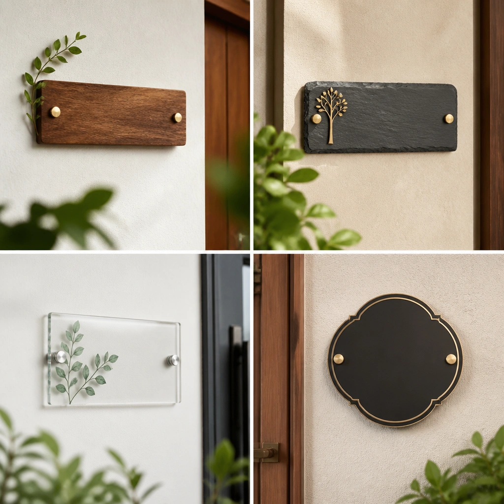
One warningDon’t use a glossy, mirror finish on high-traffic doors — it shows fingerprints and smears.
2. Matte black aluminum with inset white letters
Matte black aluminum gives you that modern, calm signage look with a controlled finish. Inset white letters add legibility without turning the plate into a high-contrast sticker. This is a great choice for minimal homes with black hardware — think matte black faucets, door handles, or light fixtures. The key is the inset depth: shallow inset lettering looks flat, while a slightly raised inset reads cleaner from across the hall. Use it for bedroom doors, a home office, or the pantry where you want labels to feel intentional.
Pick a single font style and stick to it — block sans or simple geometric serif both work, but don’t mix styles. Choose a plate size around 4 inches wide for one-word names and 5-6 inches wide for two-word labels. Mount it on the door frame or wall next to the latch side so it’s readable when you approach. If the plate is adhesive-backed, clean the surface with isopropyl alcohol first and let it dry fully before pressing.
Pro tipUse one consistent letter case across your home: all caps looks more minimal than Title Case.
One warningSkip glossy black plates; they look shiny and cheap under hallway lighting.
3. White ceramic tile with black cut-out typography
Ceramic is the move for bathrooms and laundry rooms because it handles steam and cleaning better than most materials. A white ceramic base keeps the look bright, while black cut-out or glazed letters stay crisp even after repeated wipe-downs. This style reads “designed,” not “printed,” because ceramic has weight and a subtle hand-finished texture. Keep the plate small and tidy — modern minimalist works best when the label doesn’t take over the wall. It’s ideal for powder rooms, shower-adjacent doors, and utility closets.
Choose a ceramic plate with a thickness around 1/4 to 1/2 inch so it feels substantial. Place it near the door handle area, but not so high that it’s only readable from a standing angle — keep the center around 60 inches. If you’re mounting to tile, use tile-safe adhesive or a thin-set rated for small ceramics, and let it cure fully before touching. For grout lines, align the plate edges parallel to the tile layout for a clean, modern grid.
Pick black letters with a matte finish so they don’t glare under vanity lights.
Don’t mount ceramic plates with generic craft glue on tile — it fails with humidity.
4. Walnut veneer plate with routed letters
Warm wood instantly softens modern minimalist spaces while still reading clean. Walnut veneer looks high-end because the grain pattern is controlled and the edges feel finished. Routed letters — where the letters are cut into the wood and possibly stained slightly darker — create depth without relying on paint. This is a strong match for homes with oak, walnut, or warm white walls. Use it on office doors, bedroom doors, and closets where you want the label to feel like part of the architecture rather than a sign.
Choose a walnut veneer plate with routed letters that are at least 1/16 inch deep so the shadows stay visible. Keep the plate width between 3 and 5 inches for one-word names to avoid looking bulky. Mount it using small screws into a door frame or a wood-safe mounting method if you’re attaching to trim. Pre-mark the holes, then drill pilot holes to prevent veneer splitting.
Match the plate’s wood tone to your trim undertone — slightly red walnut reads different than golden oak.
Avoid fully painted letters on wood; the paint edges chip and break the minimalist look.
5. Clear acrylic plate with black vinyl letters
If you want the label to feel like it’s floating, clear acrylic is a smart minimalist trick. Use it with black letters applied cleanly so the plate looks light and modern instead of bulky. This works best in narrow hallways where you don’t want the label to add weight visually. The acrylic edge gives a crisp line, and the black typography keeps it readable. Put it on home office doors, linen closets, and smaller rooms where you want the label to disappear into the design but still be there.
Select an acrylic plate with a thickness around 1/4 inch so it doesn’t flex when mounted. Apply black vinyl letters using a pre-cut stencil or vinyl cutter so the edges are sharp. Mount with standoffs or hidden screws so the plate sits flush and doesn’t wobble. Measure the door frame and place the center of the plate at about 60 inches for consistent hallway sightlines.
Pro tipUse matte black lettering, not glossy, to avoid glare from hallway lights.
One warningDon’t use cheap vinyl with fuzzy edges; it reads messy at close range.
6. Stone-look composite plate with engraved letters
Stone-look composite gives you the calm, grounded feel of real stone without the upkeep. Engraved letters keep the modern minimalist look because you’re not relying on printed ink that can fade. This style suits neutral interiors — greige, warm white, and soft taupe — where you want the label to blend while still reading clearly. It also hides small scuffs better than painted metal. Use it on entryway doors or a mudroom where shoes, bags, and daily traffic can make labels look worn quickly.
Pick a composite plate with a matte finish and engraved letters that are filled or contrast-ready. Keep the plate relatively small — about 4 inches wide for one-word labels. Mount it at the same height as the other plates, using screws into the door frame or wall anchor if needed. Clean the mounting surface first so adhesive options grab firmly and stay flat.
Pro tipChoose one stone tone across rooms, like warm limestone or cool slate, so your hallway doesn’t look random.
One warningSkip glossy stone-look finishes; they look like print effects under lighting.
7. Powder-coated steel plate with raised letters
Raised letters on powder-coated steel add tactile clarity while staying minimalist. The powder coat resists scratches and holds its color, which matters in entryways and high-touch doors. Choose a single color — matte white, charcoal, or deep sage — and keep the plate outline simple. Raised typography reads well from a distance because it catches light along the edges. This style works especially well on darker doors or walls where engraved-only labels can look too subtle.
Choose a plate size that matches the text length: 3.5-4 inches wide for one word, 5-6 inches for two words. Position it near the handle side so it’s visible when you reach for the door. Mount using the included hardware or pre-drill pilot holes for screws to avoid coating chipping. After mounting, check alignment from standing height, not from the ladder.
If your home has brushed hardware, avoid mixing it with highly glossy raised-letter plates.
Don’t pick a loud accent color if your door hardware is neutral; it will feel off.
8. Brass plate with black patina letters
Brass can look modern minimalist when the design stays simple and the letters are darkened for contrast. A brass base with black patina letters gives you that architectural warmth without turning into vintage decor. This is a strong option for homes with light wood floors, oak trim, or warm neutrals. Keep the plate thin and the typography clean, so it reads as refined signage, not decorative wall art. Use it for kitchen pantry doors, home office doors, and guest rooms.
Choose a brass plate with a satin finish so it doesn’t glare like polished gold. For readability, keep letter strokes thick and avoid thin script fonts. Mount at the same height as your other plates, around 60 inches to the center, and align edges with the door trim. Use screws or standoffs rather than adhesive if the door sees frequent wiping, since brass can oxidize around adhesive edges.
Wipe brass with a dry microfiber cloth, not wet polish, so the patina stays even.
Avoid mirror-polished brass; it looks flashy next to minimalist hardware.
9. Blackened steel plate with etched letters and thin border
This is for people who want a darker, more industrial modern minimalist look without turning the plate into a chalkboard. Blackened steel has a slightly irregular depth that reads natural under light, and etched letters keep it crisp. A thin border line frames the text without adding clutter, so the plate looks designed, not stamped. Place it near the entry to label rooms that guests will immediately ask about — like “Office” or “Guest Bath.” It also looks great on matte black doors or near dark trim.
Pick a plate with a border line thickness under 1/8 inch so it stays subtle. Use one font weight — don’t mix bold and light in the same plate. Mount it so the border lines align with the door frame edges, which means you should measure from the same reference point on the trim. For attachment, use hidden screws or a metal-rated mount so the plate sits flat and doesn’t peel.
Pro tipKeep the label text short — one word is cleaner than “Main Bedroom Suite” for minimalist rooms.
One warningAvoid thick borders; they make the plate look like a storefront sign.
10. Matte white aluminum with engraved letters
Matte white aluminum gives you a crisp, clean look that blends with modern walls instead of competing with them. Engraved letters keep the typographic edge sharp, and the matte finish reduces glare under overhead lighting. This is perfect for minimal homes with gray walls, white trim, and light floors where you want the plate to feel like it belongs. It also hides minor wall texture better than glossy labels. Use it on hallway doors, linen closets, and utility rooms where you want consistent readability.
Choose a plate size around 4 inches wide for one-word names so it doesn’t look toy-sized. Mount with screws into the door frame or wall anchors if you’re going into drywall. Set the top of the plate so the center lands around 60 inches from the floor. If you have multiple rooms, align the left edge of each plate to keep the hallway grid tidy.
Pro tipPair matte white plates with black door numbers elsewhere so your system stays consistent.
One warningDon’t choose bright glossy white; it reflects light and can look plasticky.
11. Graphite fabric-backed plate with woven lettering insert
Fabric-backed labels sound too soft, but done right they look modern and calm. A graphite fabric backing reduces visual noise, and a minimal lettering insert keeps the typography readable. This choice works best for rooms that feel more lounge than utility — like a reading nook, a studio, or a calm bedroom. It also helps if your wall has subtle texture, because the fabric backing hides small mounting imperfections. Keep the insert simple, with either black-on-cream or white-on-black lettering so it stays legible.
Select a plate that has a rigid backing so the fabric doesn’t sag once mounted. Choose lettering insert colors with strong contrast, and avoid thin serif fonts that disappear against texture. Mount it with a concealed screw system or a strong adhesive designed for fabric-backed decor. Hold the plate against the wall first and check visibility from the hallway walking angle before marking holes.
Pro tipUse fabric-backed plates only in low-humidity areas; steam will darken and curl the backing over time.
One warningDon’t use this in bathrooms or near showers where moisture hits the plate.
12. Acid-etched glass panel with back-painted letters
Etched glass is a modern minimalist flex when you want a softer reflection and a premium feel. Acid-etched glass diffuses light, so you don’t get glare, and back-painted letters keep the typography clean without relying on surface decals. This works beautifully on entry doors, offices, and bedrooms where you want the label to look like part of a built-in system. Keep the glass plate framed in a thin metal border or mount it with minimal standoffs so the edges look intentional. The result is readable typography with a calm, glassy presence.
Choose a glass plate with a frosted or etched finish and back-painted letters in black, charcoal, or deep green. Mount using standoffs or a frame system so the glass doesn’t rub against trim and chip. Mark the placement using painter’s tape, then drill pilot holes for the mounting points to keep everything straight. Allow extra cure time for any adhesive used, and avoid cleaning with abrasive pads.
Pro tipPick one glass tone across your hallway so the plates don’t look like different product runs.
One warningDon’t pick clear glass with surface-printed letters; it looks like a sticker.
13. Oak slat name plate with laser-cut letters
This is a warm modern minimalist option that still reads clean because the letters are laser-cut, not painted. Oak slats add a subtle rhythm, and the cut-out letters let light pass through, making the typography feel lighter than a solid plaque. It’s a great fit for homes with wood slat accents, oak shelves, or natural textures. Keep the plate narrow and the letter spacing tight so it doesn’t look like a decorative sign. Use it for rooms that need a gentle touch — like a home office corner or a guest room door.
Choose a slat plate with a rigid frame so the slats don’t warp. Laser-cut letters should have clean edges and consistent thickness; aim for letters that are at least 3/4 inch tall for easy reading. Mount it near the door handle side, aligning the slat direction parallel to the trim lines. Use a level and install anchors or screws so the plate sits flat against the wall without rocking.
Pro tipMatch the oak tone to your shelves — golden oak and red oak look different under warm bulbs.
One warningSkip thick, chunky slats if your hallway is narrow; it can look heavy.
14. Navy enamel plate with white enamel lettering
Navy enamel gives you a crisp, modern look with a durable surface that can take daily cleaning. White enamel letters stay bright and readable, and the slight tooth of enamel prevents the plate from looking like smooth plastic. This is a strong choice when your interior palette is mostly white and warm wood, and you want one controlled accent color. Keep the plate minimal with a simple rectangle and rounded corners. It works for door labels in entryways and mudrooms where you want labels to look sturdy, not delicate.
Pick a plate with a true enamel finish, not painted metal, so the letters stay sharp. For a one-word label, choose about 4 inches wide and keep the letter height around 1 to 1.25 inches. Mount with screws so the enamel doesn’t get stressed by adhesive. Position it so the center is about 60 inches from the floor, and align with your other plates if you’re building a matching set.
Pro tipIf you have navy in other places (pillows, rugs), repeat the same navy tone to keep the hallway cohesive.
One warningDon’t use navy plates on already-dark walls; you lose contrast and the letters feel muted.
15. Cork-backed plate with black rubber stamp style letters
Cork backing is a minimalist texture play that still reads clearly when the letters are bold. The stamped-style lettering adds a lived-in edge without turning the whole space rustic, especially when the plate is framed in simple metal. This works best for spaces where you want softness — like a creative studio, reading room, or small home office. It also helps hide tiny wall imperfections. Choose stamped-style letters that are consistent and not overly decorative; the modern minimalist win is controlled texture, not messy typography.
Select a cork-backed plate that has a rigid frame and pre-cut lettering insert. Use black letters with thick strokes so they stay legible from the hallway. Mount at about 60 inches to the center, and secure through the frame with screws so the cork doesn’t shift. If you’re mounting to drywall, use anchors sized for the plate weight, then check alignment before tightening fully.
Keep the rest of the hallway hardware neutral so the cork texture becomes the only warm material note.
Avoid thin, light gray stamped letters; they disappear under overhead lighting.
16. Two-tone plate with black base and walnut top strip
Two-tone plates look modern minimalist when the design is strict: one base color, one warm material strip, no extra accents. A black base gives you the clean graphic line, and a walnut top strip adds warmth right where your eye lands. Letters should be engraved or cut so the typography looks intentional, not printed. This style is perfect for transitional modern homes that have both black hardware and wood trim. Use it for main rooms — kitchen, office, bedroom — where you want the labels to feel cohesive across the hallway.
Choose a plate with a walnut strip that’s proportioned — roughly 1/4 to 1/3 of the plate height. Keep the lettering style simple and consistent, and avoid multi-color text. Mount it centered on the door frame, with the plate center around 60 inches from the floor. For installation, use the included mounting method and make sure the plate sits perfectly flush so the two-tone seam looks straight.
Pro tipRepeat the black and walnut combo in at least one other element (light switch cover or shelf) so the hallway feels designed.
One warningDon’t add a third finish like brushed nickel; two-tone is the rule here.