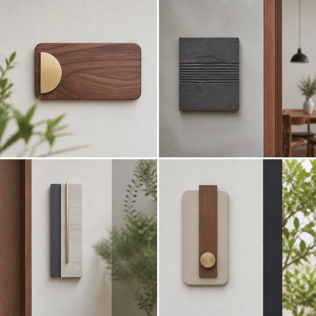
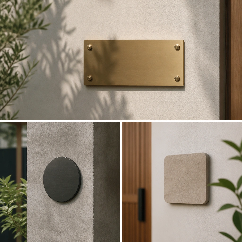
1. Matte Black Door Plate with Raised Letters
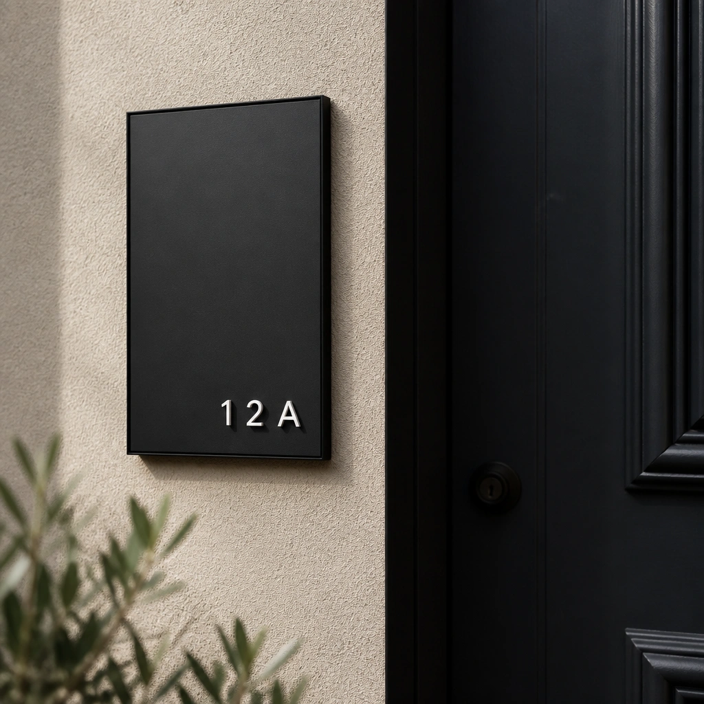
This style looks crisp because the letters are physically raised, so even at night the wording reads clearly. Matte black powder-coated metal keeps fingerprints low and pairs beautifully with black door numbers, handles, and hinges.
Center the plate so the bottom edge sits about 48-52 inches from the floor, then check legibility from the street at dusk.
2. Brushed Stainless Plate with Laser-Cut Name
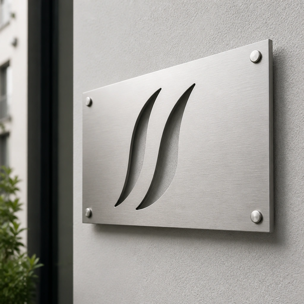
Brushed stainless gives that modern, “clean kitchen appliance” vibe while staying durable. Laser-cut negative-space letters create a lighter visual weight, which works great on minimal entryways with neutral walls.
When mounting on painted stucco or brick, use outdoor-rated anchors and a thin bead of clear exterior sealant behind the plate edges.
3. Light Oak Name Plate on Off-White Wall
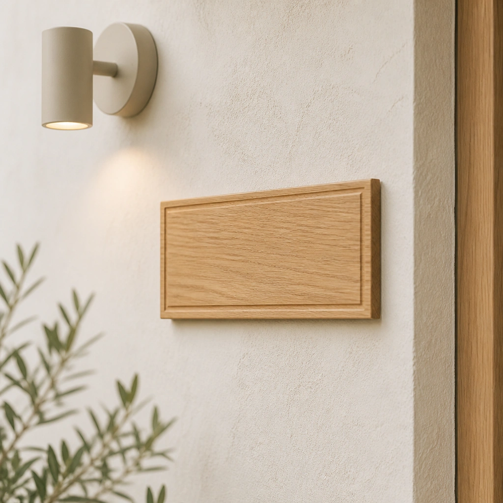
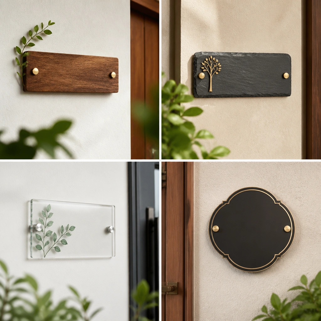
Warm wood softens minimalist spaces without adding clutter. Engraved letters (instead of painted ones) look more modern and age better because the finish won’t chip as easily.
Pro tipUse a matte clear sealer (not glossy) to protect the oak and keep the look calm under warm lighting.
4. Clear Acrylic Plate with Black Letter Vinyl
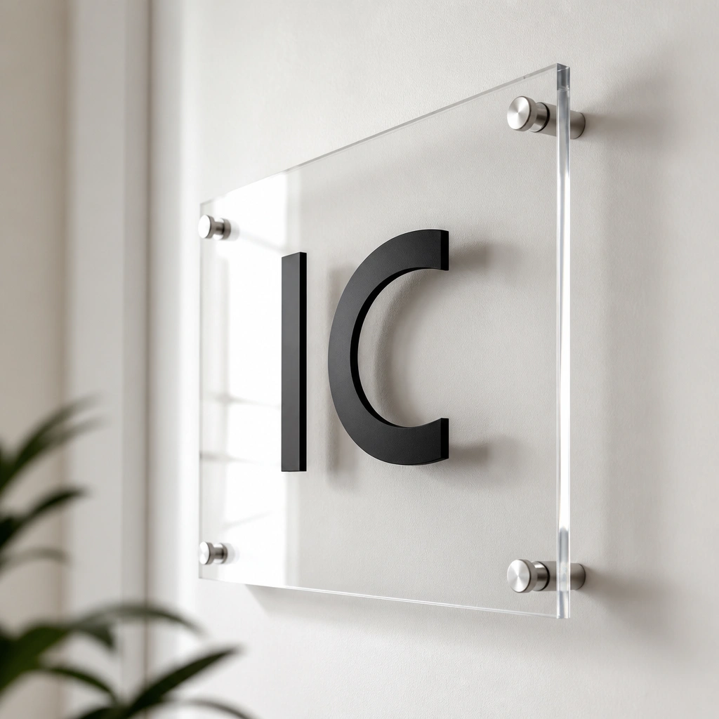
Clear acrylic feels airy and contemporary, and the standoff hardware makes it look like the letters are suspended. Black vinyl lettering keeps contrast high, especially if your wall is bright and reflective.
Pro tipFor best edges, choose UV-resistant vinyl and clean the acrylic with isopropyl alcohol before applying lettering.
5. White Ceramic Tile Name Plate with Thin Black Border
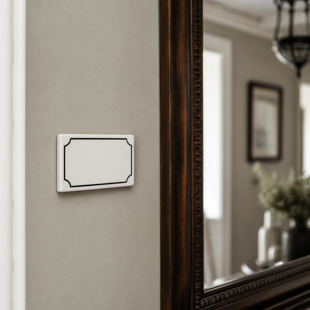
Ceramic tile reads upscale and stays looking new in humid areas like entries that get wet from umbrellas. The thin black border adds structure while keeping the overall design minimalist.
Pro tipIf mounting indoors, use tile-safe adhesive or a strong mounting tape designed for smooth glazed surfaces.
6. Powder-Coated Aluminum Vertical Slat Name Plate
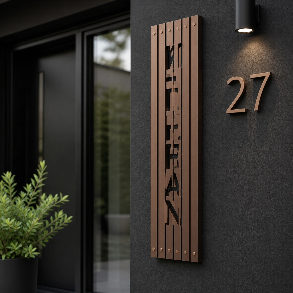
Vertical slats add texture while still feeling minimal because the lines guide the eye. Powder-coated aluminum resists rust and works especially well on covered porches where sunlight and rain both hit.
Pro tipMount it slightly above eye level (around 54-58 inches) so the letters don’t get lost behind door hardware.
7. Stone-Effect Composite Plate with Minimal Typographic Font
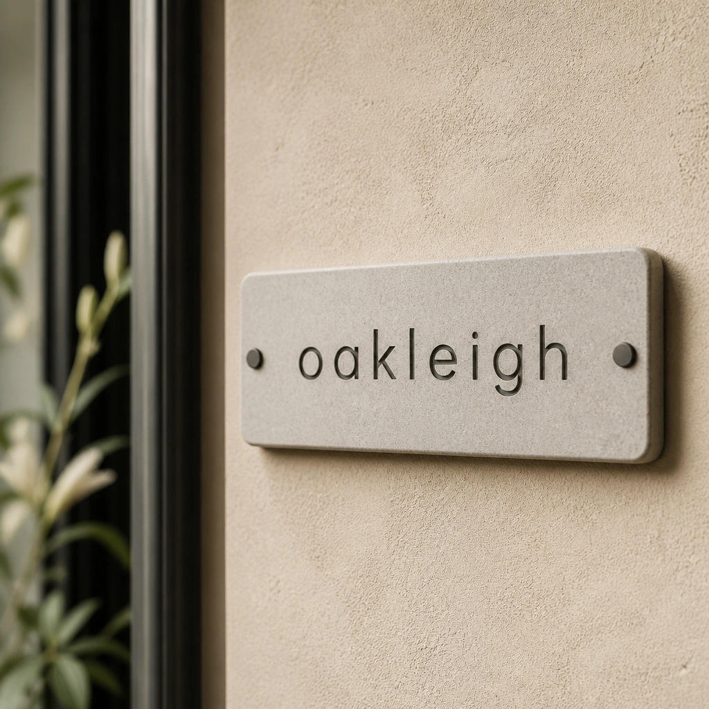
Stone-effect composite looks grounded without the weight and mess of real stone. A simple typographic font keeps it modern, and the darker gray letters hide small wear better than bright paint.
Choose composite plates labeled for exterior use, then wipe down with mild soap — no harsh solvents.
8. Textured Black Slate Plate with Chalk-Style Lettering
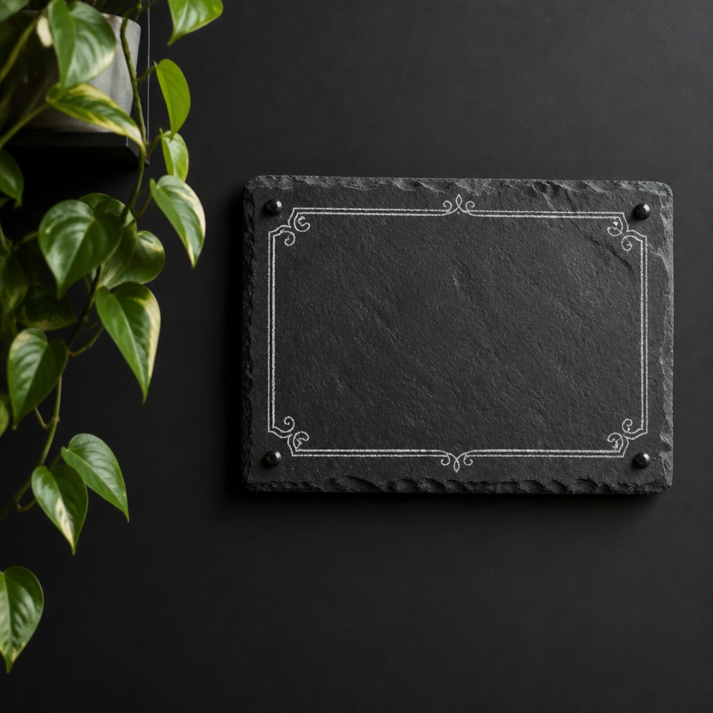
Slate texture gives a handcrafted feel, but the minimalist layout keeps it from looking rustic. Chalk-style lettering is high-contrast and reads well from a distance when the plate is placed on a matte background.
Pro tipUse a matte clear protector spray made for slate to reduce smudging and keep the lettering crisp.
9. Brass Standoff Name Plate on Light Gray Brick
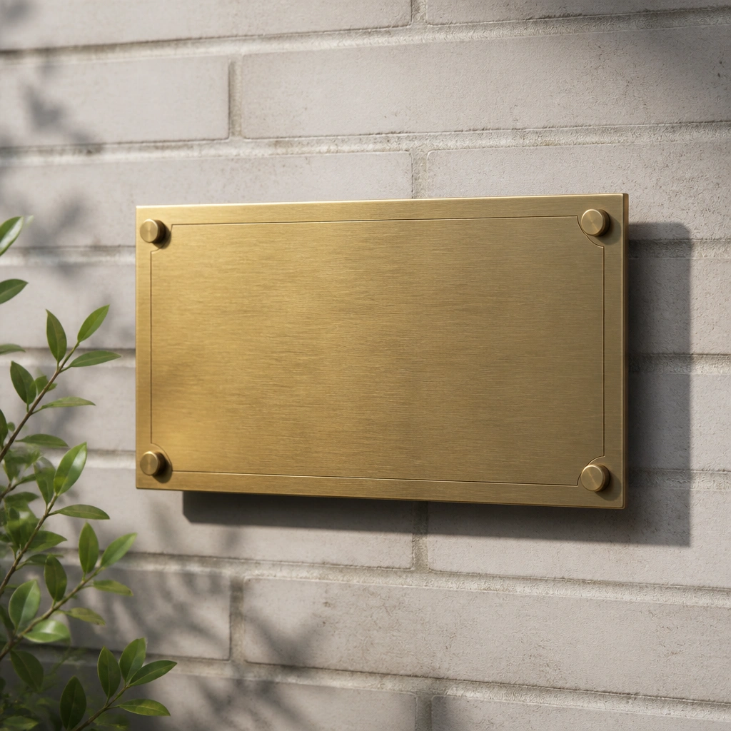
Brass standoffs create dimension and make the plate feel custom, even if it’s a simple rectangle. On brick, the shadow adds depth so the letters still look defined in changing daylight.
Match the standoff finish to your door handle or porch light — even one brass element ties the whole entry together.