1. Brushed Brass Rectangular Plates with Raised Letters
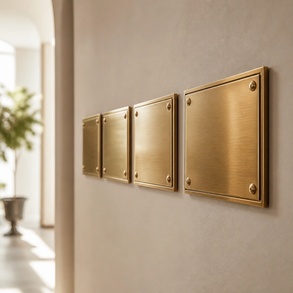
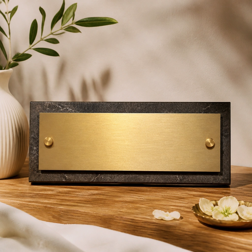
Brushed brass reads expensive because the micro-texture softens glare while still catching warm highlights. Raised letters add dimension, so they look dimensional in both daylight and evening lamp light. For living spaces, this finish pairs beautifully with warm neutrals like greige, cream, and light oak.
Pro tipMount at eye level (about 60 inches from the floor) and keep letter spacing consistent so the set looks intentional, not DIY-rushed.
2. Blackened Steel Name Plates with Minimal Sans Text
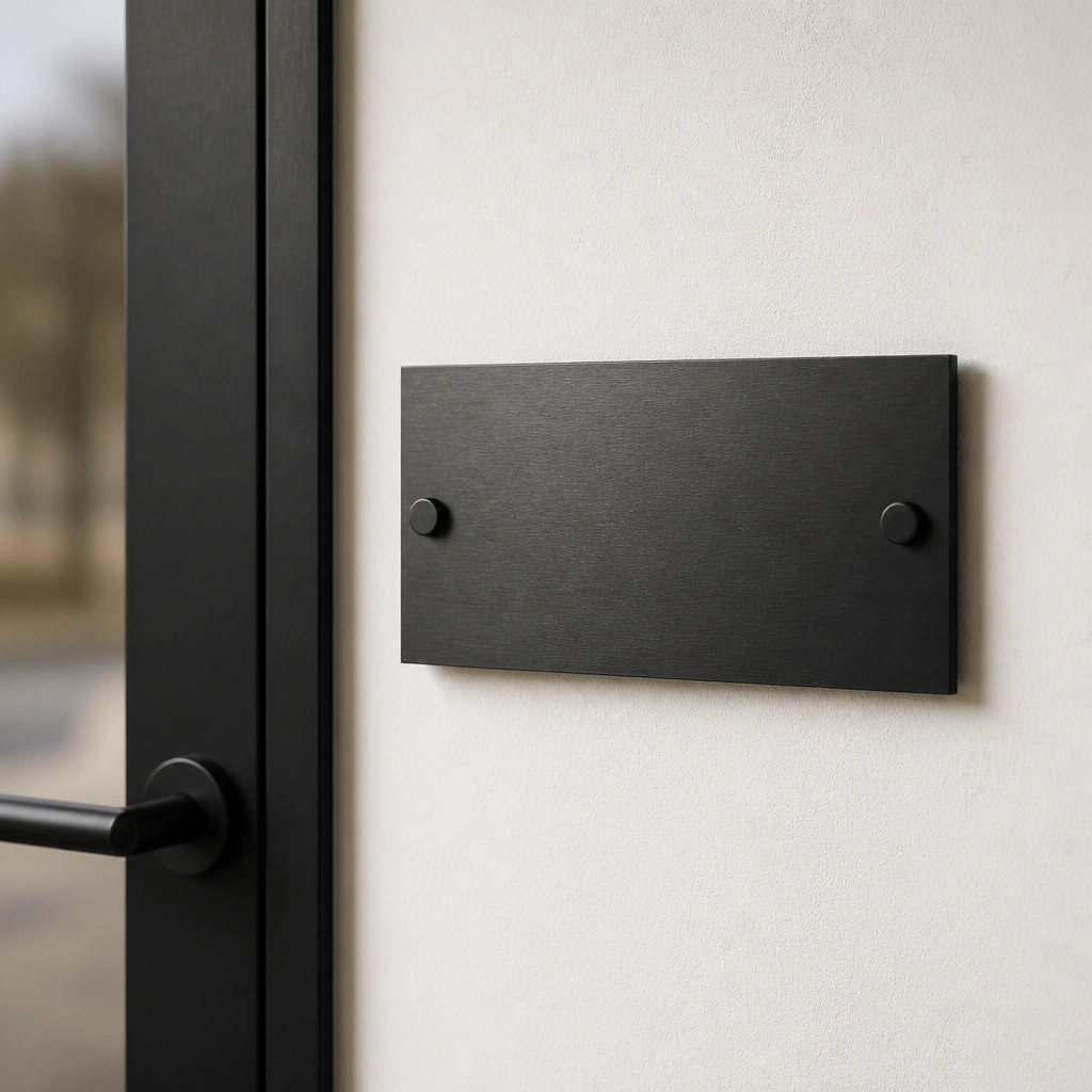
Blackened steel gives that “architectural” vibe without needing a full renovation. The matte surface hides smudges better than shiny metal, which matters in real homes where fingers touch door areas. Minimal sans text keeps the look crisp and modern, especially in entryways and living rooms.
Use a level and mark screw holes first — matte plates show misalignment more than glossy ones because there’s no shine to mask it.
3. White Porcelain Plates with Gold-Edge Lettering
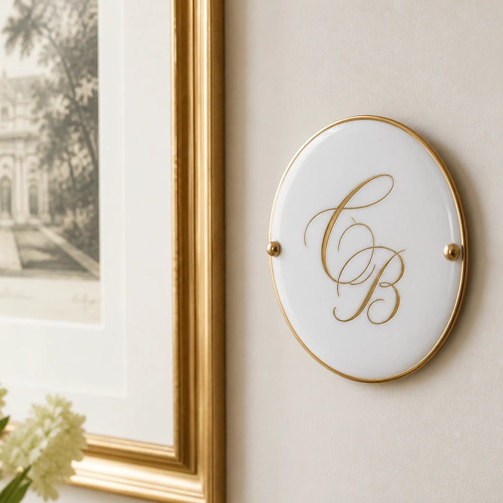
Porcelain looks luxe because it’s smooth, glossy, and feels “heirloom” when light hits it. A gold rim or gold lettering elevates it instantly, but the contrast stays soft and livable (not harsh like bright yellow gold). This option is perfect for cozy living spaces with warm whites, linen textures, and light wood.
Pro tipClean with a damp microfiber cloth only — avoid abrasive pads so the gold edge doesn’t dull.
4. Antique-Style Cream Enamel with Dark Green Script
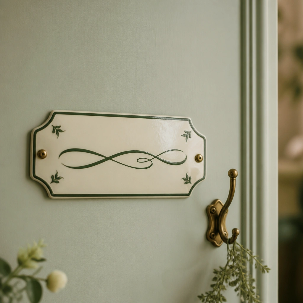
Enamel-style plates mimic old-world craftsmanship and look expensive because the finish looks layered and curated. Cream + deep green is a high-end color combo that feels calm and classic, especially in rooms with plants, natural textures, and soft patterned rugs. The script lettering adds personality without looking childish.
Pro tipPair one hero plate with smaller coordinating labels (like “Family Room” or “Library”) so the whole wall reads styled, not random.
5. Smoked Glass Name Plates with Backlit-Look Typography
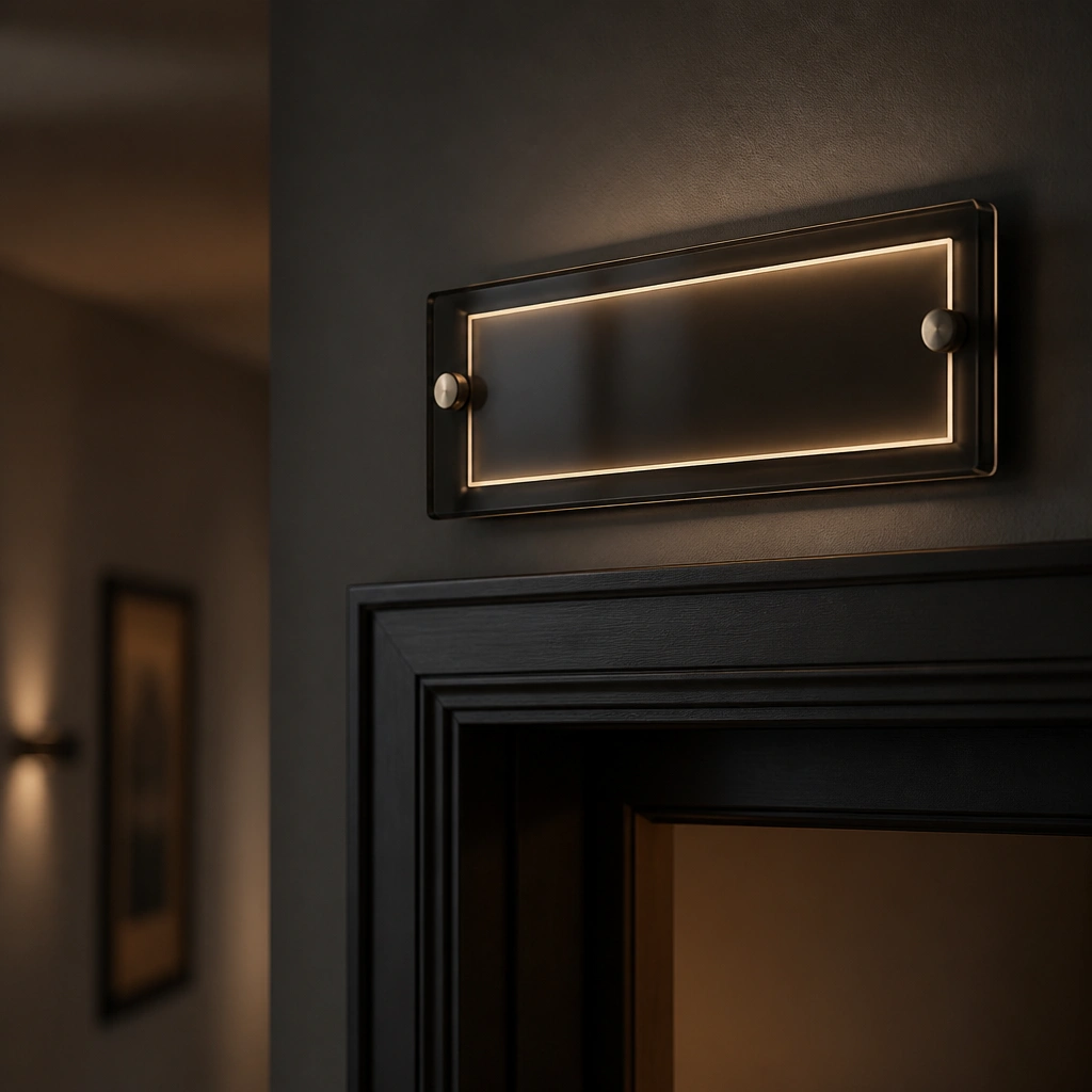
Smoked glass looks dramatic and expensive because it adds depth — the lettering sits behind a tinted surface, creating a subtle glowing effect. Choose lighter text (warm white or pale gold) so it stays readable without looking like a shadow. This is a great fit for modern living spaces with black accents, gallery walls, and low-gloss paint.
Pro tipIf you’re mounting without lighting, choose higher-contrast lettering so it’s still legible at night.
6. Natural Walnut Plaques with Laser-Cut Letters
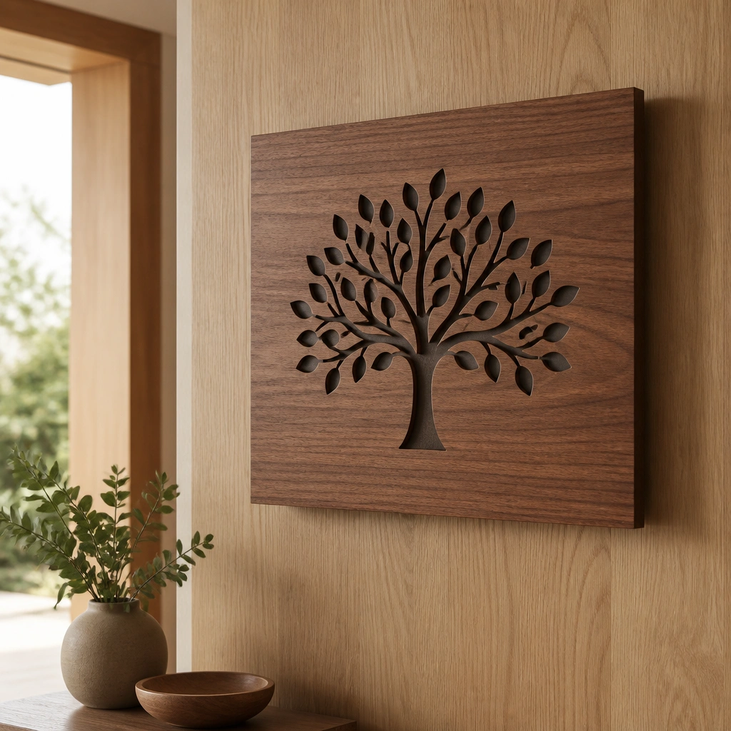
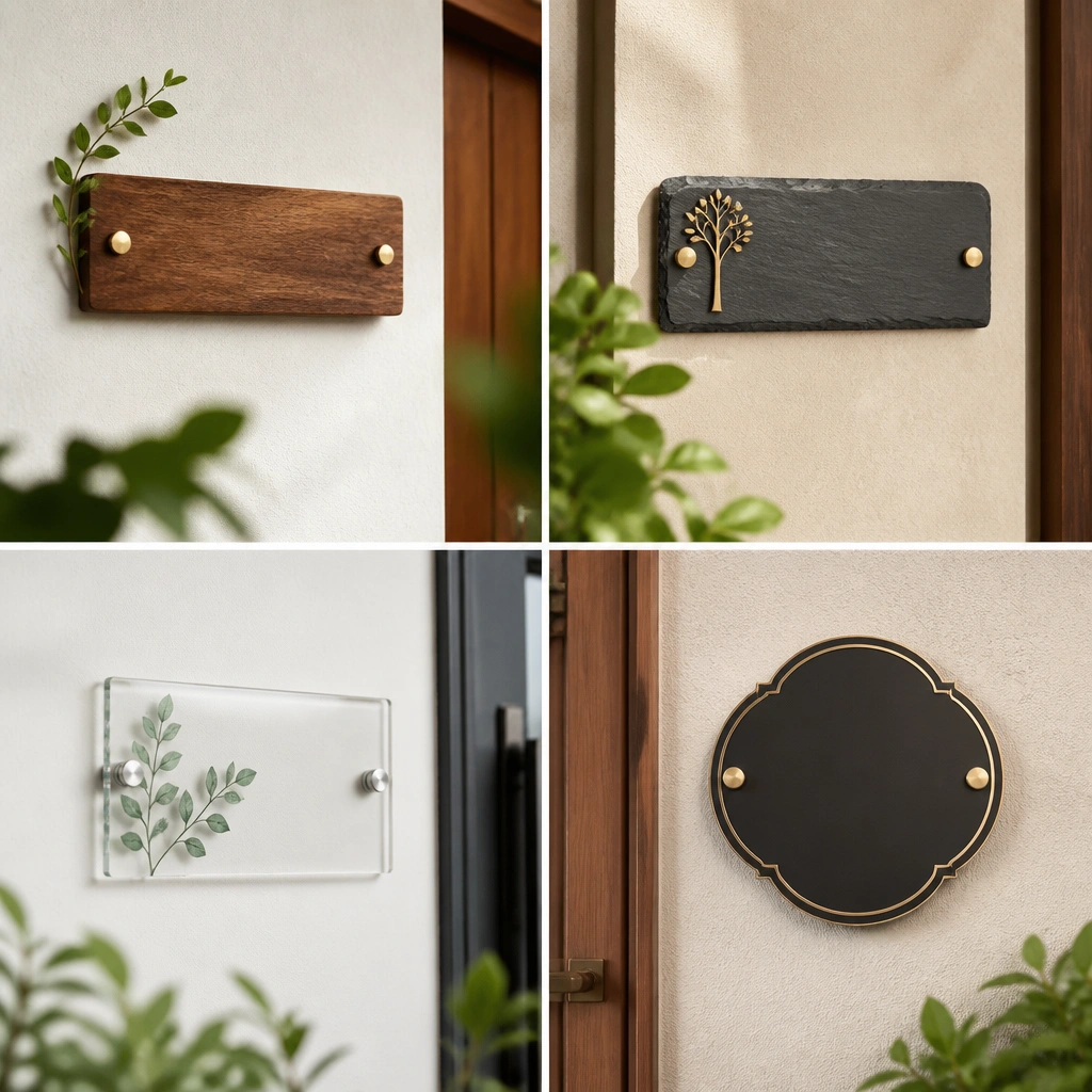
Walnut instantly warms a living space and reads premium, especially when the letters are laser-cut for clean edges. Laser-cut designs look sharper than painted letters, and the stain fill makes the name pop without looking flat. This option is ideal if your home already has wood tones like oak, walnut, or teak.
Seal the wood with a matte clear coat to protect against fingerprints and humidity near entrances.
7. Cream Acrylic Name Plates with Gold Foil Lettering
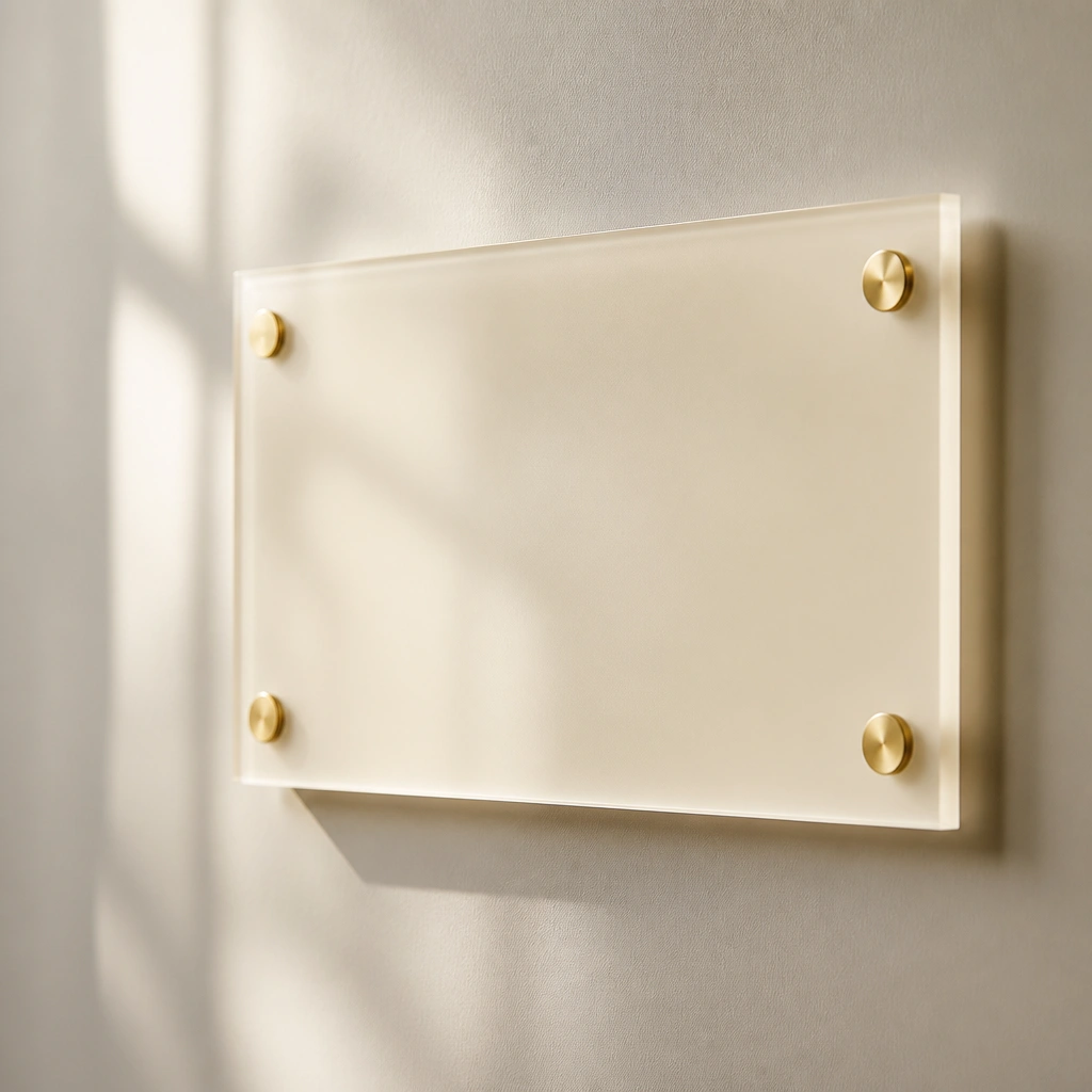
Cream acrylic can look like a glass-and-gold moment, but it’s lighter and easier to install than true glass. Gold foil lettering catches light in a controlled way — it looks rich without the full reflectivity of shiny metal. This is a smart choice for renters because it’s easier to mount cleanly and replace later.
Pro tipUse clear mounting standoffs or strong double-sided adhesive strips made for acrylic so it sits flush and doesn’t bow.
8. Marble-Look Composite Plates with Veined Typography
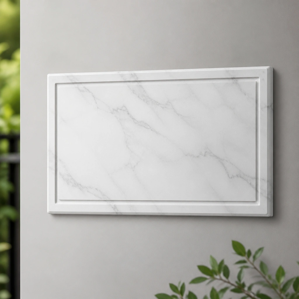
Marble-look composite is a budget-friendly way to get that high-end stone vibe. The key to making it look expensive is contrast — engraved or dark letters prevent the plate from blending into the pattern. It’s especially effective in modern living spaces with gray walls, black frames, and sleek furniture.
Pro tipAvoid overly similar wall patterns — marble-look plates pop best against solid or lightly textured paint.
9. Antique Brass Oval Plates with Curved Script
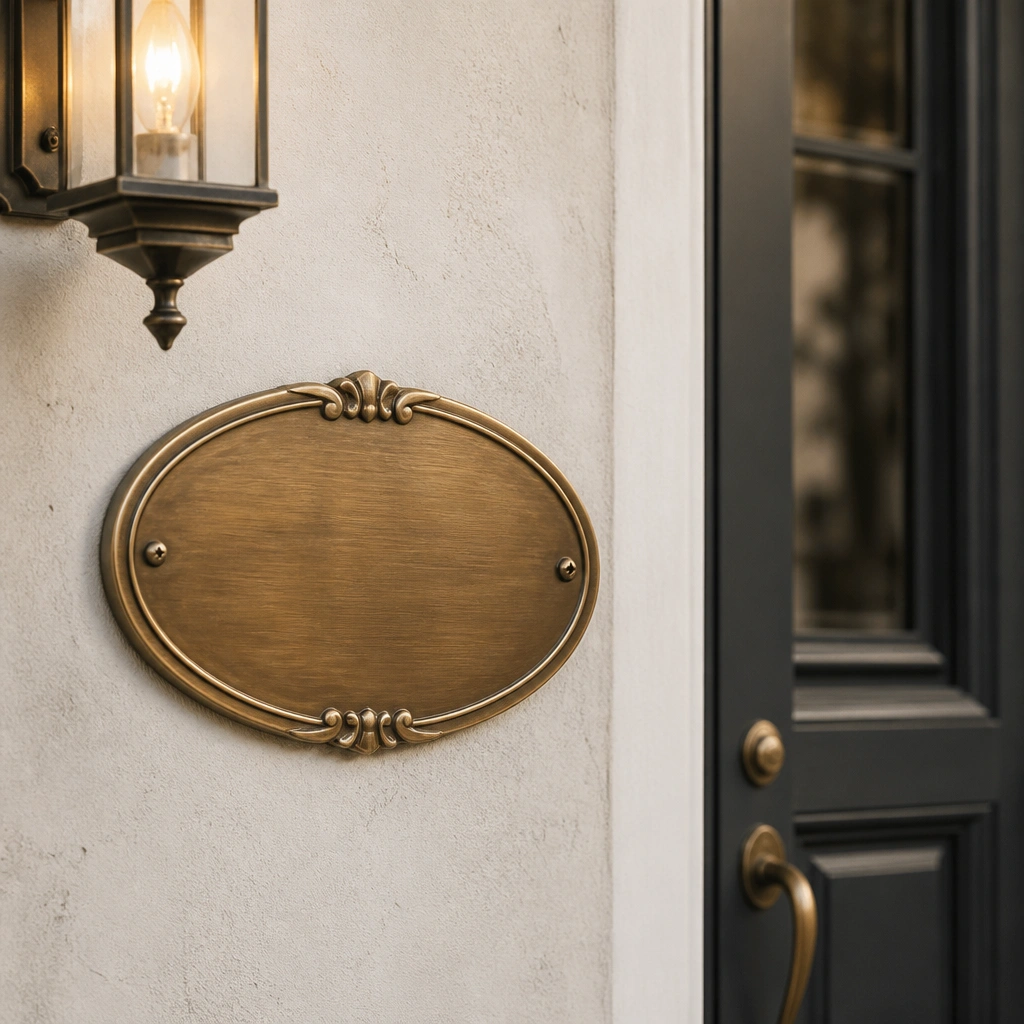
Oval plates feel softer and more decorative than rectangles, which is why they photograph “collected” and expensive. Antique brass adds depth — it looks aged, not just polished, and it pairs well with warm lighting. Curved script lettering matches the shape and adds elegance without feeling overly formal.
Pro tipKeep the backing color neutral (cream, taupe, or off-white) so the plate’s warm tones look intentional.
10. Matte Stoneware Plates with Speckled Finish
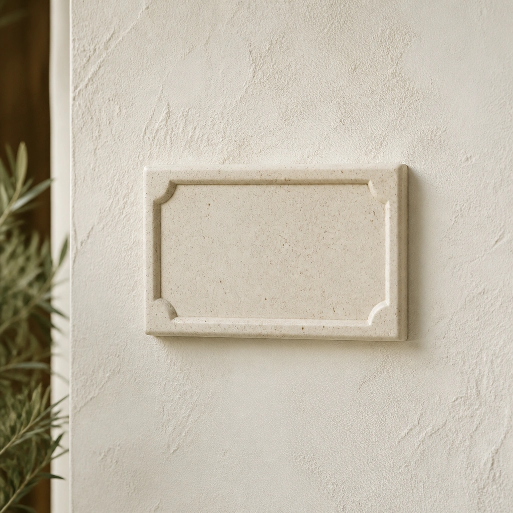
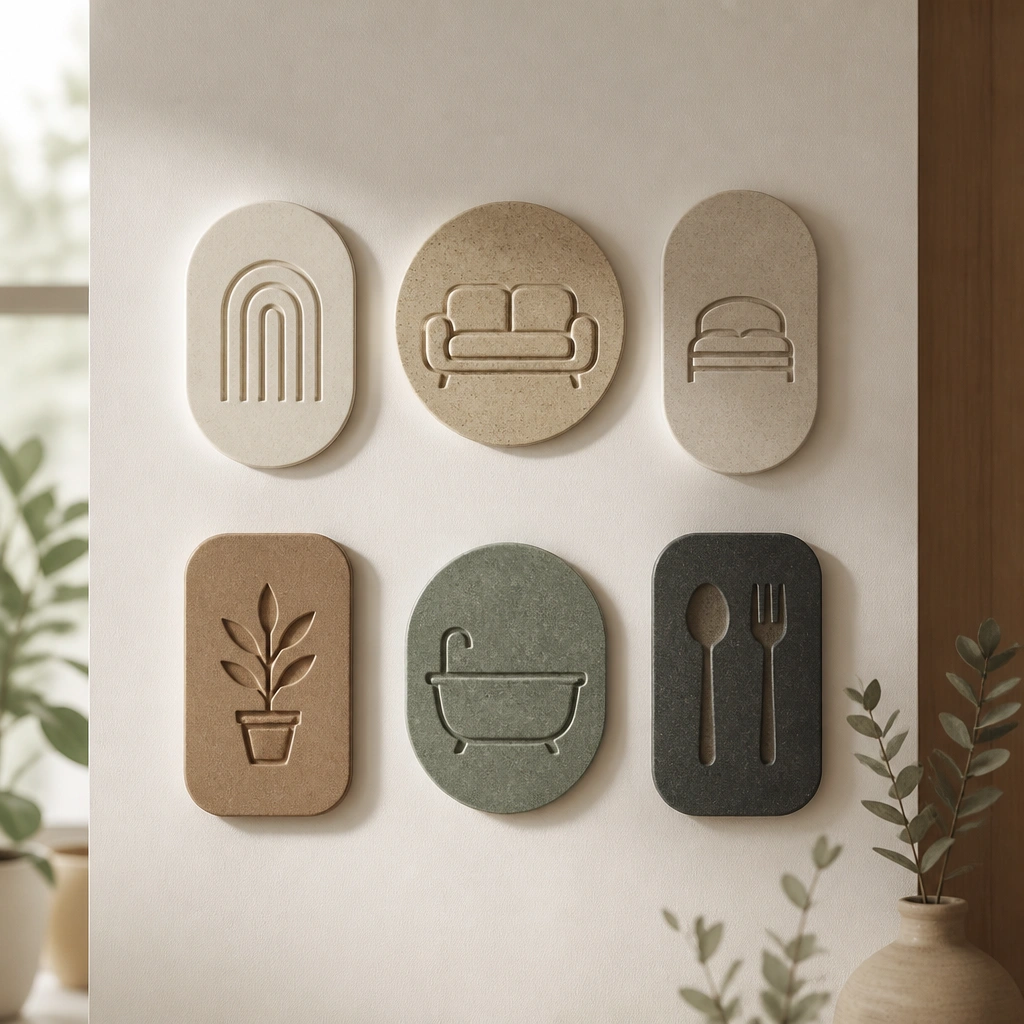
Speckled stoneware reads artisanal, which is the fastest route to an expensive-looking aesthetic without looking flashy. The matte surface hides fingerprints, and the carved letters feel more tactile than vinyl or printed designs. This works beautifully in living spaces with pottery, woven textures, and soft neutral palettes.
Mount with screws or heavy-duty adhesive designed for ceramic so it doesn’t shift as the wall temperature changes.
11. Aged Mirror Plates with Etched Name Typography
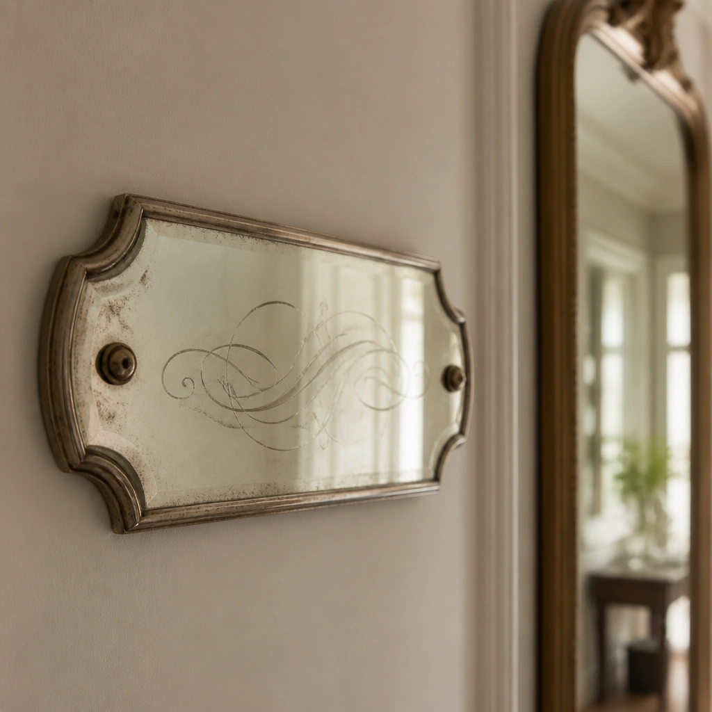
Aged mirror creates a boutique-hotel vibe because it reflects light while still looking softened and vintage. Etched lettering looks premium because it’s recessed and doesn’t rely on surface paint. Place it near a mirror or light source so it bounces brightness around your living space.
Wipe gently with glass cleaner on a microfiber cloth, then dry immediately to prevent streaks.