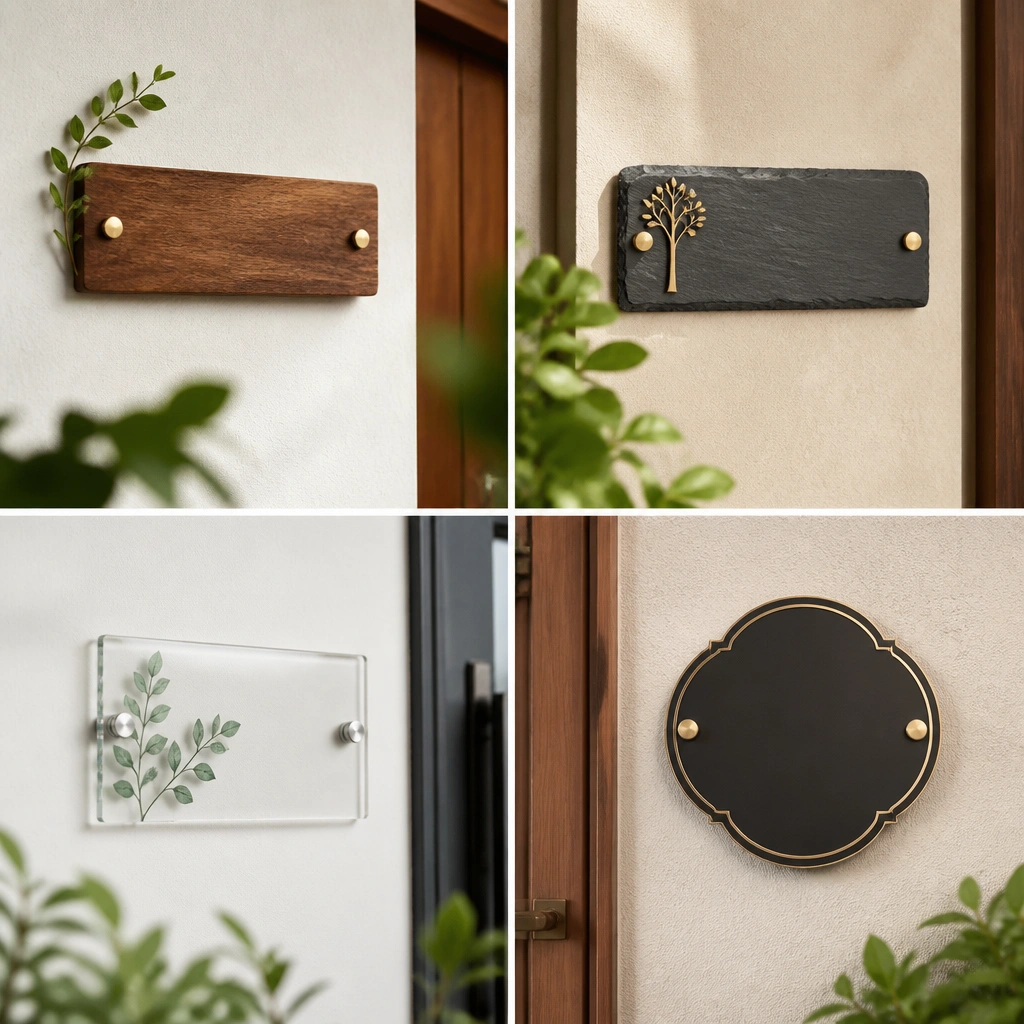
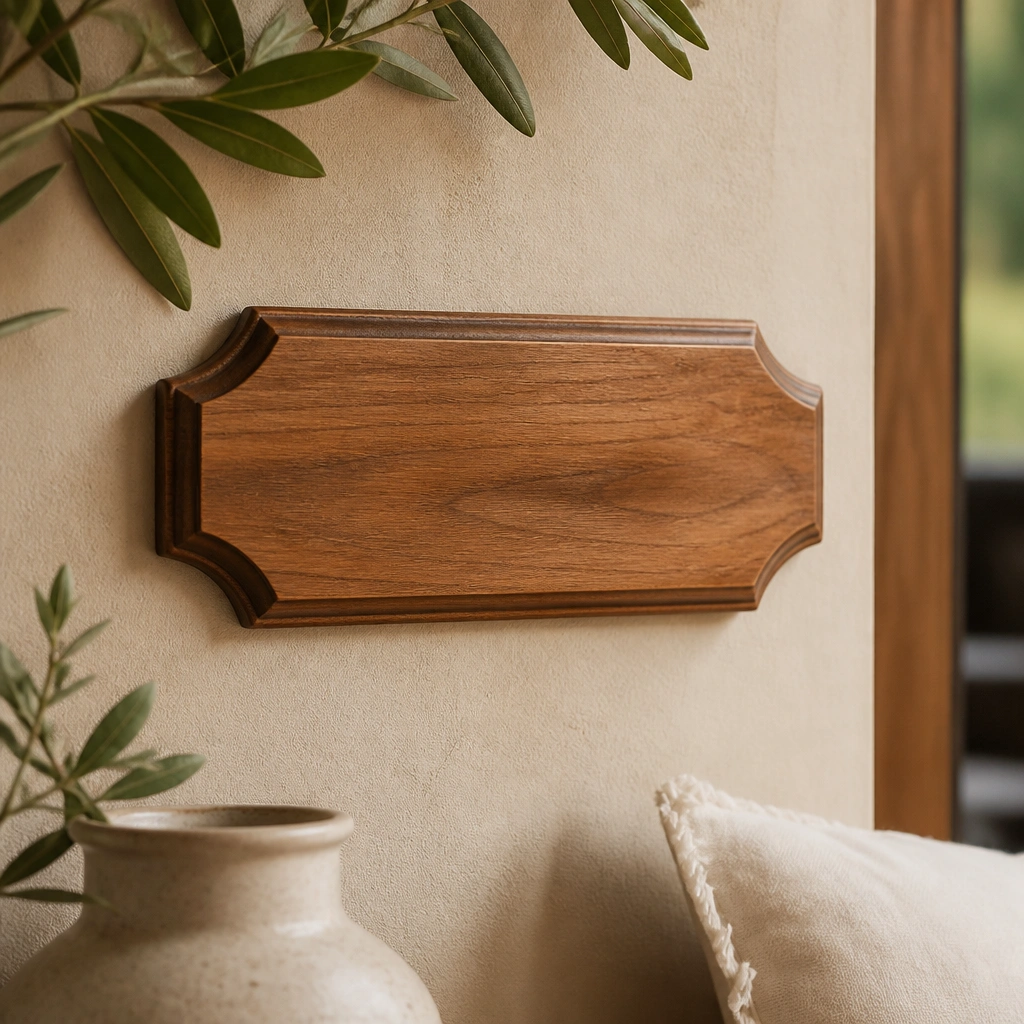
1. Burnt Honey Wood Script Plate for the Entry
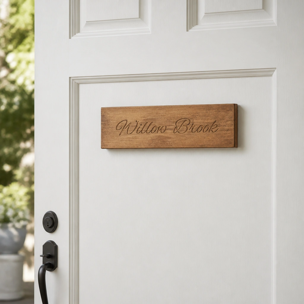
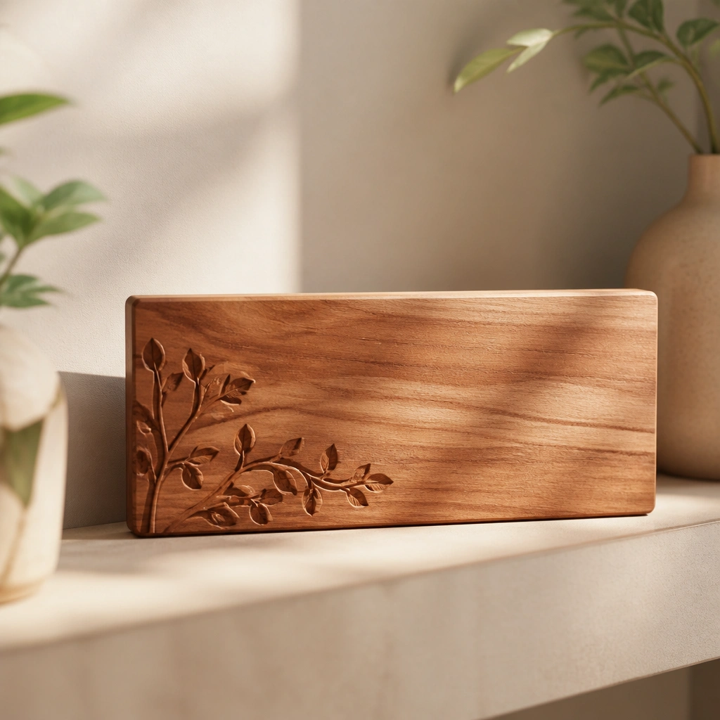
This look uses warm amber-brown wood with a lightly sealed finish so it reads cozy even in daylight shade. The engraved script catches light without looking glittery, and it pairs beautifully with white, cream, or pale gray doors. Keep the background matte so the name stands out clearly.
Seal the wood with a matte clear coat (not gloss) and mount at eye level — around 58-60 inches from the floor — for the most welcoming feel.
2. Cream Ceramic Tile Name Plate with a Soft Speckle Edge
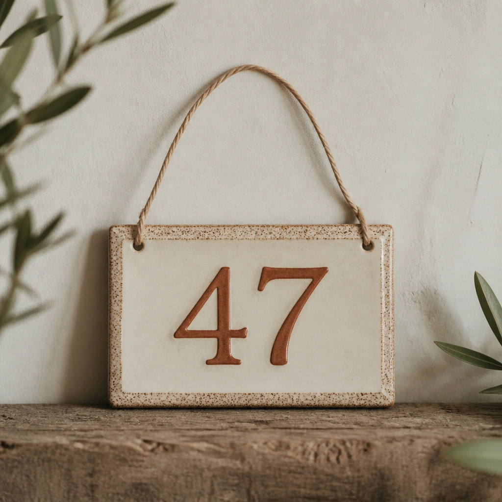
Ceramic tile gives you that “cottage handmade” vibe with a durable surface that wipes clean. Choose a cream glaze with subtle speckling so it looks warm even when the light is flat. Terracotta or muted clay lettering feels cozy without turning into a bright orange sign.
Pro tipIf it’s outdoors, use ceramic-safe outdoor mounting hardware or a weatherproof adhesive pad so moisture doesn’t loosen it.
3. Aged Brass Oval Plate with Raised Lettering
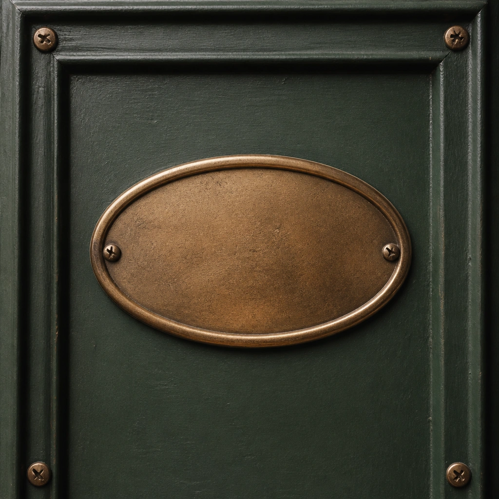
Aged brass warms up darker doors fast. The raised lettering creates soft shadows that look premium in the morning and evening, adding depth without needing extra decor. Oval shapes also feel friendly compared to sharp rectangles.
Wipe brass with a gentle microfiber cloth and mild soap, then dry fully to prevent water spots.
4. Warm White Acrylic Plate with Back-Paint Glow Effect
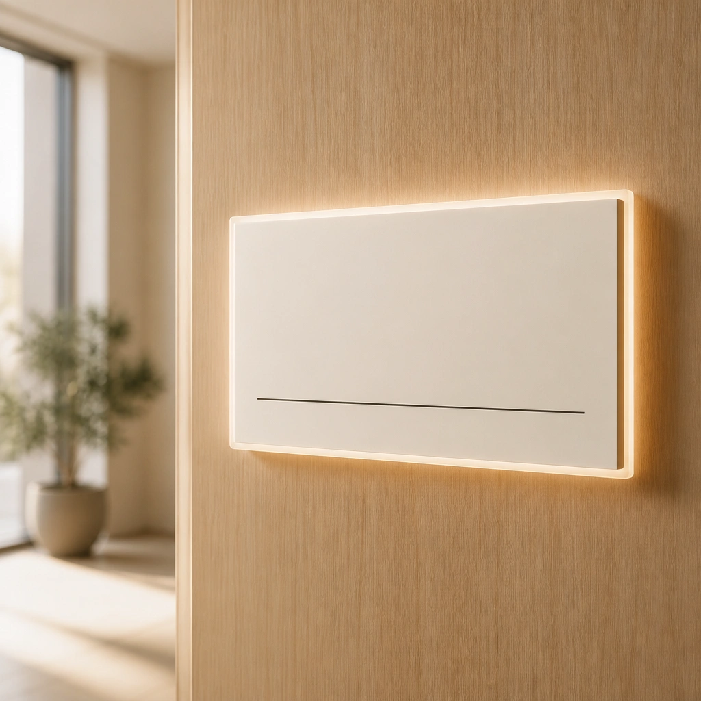
Back-painted acrylic looks clean and cozy because the warm white background softens the contrast. It’s great for renters since it can be mounted with removable adhesive strips or low-profile hardware. Dark lettering keeps it readable even from a distance.
Use removable mounting strips rated for the weight of the plate, and test adhesion on a hidden spot first.
5. Cozy Farmhouse Shiplap Name Plate in Natural Pine
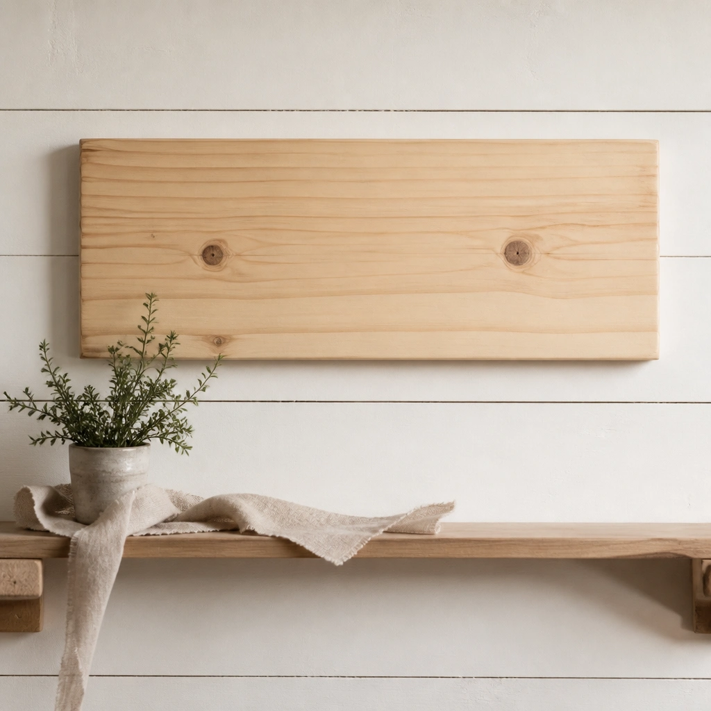
Natural pine + block lettering reads farmhouse-cozy without being too busy. The shiplap texture makes the wood grain look richer, and the simple font keeps it from feeling juvenile. This style is perfect for a mudroom, hallway, or home office nook.
For a crisp look, lightly sand edges and stain only the front face so the sides stay natural and warm.
6. Terracotta Hanging Name Plate for a Covered Porch
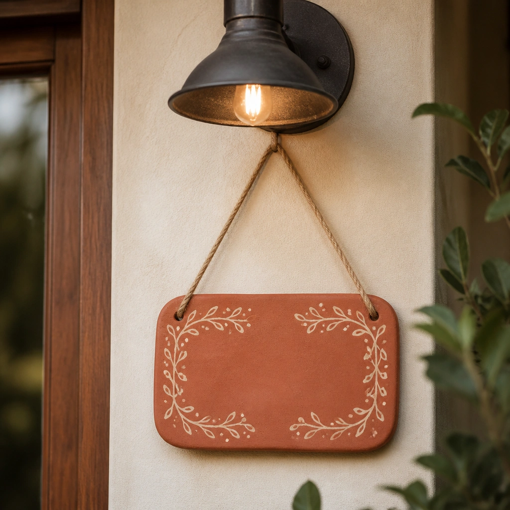
Terracotta brings instant warmth, especially in the golden hour. When letters are painted in cream, they look soft and inviting rather than harsh. Hanging under a covered porch light adds an even cozy glow and makes the plate feel like part of the lighting plan.
Pro tipUse outdoor-rated clear sealer over the painted letters to prevent fading and scuffs.
7. Matte Black Metal Plate with Warm Ecru Typography
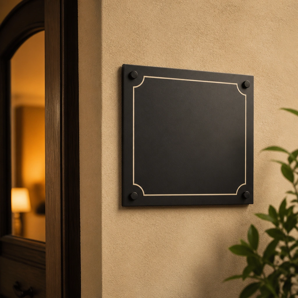
Matte black can still feel cozy when paired with warm ecru instead of bright white. The modern serif keeps it elegant, and the matte finish avoids glare that can make signage feel cold. This is a great match for neutral interiors with beige, camel, or oatmeal tones.
Pro tipAvoid glossy finishes if it’s near sunlight — matte reads warmer and more natural in photos.
8. Woven Wreath + Name Plate Combo for the Front Door
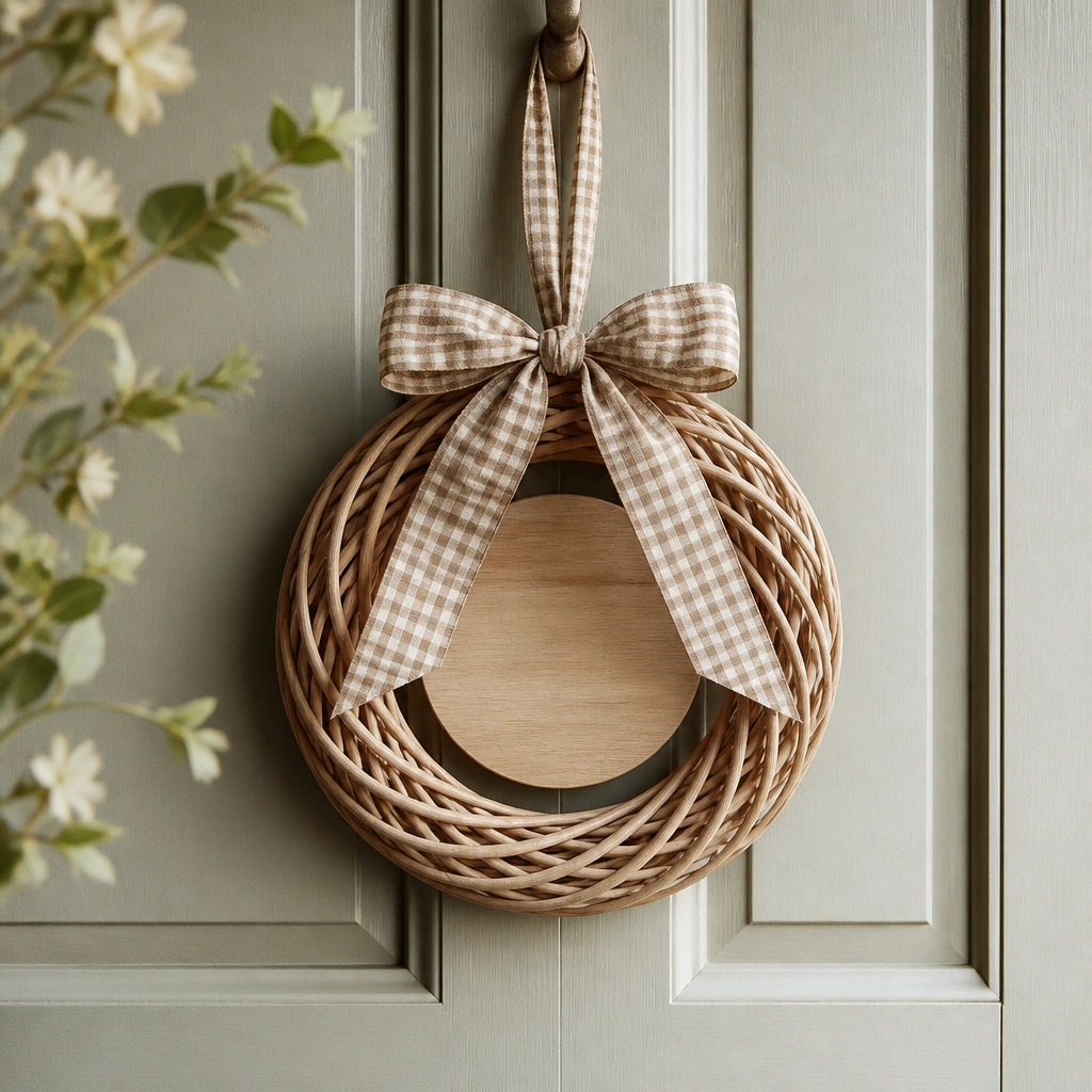
This combo makes the name plate feel integrated, not stuck on. Natural woven textures add cozy dimension and soften the look of the lettering, especially when the plate is wood-toned. Keep the plate compact so the wreath still reads airy and welcoming.
Pro tipChoose a name plate width about half the wreath’s diameter for balanced spacing.
9. Vintage Look Letterboard-Style Name Plate (Cozy Neutral Palette)
A letterboard style lets you rotate the vibe while staying cozy. Use warm neutral tiles (cream, sand, clay) so it doesn’t feel like a birthday sign. It’s also ideal if you’re unsure about exact wording — you can test layouts before committing to a permanent plate.
Keep letter height consistent and leave a small gap between first and last name so it stays readable from across the room.