1. Warm Greige Cabinets + Quartz-Style Countertops
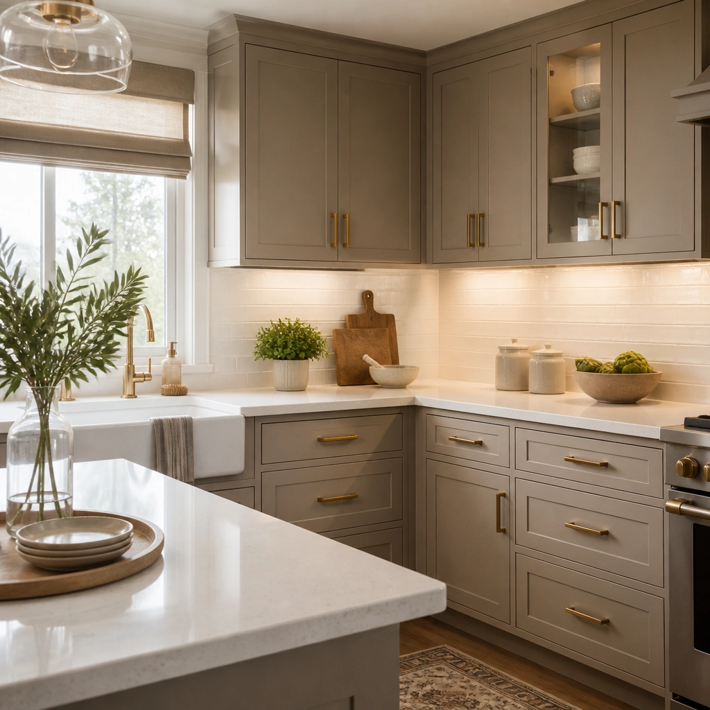
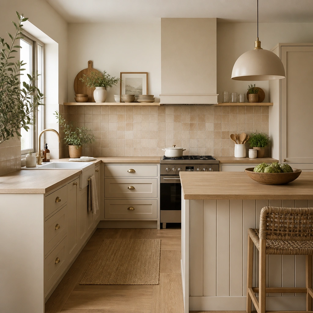
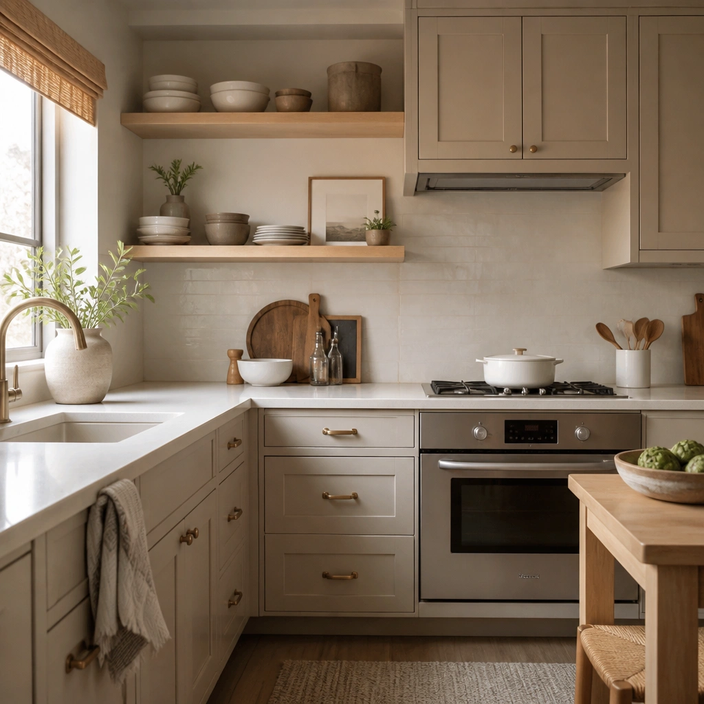
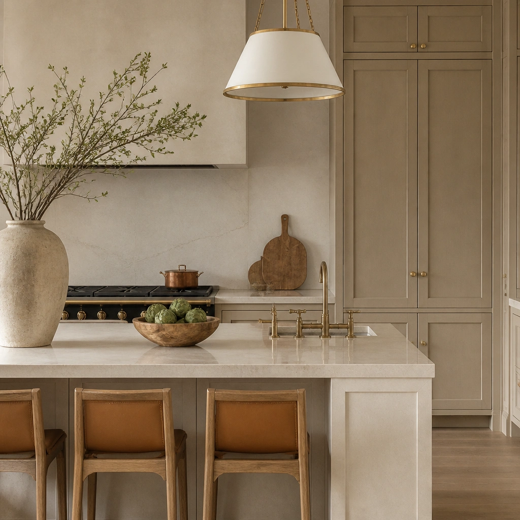
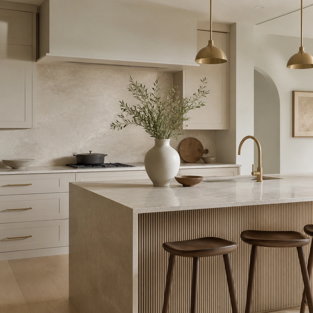
Go for greige cabinets with warm undertones (think creamy oatmeal, not gray-beige). Pair them with quartz-look counters that have fine, natural-looking movement — the tiny variation reads high-end even when you’re not using real stone. Keep the backsplash light and minimal so the counters stay the focal point.
Pro tipBefore committing, place a sample swatch of your cabinet paint next to a printed “quartz-look” image in daylight and evening light — warm undertones should still look inviting at night.
2. Creamy Beiges With a Full-Height Backsplash (No Gaps)
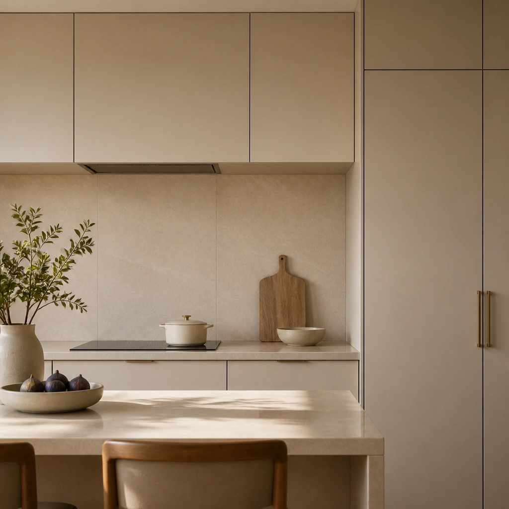
Full-height backsplash coverage makes beige feel intentional and tailored. Use large-format tiles (or a slim slab-look) with thin grout lines to avoid the “patchwork” look that can make beige kitchens feel dated. The uninterrupted surface also makes lighting reflect more evenly.
Pro tipIf you’re DIY-ing or planning materials, measure the backsplash height from countertop to the cabinet underside and buy extra tile to match the pattern direction without ending mid-line.
3. Brass Hardware + Matte Black Touches (Balanced Contrast)
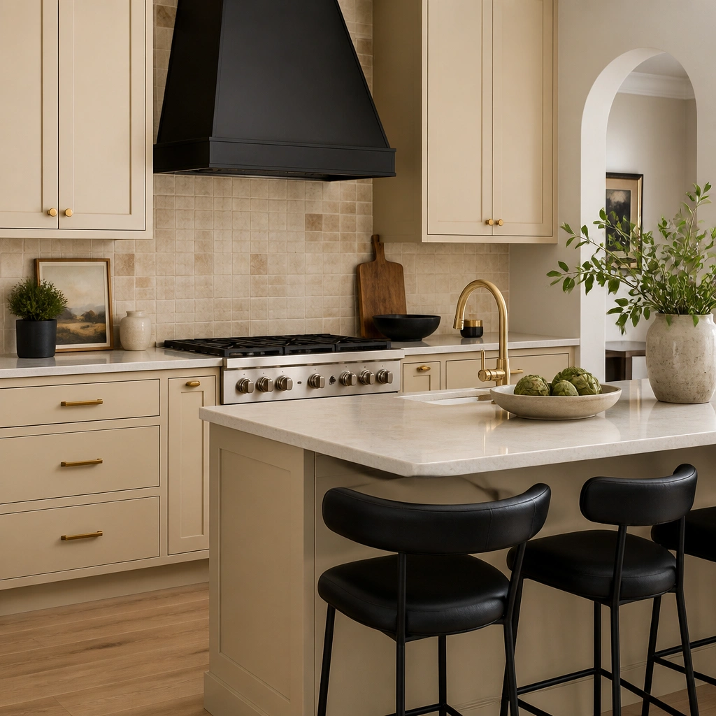
Expensive kitchens usually repeat finishes. Brass on cabinets and faucet adds warmth and glow, while a small amount of matte black (hood, fixtures, or a single appliance face) gives structure and prevents beige from blending together. The key is moderation — 2 metals, not 4.
Pro tipPick your “hero metal” (brass or black) and match it across at least 3 elements: hardware + faucet + one statement fixture.
4. Two-Layer Lighting: Under-Cabinet Warm + Pendant Task Glow
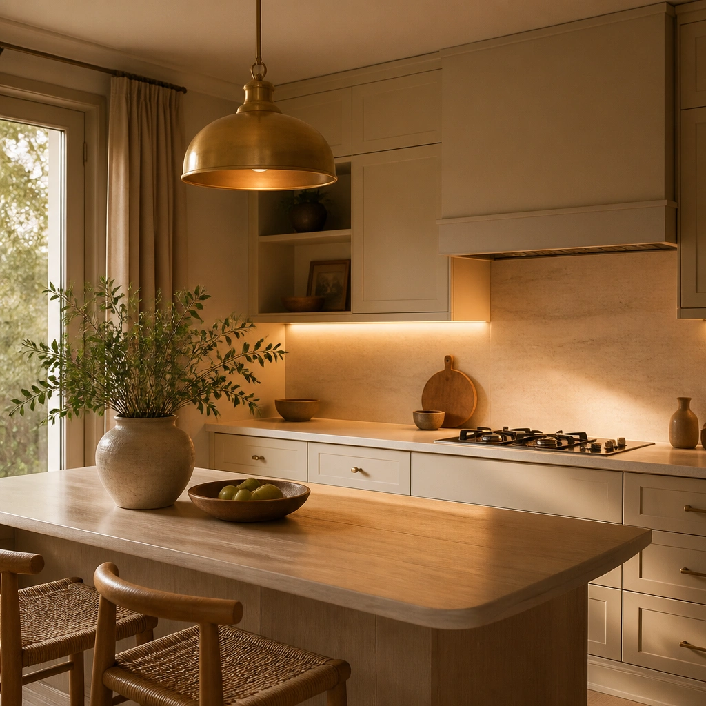
Lighting is what makes beige look expensive because it controls how the undertones read. Use warm under-cabinet LEDs (around 2700K-3000K) to highlight texture in countertops and tile. Add a pendant with a warm finish so the center of the room feels styled, not flat.
Pro tipAim for layered brightness: install under-cabinet lighting first, then choose a pendant that casts light downward without glaring — use a dimmer if you can.
5. Matte-Beige Cabinet Paint + Subtle Wood Grain Shelves
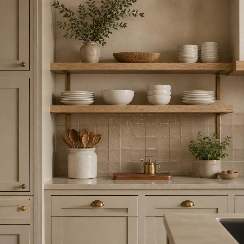
Matte beige hides fingerprints and looks designer when paired with real wood grain. Use open shelves sparingly: a small section above a coffee station or along one wall gives visual interest without breaking the neutral palette. Keep shelf wood light (oak or ash) so it stays warm against beige.
Pro tipUse matching shelf brackets and hardware so the wood + beige reads like one custom built-in, not separate decor.
6. Sage-Edge Beige: Tiny Green Accents in Backsplash + Textiles
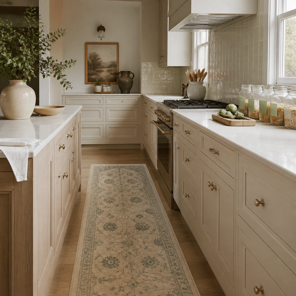
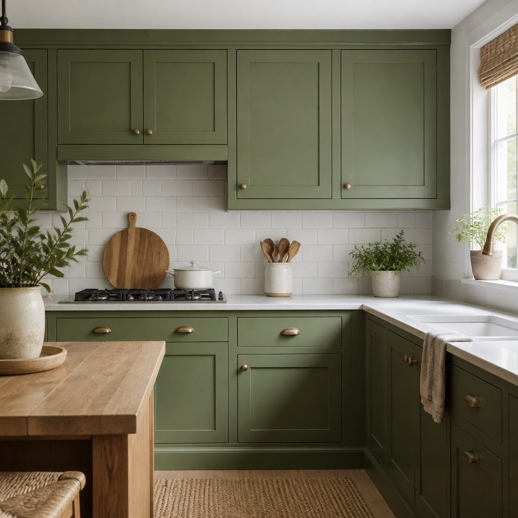
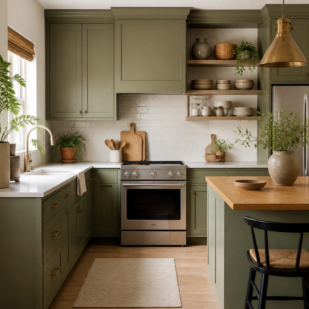
A whisper of green keeps beige from feeling sterile. Look for tiles, grout, or even backsplash paint that leans creamy with a subtle sage undertone. Then add textiles or styling that echo that tone — it makes the whole room feel curated and more expensive than plain beige alone.
Pro tipLimit green accents to 1-2 shades and repeat them in at least two places (textile + small decor) for a cohesive look.
7. Oversized Farmhouse Sink in Matte White + Warm Beige Surround
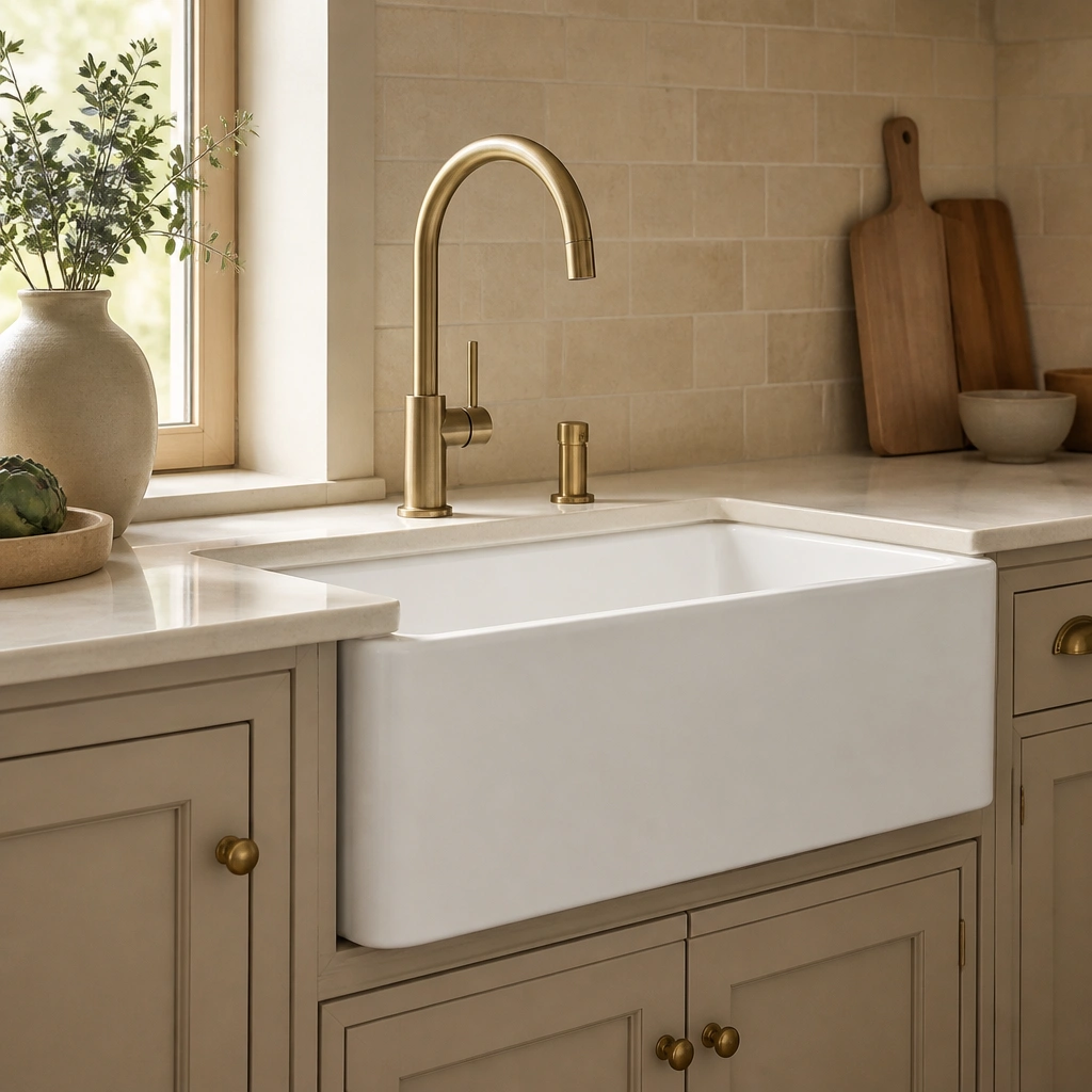
A high-end feel often starts at the sink because it’s the visual anchor. Choose a matte or honed white finish (not glossy) so it blends with beige warmth. Pair it with a brass faucet and a simple backsplash so the sink reads clean, not busy.
If you’re replacing hardware, coordinate faucet finish with your cabinet pulls — same metal, same tone, no mismatch.
8. Beige + Texture: Plaster-Look Walls or Limewash Finish
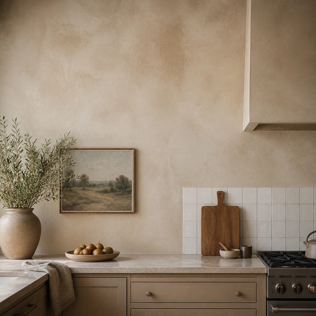
Flat paint can make beige look cheap because it reflects light evenly and shows every imperfection. A plaster-look finish adds micro-texture that catches light softly — that “designer” depth reads expensive. Keep the rest of the kitchen simple so the wall texture becomes the feature.
Test a small section of limewash/plaster-look coating in morning and evening light — texture can shift from warm to dusty depending on undertone.
9. Crisp White Trim + Beige Cabinets for a Tailored Frame
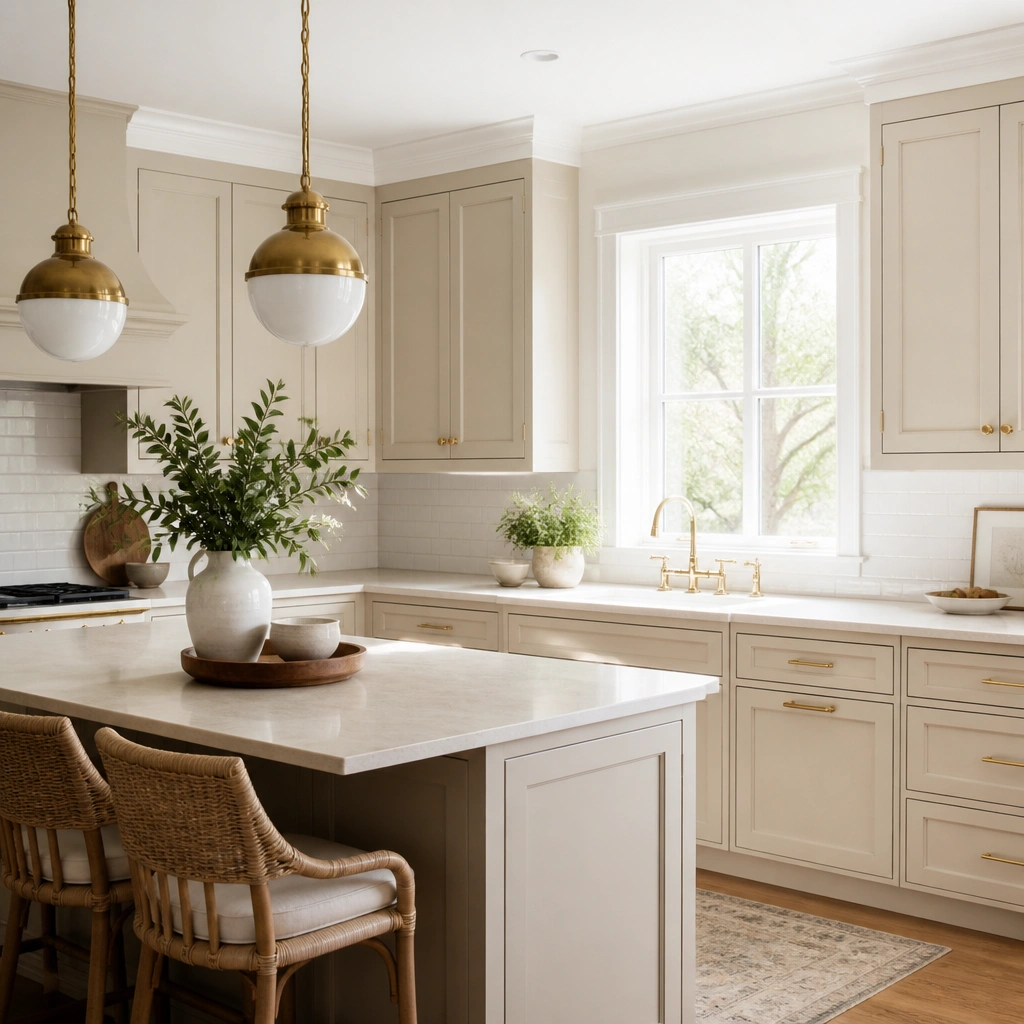
Beige can look luxe when it’s framed by clean white lines. Add or emphasize trim: crown molding, window casing, or a white “picture frame” detail around an accent panel. The sharp contrast makes beige look intentional and architectural.
If you can’t add new trim, use paint and painter’s tape to create a narrow white border where the eye naturally rests (around windows or cabinet uppers).
10. Stone-Look Backsplash With Thin Grout (Modern Luxe)
Stone-look tile becomes expensive-looking when the pattern is cohesive and the grout is minimal. Choose a warm stone palette (cream + light taupe) and keep grout lines slim so the surface reads like a single material. This is a great way to get the “designer stone” vibe without full slab costs.
Ask for the thinnest available grout line option from your tile supplier and dry-lay a section to confirm the veining direction.