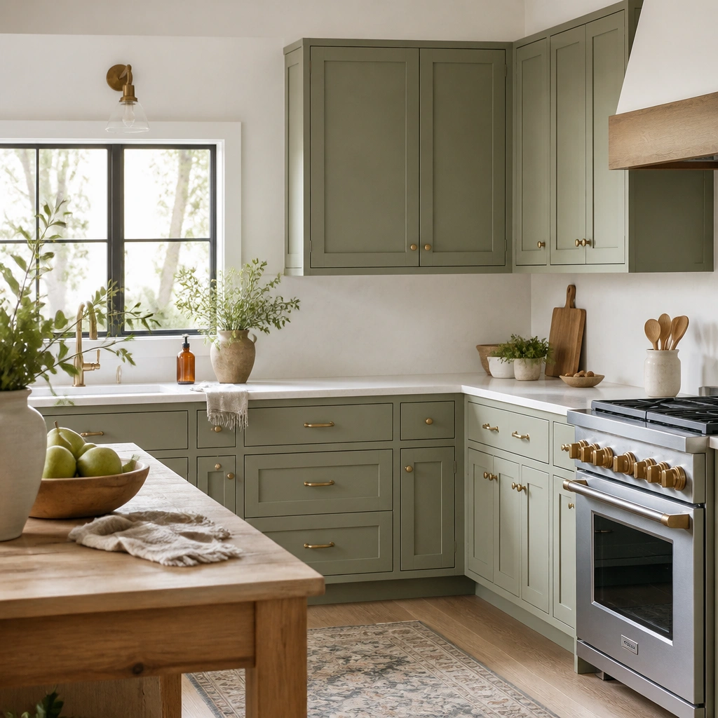
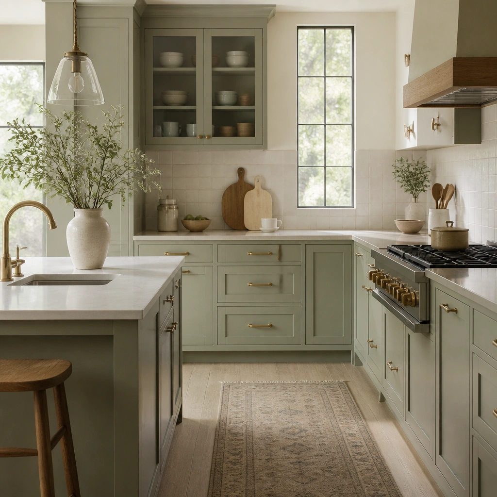
1. Dusty Sage Matte + Warm White Walls
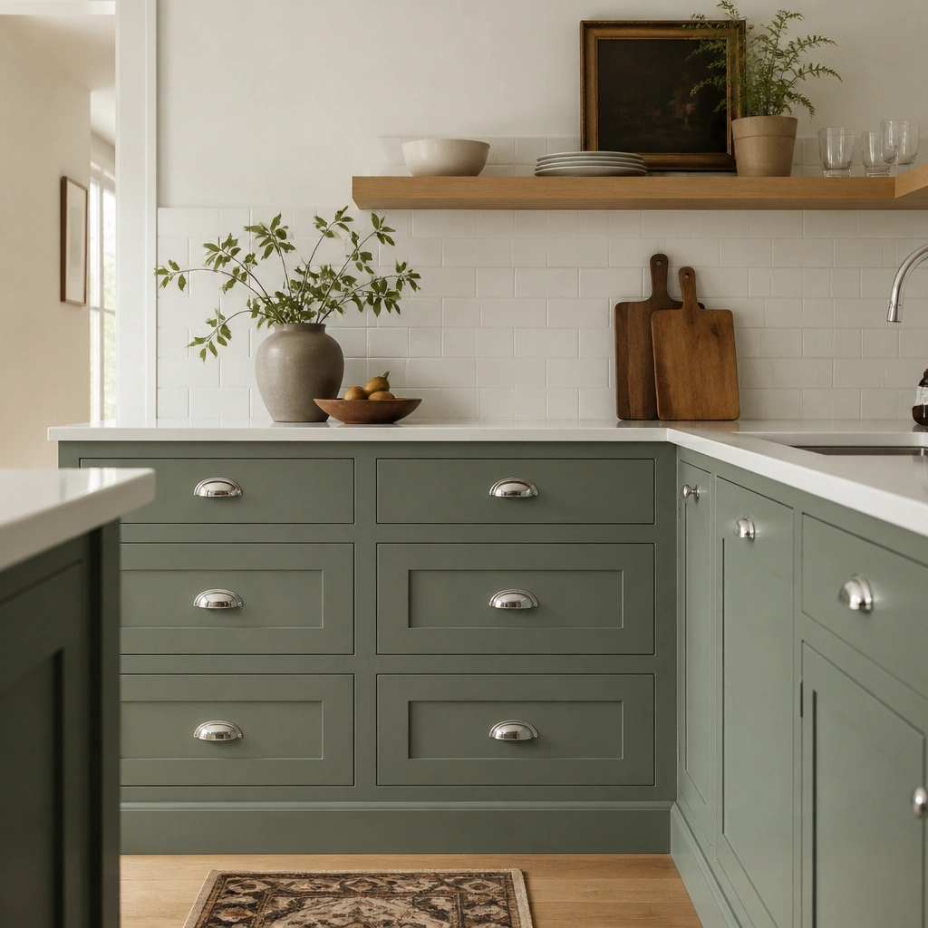
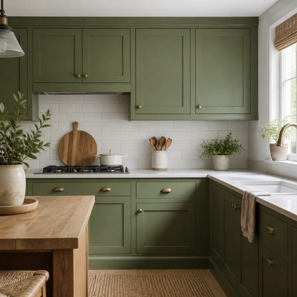
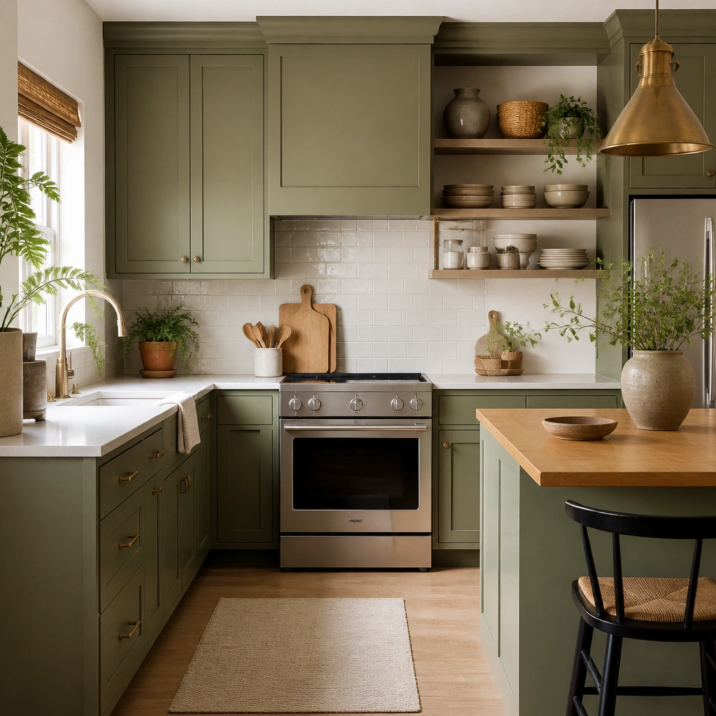
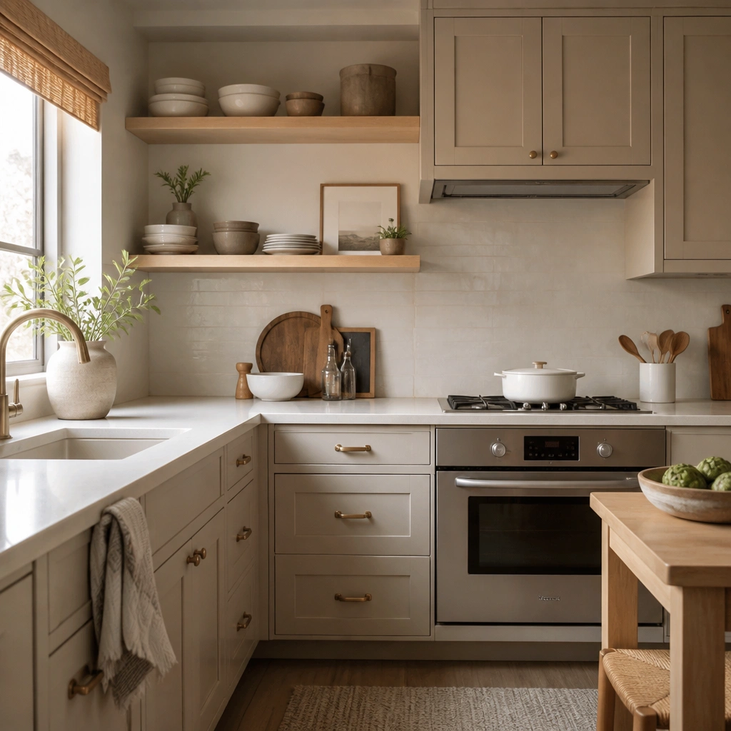
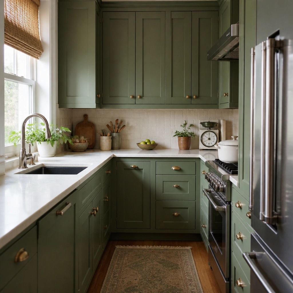
Dusty sage with a matte finish absorbs light, which makes green feel calm and “finished” even in smaller kitchens. Pair it with warm white walls (not icy white) so the sage doesn’t look gray or harsh. This combo also hides minor brush marks better than glossy finishes.
If you’re unsure of undertone, test paint samples on two cabinet doors and view them at night with the overhead lights on.
2. Gray-Sage Cabinets + Light Oak Shelves
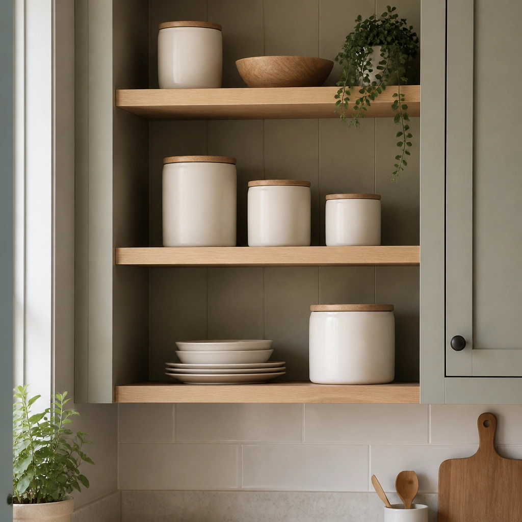
Gray-sage leans modern without going cold. Light oak adds warmth and keeps the kitchen from feeling too sterile. The contrast between the muted green and the visible wood grain makes the space feel layered, not flat.
Pro tipChoose hardware with a similar warmth to your wood (brushed brass or warm bronze works best).
3. Olive-Sage Cabinets + Black Iron Accents
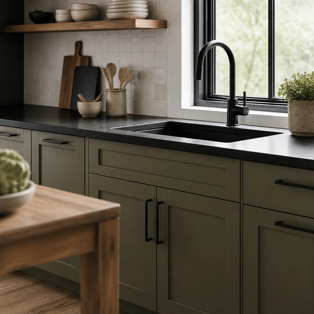
Olive-sage brings a slightly earthy, cottage vibe. Black accents sharpen the look and make the green feel intentional instead of washed out. Use black in small doses (pulls, faucet, one light fixture) so the kitchen stays soothing.
Pro tipBefore painting, hold a black hardware sample next to the sage sample under daylight to confirm the contrast feels balanced.
4. Sage Green Shaker Cabinets + Creamy Quartz
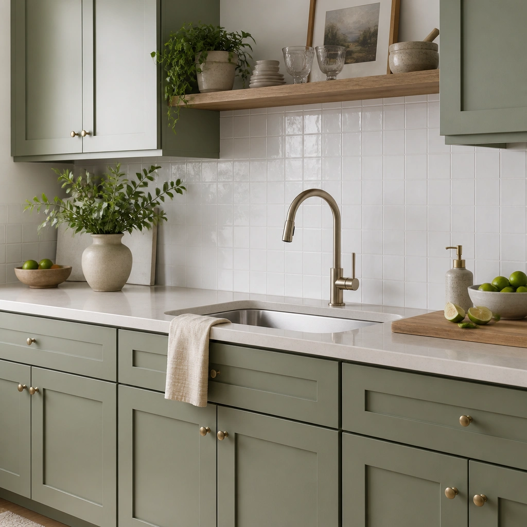
Shaker doors make sage look crisp because the grooves catch light differently than flat-panel doors. Creamy quartz (with soft beige veining) keeps the palette cozy and prevents sage from looking too “green” against stark whites. This is a beginner-safe combo because it’s forgiving.
Pro tipIf your countertop is already installed, match sage to it by looking at the countertop’s lightest warm tone, not the darkest veining.
5. Sage Upper Cabinets + White Lower Cabinets
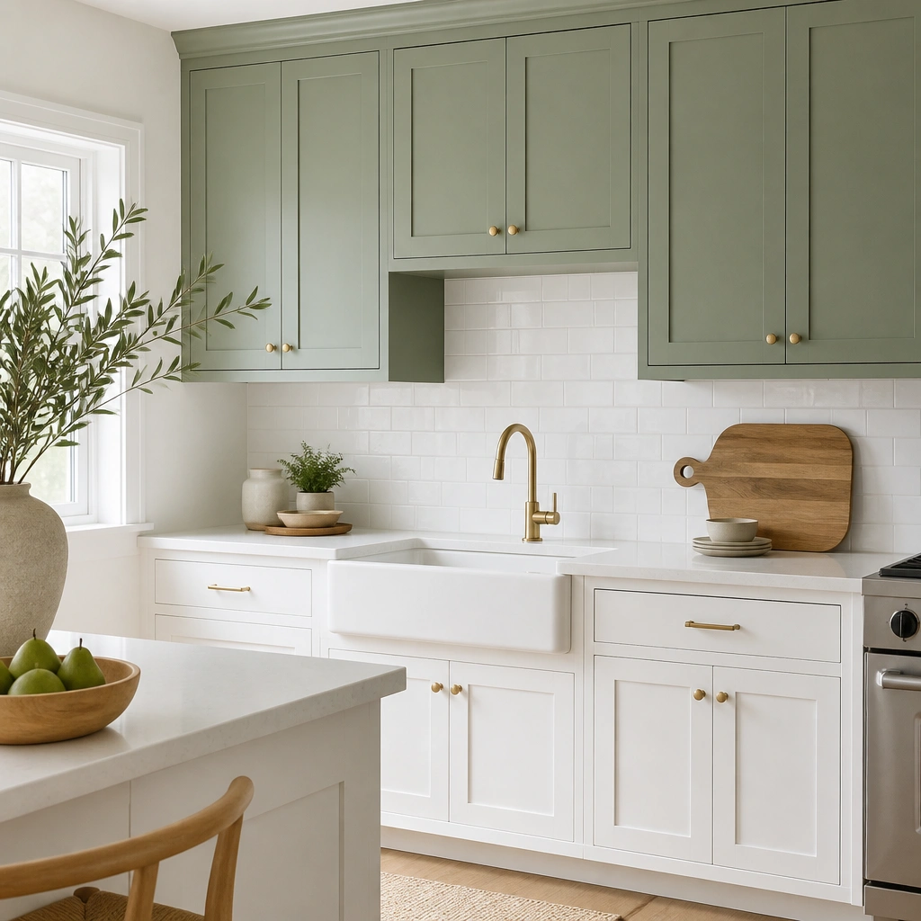
This split approach is the easiest way to try sage without committing to a full green kitchen. The eye stays anchored on the white lowers, while the sage adds color where your attention naturally goes — around the sink and prep area. It’s also great for renters because you can focus on a smaller painted area.
Pro tipKeep the sage finish consistent across all upper doors for a uniform look — don’t mix matte and satin in the same zone.
6. Two-Tone Sage: Upper Dusty + Base Olive
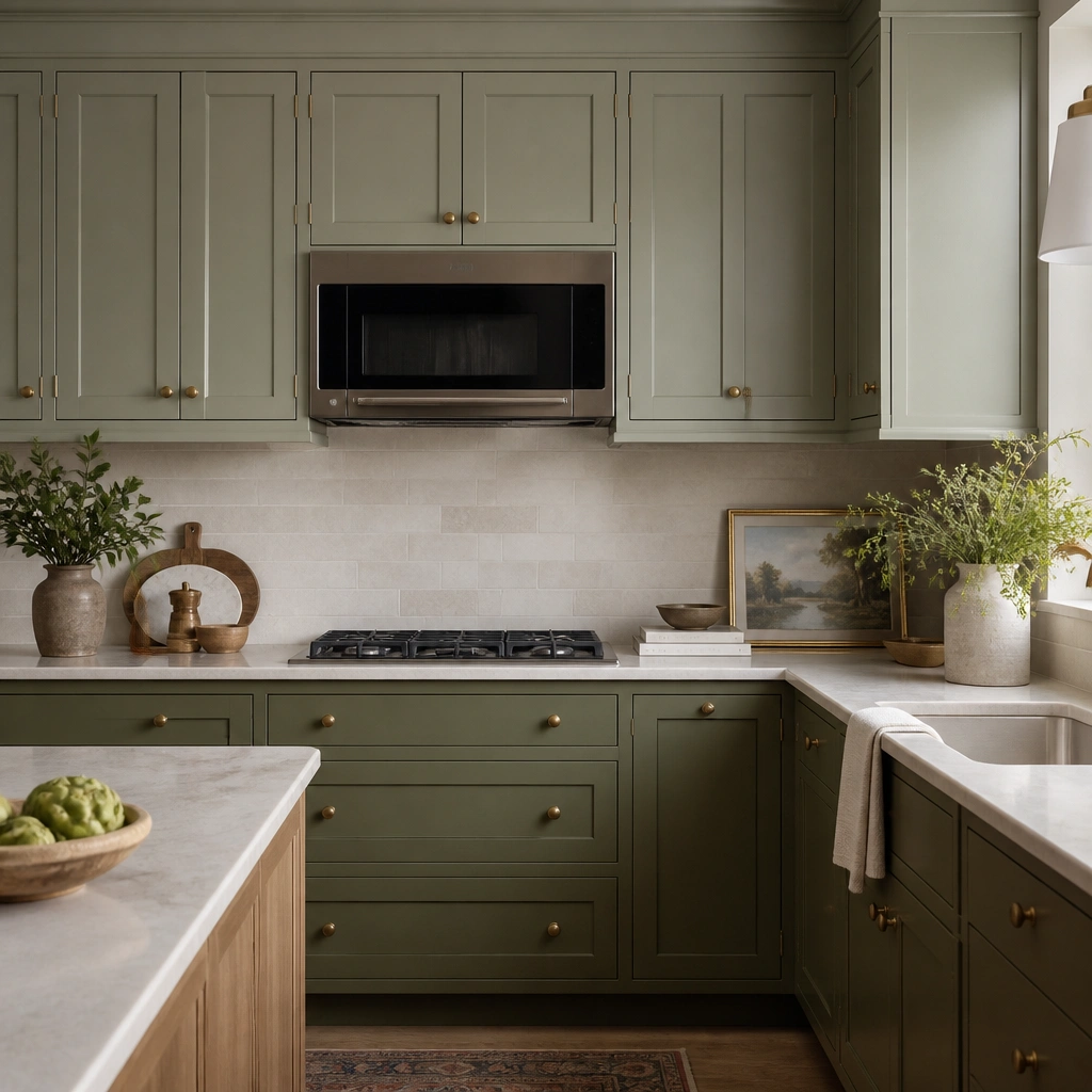
Two-tone sage creates depth without using multiple unrelated colors. Keep the undertones related (dusty gray-leaning up top, olive-leaning on the bottom) so the kitchen feels cohesive. Brass knobs tie both shades together and make hardware look more expensive.
Pro tipUse the same primer and sheen for both shades, then apply two test swatches side-by-side to confirm they read “in-family.”
7. Sage Cabinets + Terrazzo-Look Backsplash
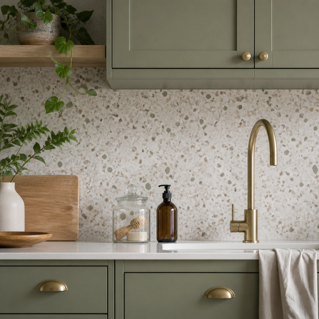
Terrazzo-look tile adds movement and tiny color flecks that play nicely with sage’s muted tone. The speckles prevent the backsplash from competing with the cabinets. This pairing is beginner-friendly because you’re not trying to match one exact color — you’re matching a range of neutrals.
Pro tipAim for backsplash colors that include white and beige; if it has lots of cool gray, your sage may look too muted.
8. Sage Cabinets + Brushed Brass Hardware
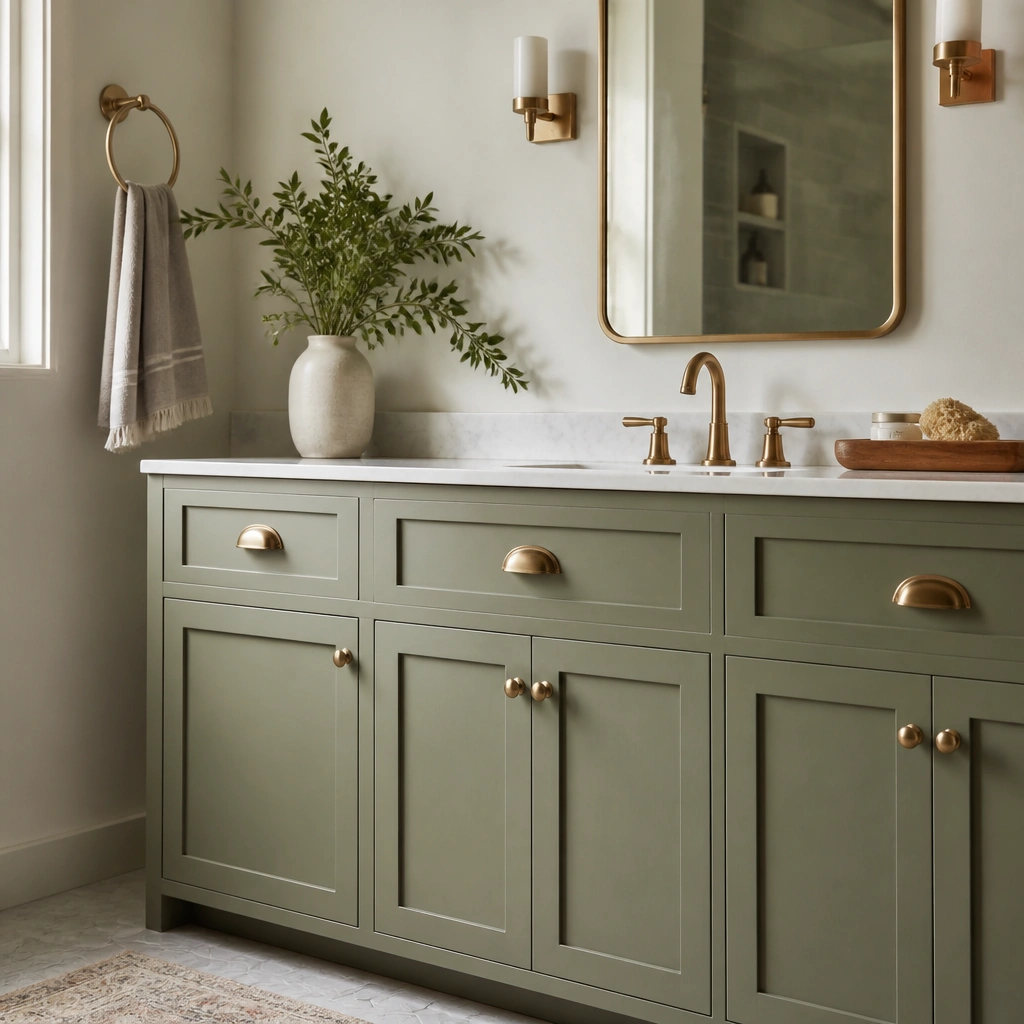
Brushed brass adds warmth that balances sage’s green-gray nature. The texture (not shiny mirror brass) keeps it soft and modern. Hardware can also make a beginner paint job look more intentional because the details catch light.
Pro tipChoose pulls with a similar finish across the kitchen (all brass, or all brushed nickel) to avoid a “mixed metals” look.
9. Sage Cabinets + White Marble-Style Countertops
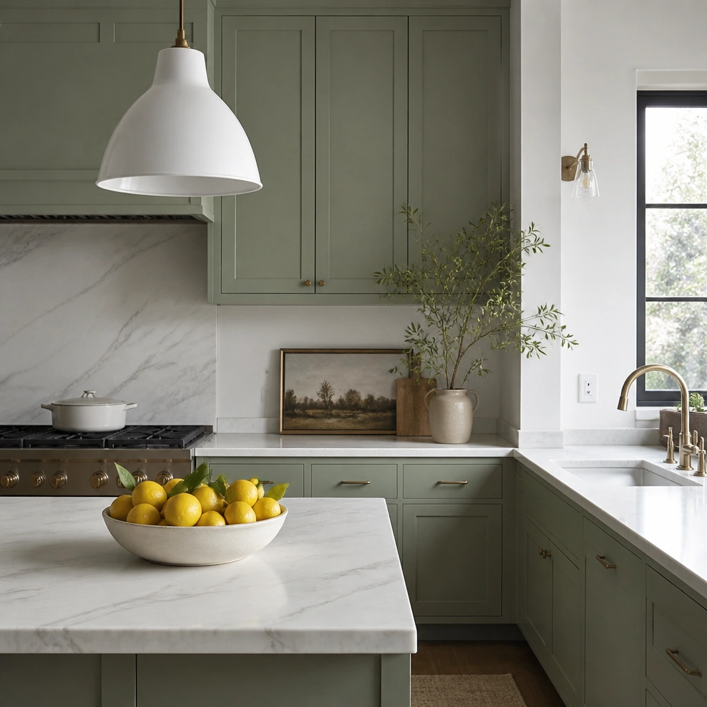
Marble-style countertops with soft gray veining make sage feel elevated without turning the kitchen cold. The key is keeping veining delicate, not high-contrast black-and-white. When the countertop stays light, sage remains airy and beginner-friendly.
If your countertop has strong beige warmth, consider a slightly warmer sage (more olive) so they don’t fight.
10. Sage Cabinets in a Small Kitchen (Light + Reflective)
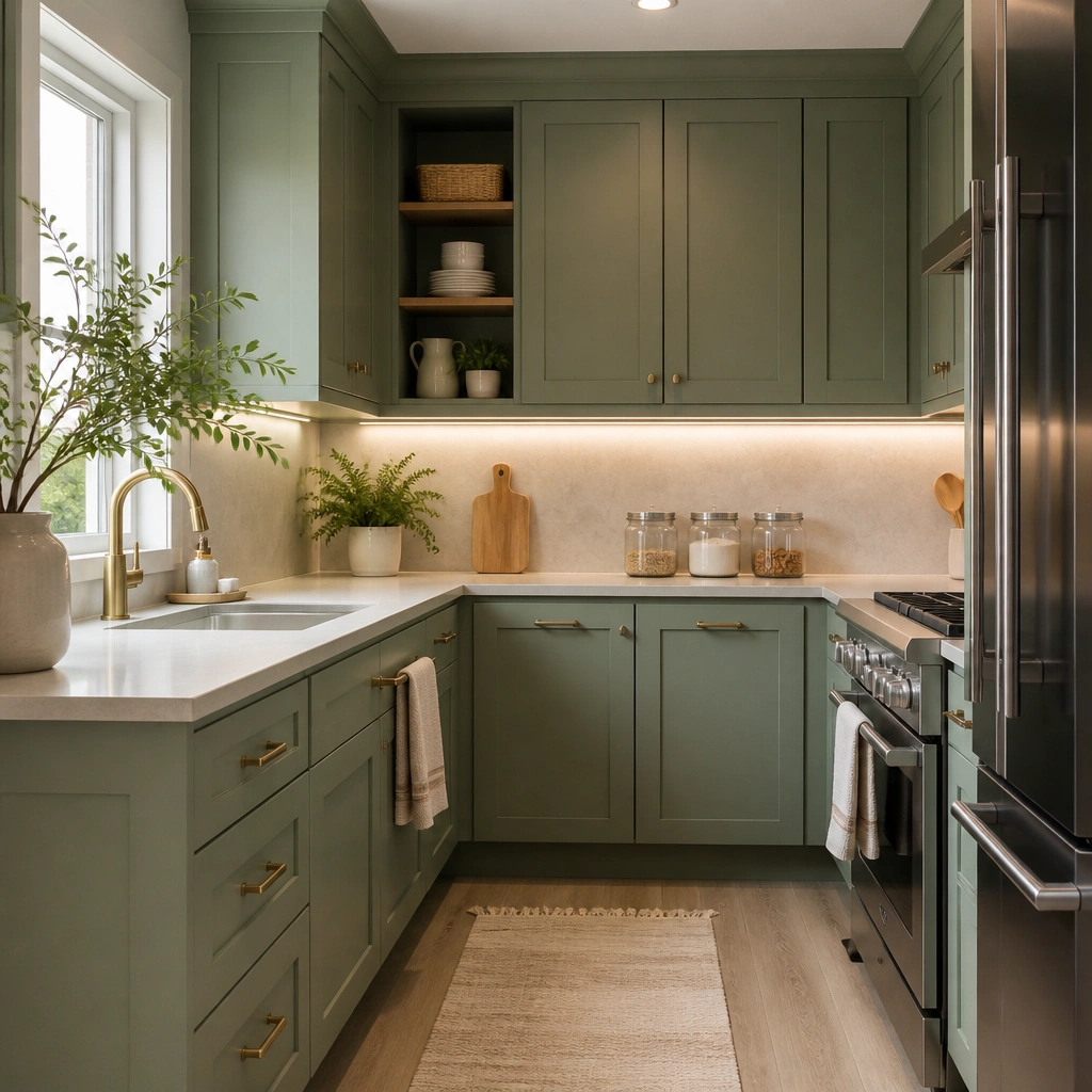
In small kitchens, sage works best when you add light sources and reflective surfaces. Under-cabinet lighting helps sage look fresh instead of flat, especially at night. Pairing with light flooring and a simple backsplash keeps the room from feeling crowded.
Before painting, turn on all kitchen lights and observe how your cabinet color sample looks — adjust undertone if it turns too dull.
11. Sage Green Cabinet Paint Finish Guide (Satin vs Matte)
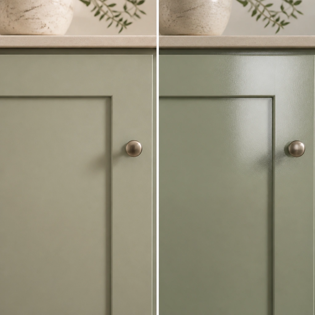
Matte sage hides imperfections and feels cozy, but it’s more likely to show scuffs over time. Satin is a beginner sweet spot because it’s still soft-looking while being easier to wipe down. For most kitchens, satin is the practical choice if you cook daily.
Pro tipIf you’re worried about durability, choose satin and use a cabinet-specific topcoat rated for interior doors and trim.