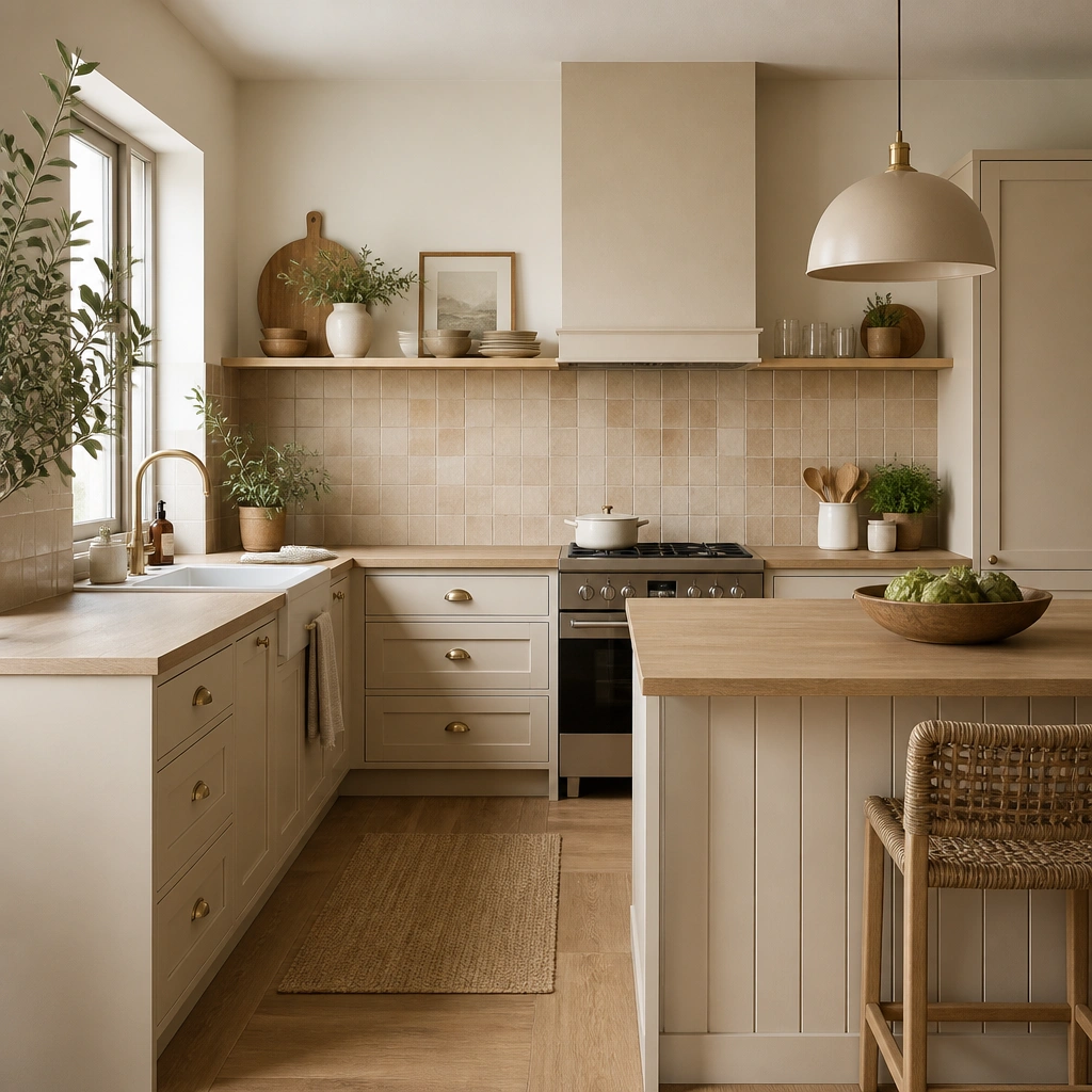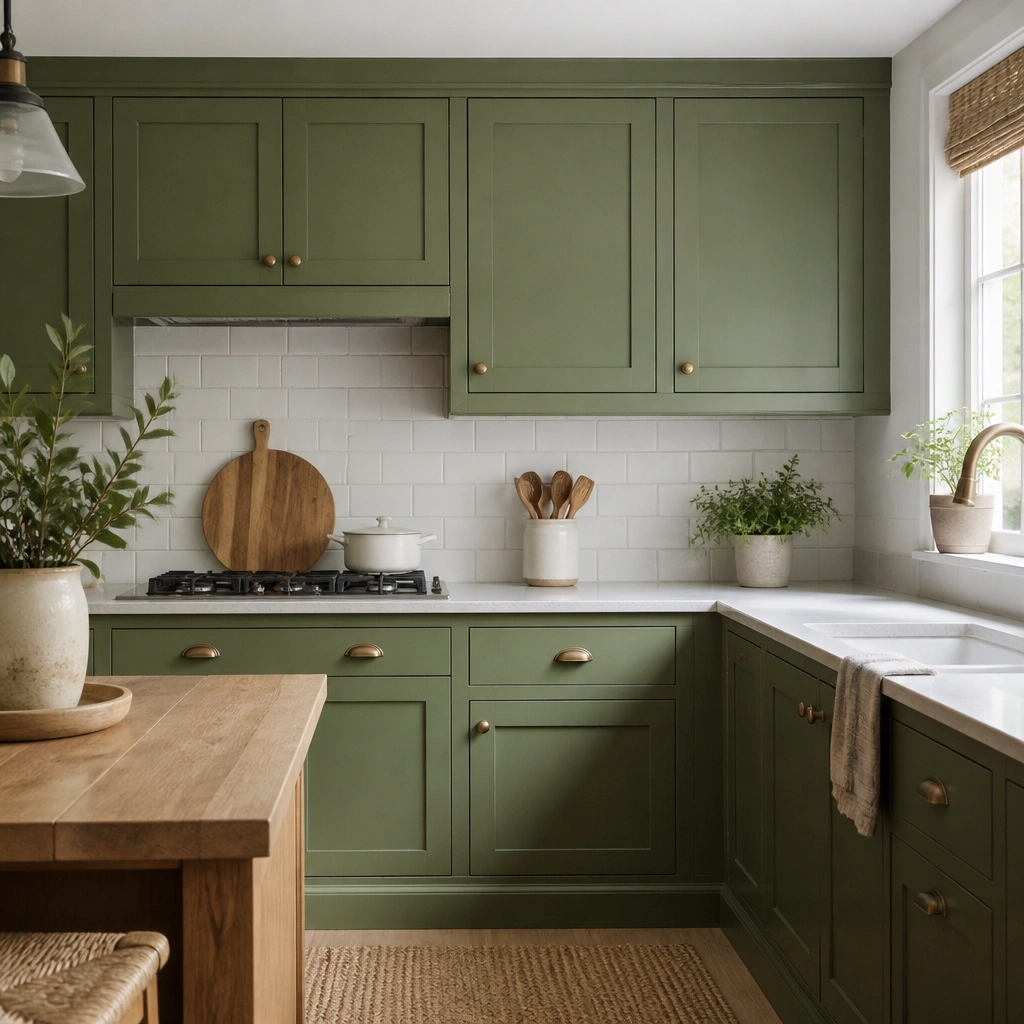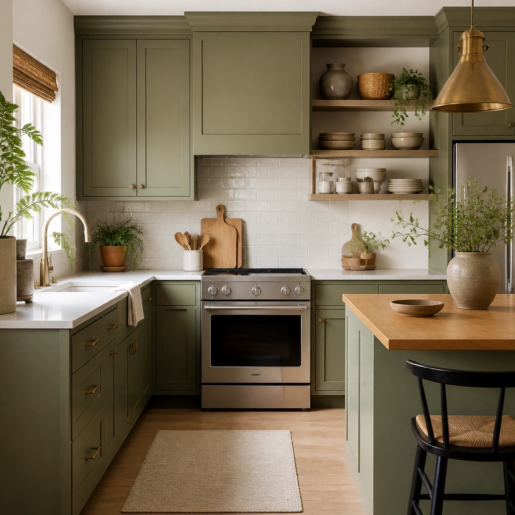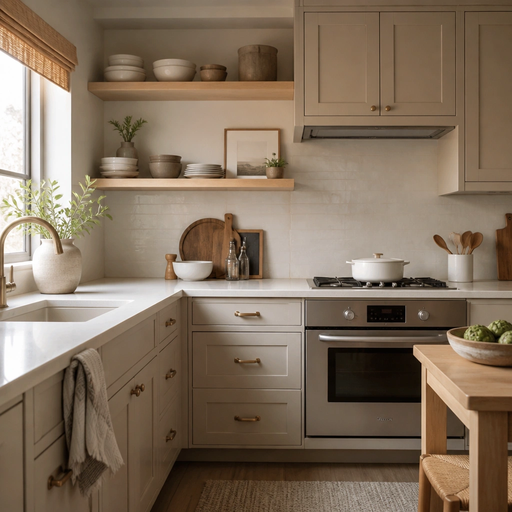
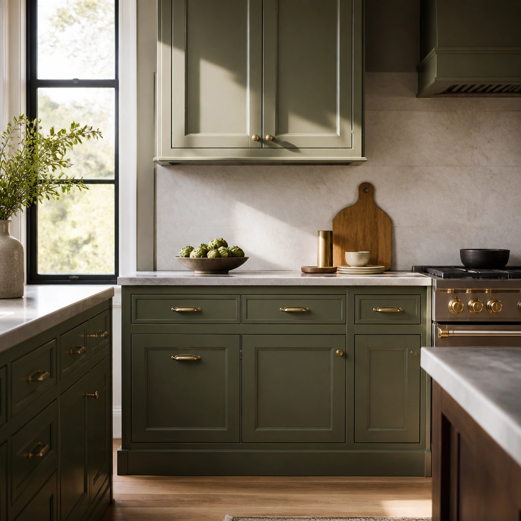
1. Sage Green Shaker + Warm Brass Pulls
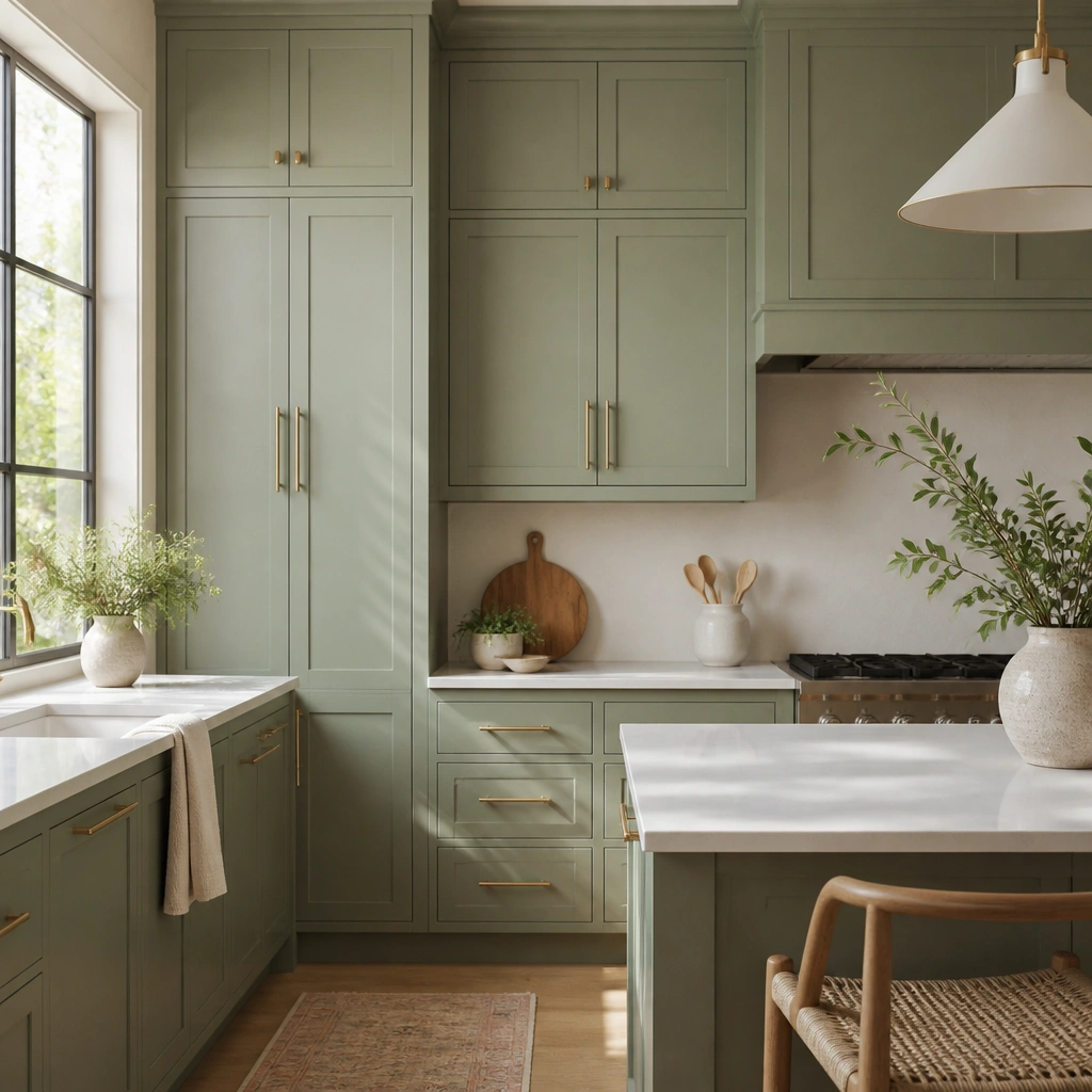
This look uses sage green (slightly gray, not yellow) so it reads calm and high-end. Pair it with shaker doors and warm brass hardware to add golden contrast that makes the green feel tailored. Keep the counters bright — a creamy white or subtle veining reads “expensive” next to sage.
If your green looks dull, switch to a satin or eggshell finish and add warm brass hardware — it boosts depth without changing the color.
2. Hunter Green Flat-Panel Cabinets + Matte Black Hardware
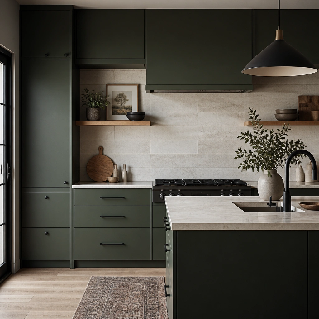
Hunter green feels luxe because it’s deep and saturated, but flat-panel doors keep it modern and expensive-looking. Matte black hardware adds contrast and sharpness without glare, especially under warm lighting. Choose a light backsplash (marble-look or creamy tile) so the dark cabinets don’t swallow the room.
Pro tipUse a warm-toned bulb (2700K-3000K) over the counters — cooler light can make hunter green turn flat.
3. Olive Green Cabinets + Natural Oak Shelving Accents
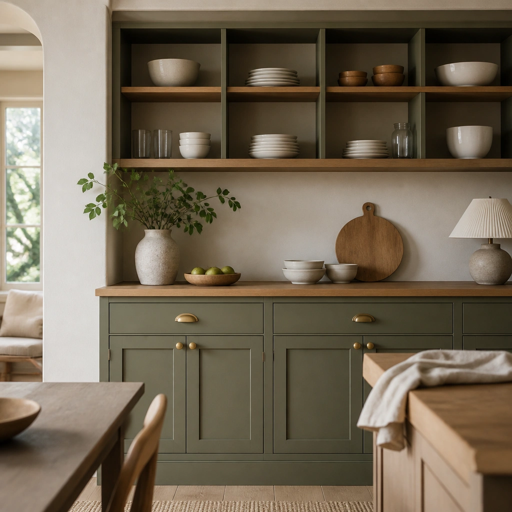
Olive green has a warm, earthy undertone that looks premium when it’s balanced with real wood. Add open shelving with natural oak (or oak-look veneer) to break up the solid cabinet fronts and give the room texture. Keep dishware in white or off-white so the olive reads rich instead of busy.
Stain new shelves in a honey oak tone — too cool a “gray oak” makes olive look dated.
4. Deep Teal-Green Cabinets + Brass-and-Glass Details
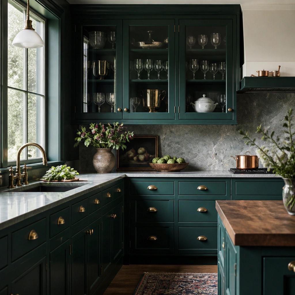
Teal-green sits between green and blue, which makes it feel custom and designer. Use brass hardware and glass-front accents to add sparkle and dimension when light hits the glass. This combination makes the cabinets look collected and high-end, not mass-produced.
Pro tipFor glass fronts, choose clear glass with a slight thickness — it catches light better than super-thin, wavy glass.
5. Soft Emerald Green + White Quartz + No-Handle Look
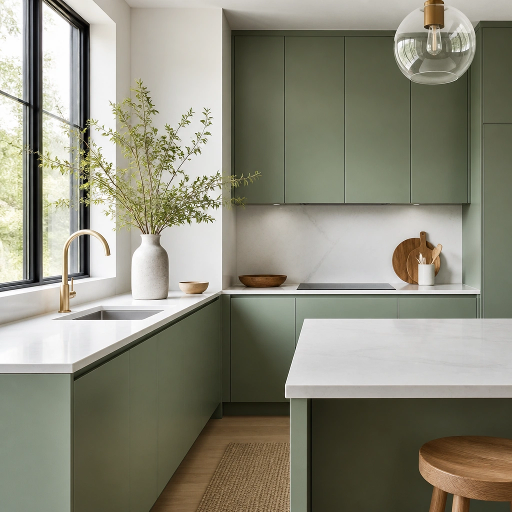
Soft emerald (more jewel than deep forest) looks expensive when the lines are uninterrupted. Pair it with white quartz — especially one with soft gray movement — and keep the fronts clean with integrated pulls or recessed hardware. The lack of visible hardware makes the cabinets feel built-in and architectural.
Pro tipIf you’re painting, use a cabinet-grade primer and sand between coats to keep edges crisp for the no-handle look.
6. Muted Sage Green + Wainscoting Backsplash Tile
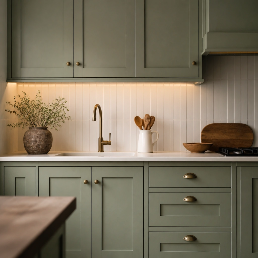
This is the “pretty but grown-up” version of green cabinets. Muted sage stays elegant, while a classic backsplash pattern (small subway or wainscoting-style tile) adds heritage detail that reads expensive. Warm under-cabinet lighting makes the green look more dimensional and less flat.
Pro tipChoose grout in soft white or light warm gray — harsh bright white can make sage look washed out.
7. Forest Green Cabinets + Marble-Look Veining and Polished Chrome
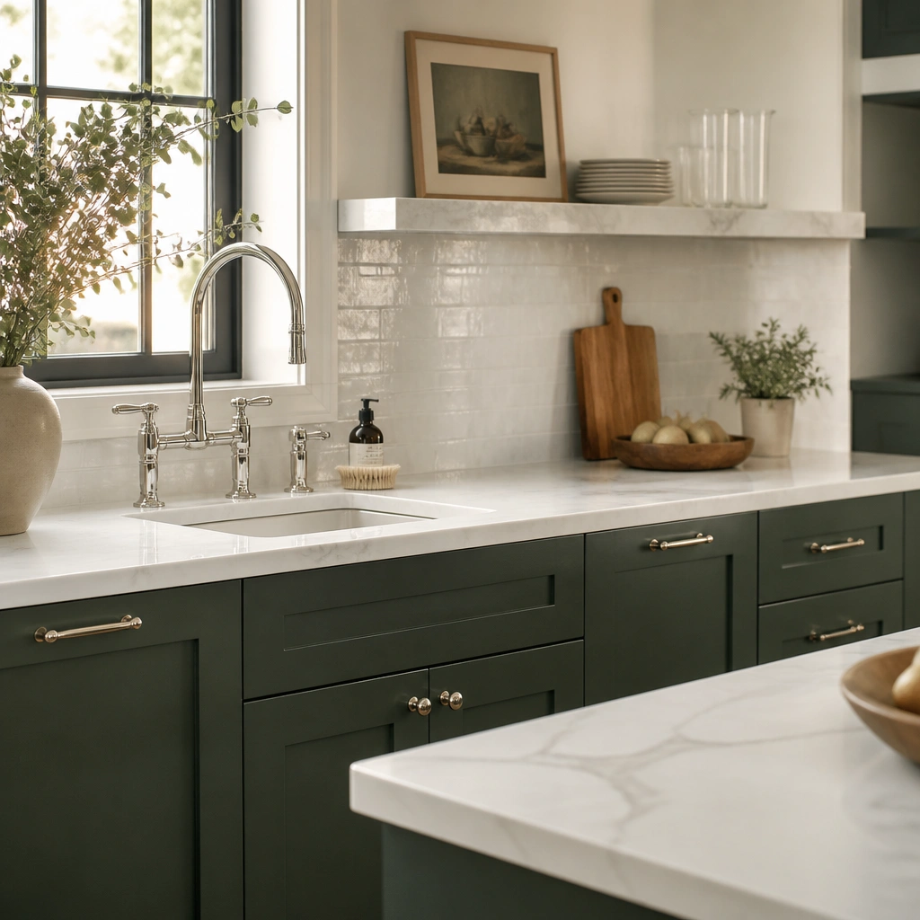
Forest green is bold, but it turns luxurious when paired with clean, high-contrast materials. Marble-look counters with gray veining add the “luxury hotel” effect, and polished chrome reflects light so the green appears deeper. Keep the overall palette neutral — think white, light gray, and stone tones.
Pro tipUse a satin topcoat on painted cabinets — it gives that slight sheen that polished fixtures bounce off.
8. Two-Tone Look: Green Lower Cabinets + White Upper Cabinets
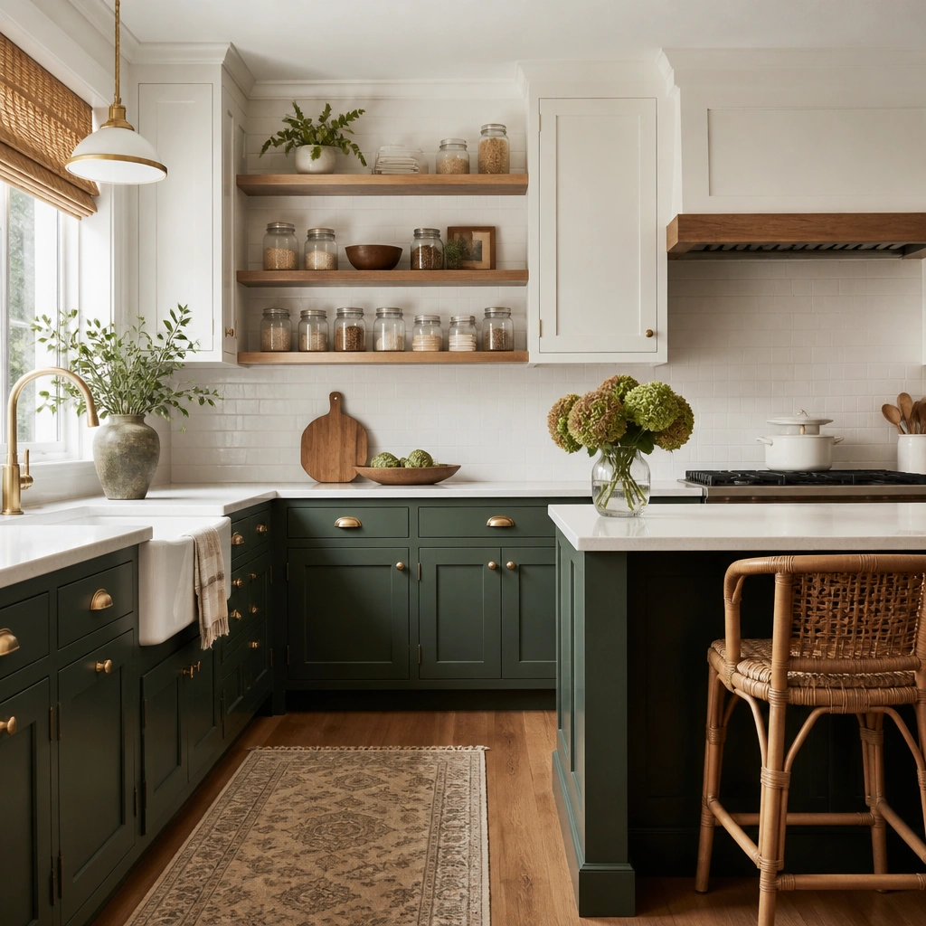
Two-tone kitchens feel instantly elevated because they create visual balance. Keep the uppers bright white (or creamy) and let the green anchor the room below. Brushed brass hardware ties both colors together, while a light backsplash keeps the green from dominating.
Match the green undertone to your floor — if your floor is warm honey, choose a green with yellow-leaning warmth (olive or warm sage).
9. Vintage-Style Green Cabinets + Antique Brass Cup Pulls
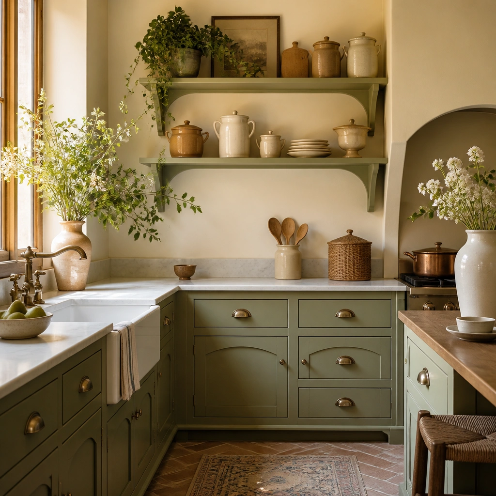
Vintage hardware instantly upgrades the cabinet look — it signals craftsmanship and age. Choose a green that’s softened (like muted olive or gray-sage) so it doesn’t look harsh. Antique brass cup pulls add warmth and a tactile feel that makes the whole kitchen look styled, not store-bought.
Pro tipBefore buying pulls, measure the existing hole spacing — you can often reuse holes with the right cup pull style.
10. Matte Olive Green + Oversized Black Overset Knobs
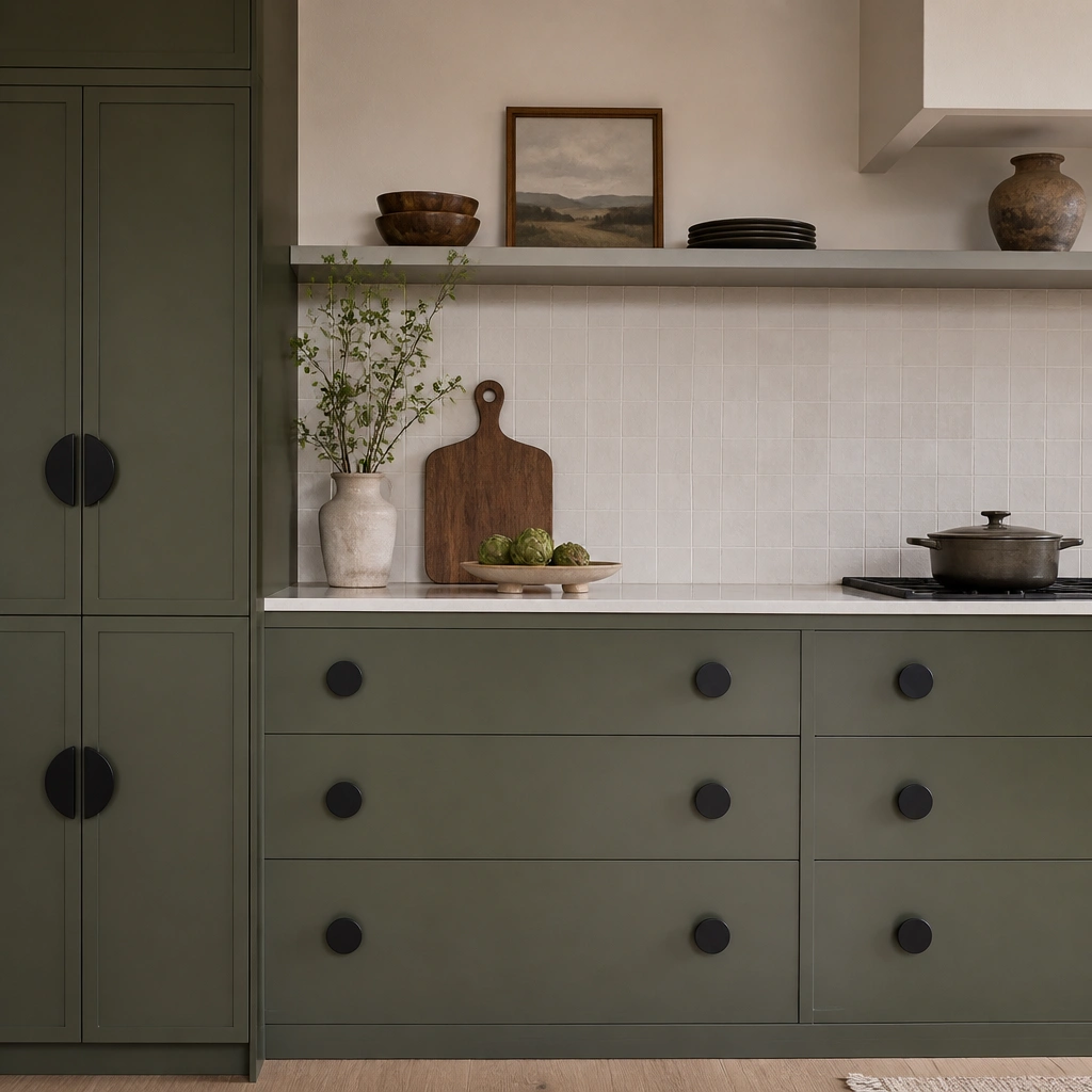
Matte finishes are the secret to “expensive” because they hide imperfections and create a soft, tailored surface. Olive green works especially well in matte because it reads sophisticated, not neon. Oversized matte black knobs add a sculptural element that looks design-forward without needing extra pattern.
If your knobs look too shiny, swap to matte — gloss hardware can make matte cabinets feel cheap.
11. Green Cabinets with Glass-Front Upper + Under-Shelf Lighting
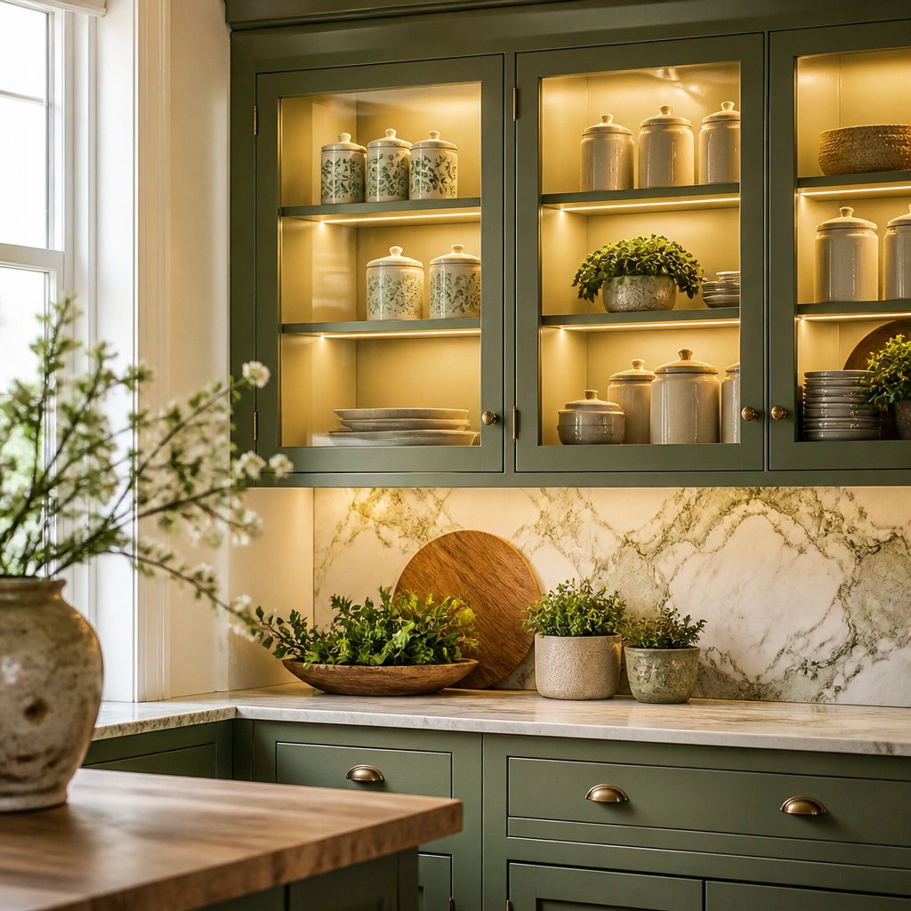
Glass-front uppers make green feel curated because you can control what’s visible. Add warm under-shelf lighting so the shelves look boutique — it also deepens the color by adding a second light source. Use matching ceramic canisters and keep the styling consistent to avoid a cluttered look.
Pro tipUse warm white LED strips (3000K) and place them slightly back from the front edge for even glow.